
'Data Visualisation: A Handbook for Data Driven Design'
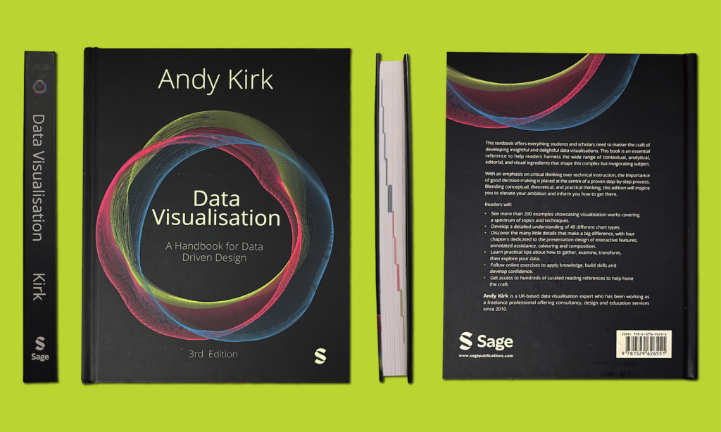
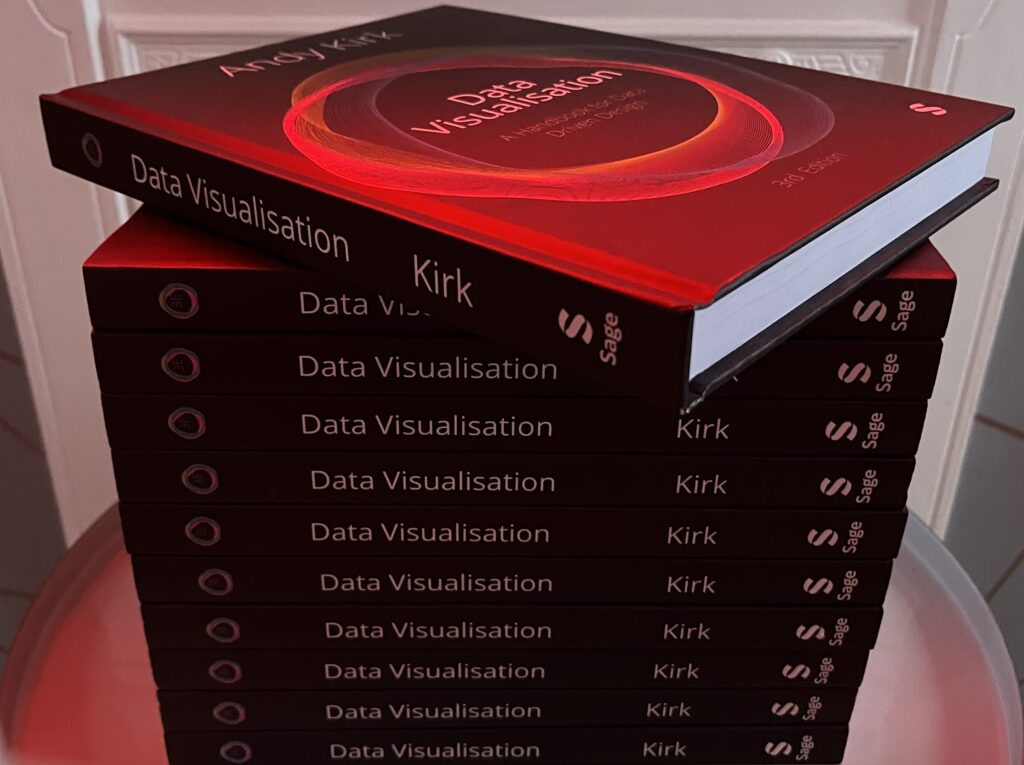

‘Data Visualisation: A Handbook for Data Driven Design’ is an award-winning published by Sage which was released in 2016 followed by a 2nd edition in 2019. The 3rd edition of the book was published on 15th November 2024 in the UK with a release in other regions to follow over the coming weeks.
The aim of this title has always been – and continues to be – to help people to become better visual communicators of data through the optimisation of creative, analytical, editorial and design-based decision-making. It is not a technical book nor a coffee-table book, rather it is a book intended to guide and elevate your craft.
The specific purpose of the 3rd edition is to take the opportunity to reflect the evolution of the field and how my own convictions have evolved, the way I communicate them, and the examples I use to illustrate them.
WHERE TO BUY?
The book was officially published in the UK during November 2024 with the title becoming available from January 2025 in all regions, across all book-selling platforms and at a consistent RRP.
The reason for mentioning ‘consistent RRP’ is that sometimes, ahead of release, the price of a book can be inflated given its rarity at that point in time. Once released, the book settles into a consistent RRP which, as a general guide, means you should be paying no more than £45, €56, or $68 for a copy and possibly less, with occasional discounts appearing on book selling platforms.
The links presented below highlight the direct sources of some of the main places to buy the book if you are in the UK or US, as these are unquestionably the two major markets for this title. For people located anywhere else in the world, visiting the equivalent regional variations of these popular sites should take you to the relevant pages you need.
If anyone from any part of the world has queries about where to source a copy in their region please do get in touch!
WHAT IS THE PURPOSE OF THIS BOOK?
Data visualisation is hot right now, but it isn’t a new subject. Though it’s become especially popularised during the 2010s, infiltrating further into mainstream discourse, it has been around as a practice for centuries. I share admiration with many of my contemporaries for the work of the pioneers in this field. People like W.E.B. Du Bois, Étienne-Jules Marey and Willard Brinton revolutionised methods for visually displaying statistics. Despite their primitive means, compared to the rich technologies we rely upon today, these people shaped the foundations of the field being practised currently.
Given that context, of a subject with such a deep history, there can be moments of hesitation about choosing to write a book on this subject: hasn’t it all been said before?
Much of it probably has, but not necessarily to the enthusiasts out there today who are seeking contemporary direction. Ideas from the past can be built on and evolved. Remixing, reinforcing, rephrasing or repeating what has been said before can still offer fresh value, while nodding respectfully to the subject’s origins.
Data visualisation is a broad subject. When writing a book the primary challenge is to determine what to leave in and what to leave out, such is the extent of potential content. There is no single book that can truly cover everything that could be included, certainly not to the depth that would be possible. Each topic covered by the chapters of this book warrants existing as a standalone book (and in many cases already does).
Data visualisation is a complex subject, though not necessarily always complicated. There will be occasions when you are working with particularly sophisticated or technical topics. There will be some tasks when you are going to need to employ advanced statistical methods, but these are neither typical nor universal. The complexity in data visualisation comes from the imperfections, the many moving parts, the range of things to think about and the amount of tasks that need doing.
Every single choice made affects every other decision yet to be faced. These decisions you face cover a spectrum of sensibilities. Creative and journalistic instincts need to blend harmoniously with analytical and scientific reason. In one moment, you might be checking the statistical rigour of an intricate calculation, in the next deciding which shade of orange most strikingly contrasts with a vibrant blue. Overcoming the complexity of data visualisation will require understanding how the myriad small ingredients interact, intersect and influence the final recipe. Weaving all these ingredients into a logical linear sequence that helps you feel in control is one of my principal aims.
The choices I have made in formulating this book’s content have been shaped by my own journey in learning this subject. I’ve been researching, writing about and practising data visualisation since the late 2000s. You can only discover the extent of your own knowledge of a subject when you have to impart it to others. I have been fortunate to have had extensive experience designing and delivering commercial training as well as academic teaching. These are opportunities that truly sharpen your convictions about what you know, what you don’t know and how capable you are of helping others to know.
I believe this book offers an effective and proven pedagogy that successfully translates the complexities of this subject in a form that is fundamentally useful. I feel well placed to bridge the gap between the everyday practitioners, who might identify themselves as beginners, and the superstar talents expanding the potential of data visualisation. I would never claim to belong to the latter cohort, but I have certainly been in the shoes of the novice, taking tentative early steps into this world. Most of my working hours are spent helping others start their journey. I know what I would have valued when I started out in this field and this helps inform how I now pass this on to others in the same position I was in all those years ago. Data visualisation may not be complicated but neither is it simple. As will be a theme running through this book, clarifying the complex should always be prioritised over attempts to simplify. Clarity is the most faithful path to pursue.
There is a substantial – and growing – library of fantastic books offering contrasting theoretical and practical viewpoints on how to learn this subject. From such an array of texts you might expect lots of contradictory advice and yet, in my experience, the vast majority of written material is complementary. We just all have different ways of explaining things and different preferences for digesting knowledge. My aim is to add value to this existing collection of valuable references by deconstructing this subject from its whole into digestible parts. I believe the path to mastering data visualisation is achieved by making better decisions: effective choices, efficiently made.
The purpose of this book is therefore to help you better understand what decisions you’ll face, when you’ll face them and how you might resolve them. I want to instil you with confidence in how to make optimum choices.
WHO IS THIS BOOK For?
Anyone who has reason to use quantitative and qualitative methods in their professional or academic duties will need to grasp the opportunities offered by data visualisation. Whether this subject will prove to be a significant part of your duties or more of an occasional encounter, this book will support your needs.
The primary intended audiences are undergraduates, postgraduates and early-career researchers in the social sciences. While the examples chosen are designed to be as relevant as possible to these readers, the book will still be relevant to those across the spectrum of arts and humanities through to the natural sciences.
This book is intended to offer an accessible route for novices to start their data visualisation learning journey. For those readers already familiar with the basics of data visualisation, the content will hopefully contribute to refining those existing capabilities. It is not necessarily targeted at experienced visualisation practitioners, though there may be some new perspectives to enrich their convictions, reinforce existing knowledge or challenge their approaches.
Over the last decade, from when I was starting to draft the first edition, we have witnessed significant growth in the data visualisation field. There are more practitioners, more studios, more events, more communities, more people writing about the subject, more people studying it, more people with jobs that have ‘visualisation’ in their title. Organisations of all shapes and sizes, across all industry types and locations, are embracing the need to do more with the data they have, to get more value from it, for both internal and external benefit. If data is everywhere and a concern for all, the effective visualisation of it should be seen as an adjacent necessity.
The people interested in this field cover all backgrounds. You can be a market researcher, a librarian or a data analyst looking to enhance your data capabilities. Perhaps you are a skilled graphic designer or web developer looking to take your portfolio of work into a more data driven direction. Maybe you are in a managerial position and, though not directly involved in the creation of visualisation work, you might wish to improve the sophistication of the language you use to coordinate or commission others who are. Everyone needs the lens and vocabulary to evaluate work effectively.
Data visualisation is an authentically multidisciplinary discipline for which nobody can expect to arrive, as a new practitioner, with all constituent capabilities fully formed. But, to extract the most benefit from this book, it is reasonable to point towards certain important (arguably non-negotiable) traits:
- Strong numeracy is necessary as well as a familiarity with basic statistics.
- While it is reasonable to assume limited prior knowledge of data visualisation, there should be a strong desire to want to learn it. The demands of learning a craft like this take time and effort; the capabilities will need nurturing through ongoing learning and practice. They are not going to be achieved overnight or acquired just from reading this book. Any book that claims to be able to magically inject mastery through just reading that one text is over-promising and likely to under-deliver.
- The best data visualisers possess inherent curiosity. You should be the type of person who is naturally drawn to question the world around them. Your instinct for discovering, then sharing, answers to your curiosities will be at the heart of this activity.
- There are no expectations of your having any prior familiarity with design principles, but an appetite to embrace some of the creative aspects presented in this book will heighten the impact of your work. Time to unleash your imagination!
- If you are somebody fortunate enough to already possess a strong creative flair, this book will guide you through when and, crucially, when not to tap into this sensibility. You should be willing to increase the rigour of your analytical decision-making and be prepared to have your creative thinking informed more fundamentally by data rather than just instinct.
- No particular technical skills are required to get value from this book, as I will explain shortly. But you will ideally have some basic knowledge of spreadsheets and experience of working with data, regardless of using any particular tool.
As the book explores, data visualisation should be seen as a channel of communicating. As with verbal and written forms, it is a portable and adaptable communication practice involving techniques that are subject matter agnostic. Throughout this book you will encounter examples from different industries and different authors, covering many different topics. Do not be deterred by any example being about a subject different to your own area of interest. Look beyond the subject matter and you will see analytical and design choices that are just as applicable to you and your work: a line chart showing political forecasts involves the same thought process as would a line chart showing stock prices changing or average global temperatures rising. A line chart is a line chart, regardless of the subject matter.
The type of data you are working with is the only legitimate restriction to the design methods you might employ, not your subject and certainly not traditions in your subject. ‘Waterfall charts are only for people in finance’, ‘Maps are only for cartographers charting journeys’, ‘Sankey diagrams are only for engineers’: never reply upon absolute statements that proclaim universal certainties like these. Rather, you are encouraged to embark on the learning of this subject with an open mind. Forget what you believe or have been told is the normal approach and this will better facilitate the expanding of your capabilities.
Although the English language dominates written discourse, the interest in the subject and work created from studios through to graphics teams originates everywhere. Data visualisation is global, not just something practised in specific geographic regions. There are cultural influences and different flavours in design sensibility around the world which enrich the field, but otherwise it is a practice common and accessible to all. The contents of this book seek to represent the thoughts and works from the widest possible range of this global community.
Book Contents
The book is organised into three main parts (A, B, and C) comprising ten chapters with an ‘Introduction’ section providing initial context about the book’s content and structure. A closing ‘Epilogue’ was included in early editions but has been withdrawn from the third edition.
PART A: THE FOUNDATIONS
Part A introduces important foundational understanding about data visualisation as a subject and as an activity. The contents of the first two chapters give shape to the coverage across the rest of the book.
Chapter 1 ‘What is Data Visualisation?’ will be the logical starting point for those who are new to the field, providing a definition for the subject and exploring some of the complexities that enrich it. If you arrive at this book already familiar with what data visualisation is about, you might skip this chapter, though it does help frame many of the discussion points elsewhere in the book.
Chapter 2 ‘The Process and Principles of Visualising Data’ introduces the value of following a design process to organise your thinking. This sequence of activities is the basis around which the book’s contents in Parts B and C are organised. It explains what steps are involved at each stage and offers useful tips to help you seamlessly adopt this efficient process approach into your workflow. Optimising your thinking is the focus of the second section, introducing the value of principles that will help you recognise what separates the good from the bad in visualisation design. This section will describe the universal visualisation principles that will help shape your decision-making, manifesting at different points and in different ways throughout the process.
PART B: THE HIDDEN THINKING
Part B profiles the first three stages of the data visualisation design process. These are the hidden preparatory stages that will significantly influence the design stages later in the process.
Chapter 3: ‘Formulating the Brief’ covers the necessary opening tasks concerned with initiating, defining and planning the requirements of your work. The first section looks at issues around context, specifically about the importance of understanding the drivers behind and circumstances that will shape your work. The second section considers the purpose behind your visualisation: what communication intention will it serve for your audience and early thoughts about how you might accomplish your aims. The final section looks at the benefit of harnessing creative ideas and forming an initial vision for your work.
Chapter 4: ‘Working With Data’ commences your practical involvement with data, stepping through the four distinct steps that acquaint you with the potential of this critical raw material. Data gathering concerns sourcing and obtaining the data, looking at some of the key concerns to weigh up in doing this with reliability. Data examination then profiles the characteristics that define the type, variation and condition of your data. Data transformation builds on your examination work to configure and enhance your data in preparation it for its eventual use. Finally, data exploration discusses approaches to discovering the qualities hidden away in your data, making the invisible visible to you.
Chapter 5: ‘Editorial Thinking’ reflects on the possibilities emerging from your data work and explains the need to make editorial choices. Before you embark on making decisions concerned with how to show your analytical content, you need to first commit to decide what that content will be: what is relevant for the audience? You’ll be introduced to four editorial perspectives – decisions about angle, framing, focus and arrangement – and learn how they influence the design choices that will follow in the next stages of the process.
PART C: THE DESIGN THINKING
Part C represents the main part of this book and covers the steps towards developing your design solution. This part is divided into five distinct chapters covering the different layers of design that make up the potential anatomy of data visualisation. They are covered in separate chapters to help organise your thinking and to avoid you being overwhelmed through exposure to many simultaneous and interrelated decisions. Each chapter follows a similar structure: opening with an array of different possible design options or consideration before guiding you through the factors that will most influence your choices. You will need to make decisions about what elements to include for the data representation (charts), potential interaction and dynamic features, and then annotation. You will complete your design thinking by making decisions around the presentation of those visual elements in respect of their colouring and composition.
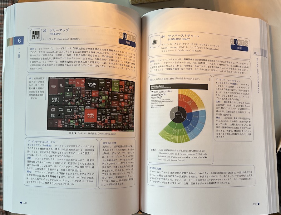
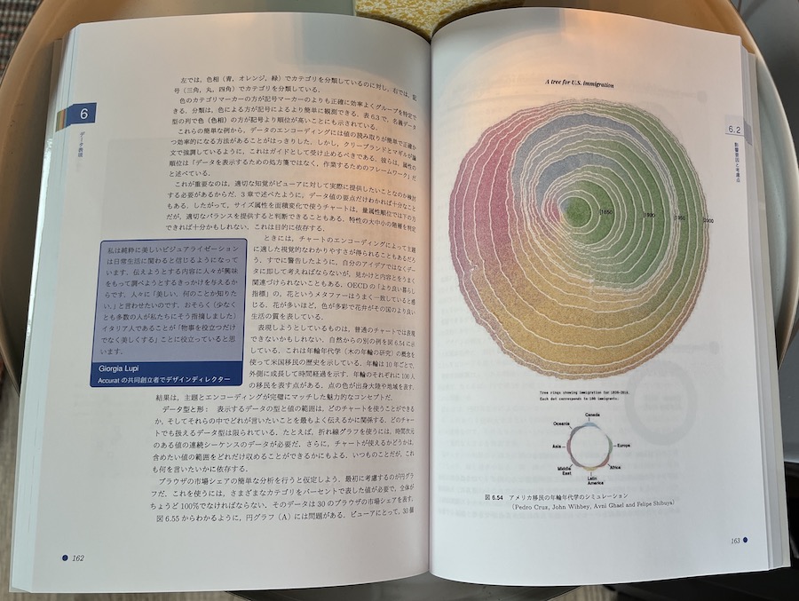
Chapter 6: ‘Data Representation’ is the largest chapter in the book and commences with an introduction to the fundamentals of visual encoding. The bulk of the chapter then follows with a large gallery profiling, in detail, 40 distinct chart types which will help broaden your visual vocabulary. The chapter closes with a run through the key factors that will influence your decisions about making the most effective data representation choices.
Chapter 7: ‘Interaction and Dynamic Design’ introduces the potential methods for enhancing your visualisation with useful features of interactivity that exploit the strengths of a digital experience. It profiles a range of common techniques – such as filtering, highlighting and animating – that will enable users to control a visualisation through their own interrogations and modifications. The chapter closes with the main considerations that will influence your selection of interactive features.
Chapter 8: ‘Annotation’ describes the importance of providing useful assistance to help your viewers navigate seamlessly through different phases of understanding. The potential inclusion of clear headings, chart apparatus and labels will help viewers to read and translate what a visualisation is showing. After running through a list of potential features to consider including, the chapter closes with a look at which factors will ultimately inform the choices you make.
Chapter 9: ‘Colour’ explains the different ways of applying colour to every constituent part of a visualisation, to facilitate data legibility and deliver functional decoration. Once again, having introduced the options, we will look at how you arrive at appropriate choices.
Chapter 10: ‘Composition’
explores the final layer of the visualisation design anatomy, which concerns how you organise the placement and sizing of all visual elements within the space you have to work. After a run through the typical set of considerations and/or options, we will wrap up this topic, and this main part of the book, with a look through how to make good choices.
ONLINE RESOURCES
A digital companion site is provided to readers of the book offering additional references and resources that will supplement their learning from the book’s 3rd edition content, though they will be relevant also readers of both earlier editions.
To accompany each book chapter, there are four sections of contents for you to browse through: ‘Explore the field!’, ‘Try for yourself!’, ‘Learn from the best!’, and ‘Figure sources’.
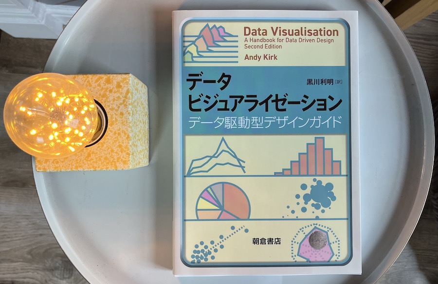
JAPANESE EDITION
In late 2020 I received news that a Japanese translation of the second edition of my book would be developed and produced by Asakura Publishing Co., Tokyo, Japan.
In July 2021 it was completed and published in Japan and made available to buy via amazon.jp.
It is a huge honour to have had my work translated and I’m so grateful to Toshiaki Kurokawa for his exceptional efforts in translating and adapting this for an entirely new audience.


Data Vis Book Club
It was super to see the book chosen as the title to be discussed at the May 2020 ‘Data Vis Book Club‘, hosted and organised by Lisa Muth of Datawrapper.
Rather than attempt to cover the whole book, Lisa asked me to select five crucial chapters that are fundamental to or representative of the book’s aims. I selected chapters 1, 2, 3, 5 and 8. I was tempted by Chapter 6, as it is perhaps the literal and figurative centrepiece of the book, but it is a large chapter and for the scope of this book club I felt these selected chapters were better choices for discussing.

The three questions asked of reviewers were:
(1) What was your general impression of the book? Would you recommend working through it, and if so, to whom?
(2) What was most inspiring, insightful or surprising while you worked through the book? What did you learn that you didn’t expect to?
(3) Having read the book, what will you do differently the next time you visualize data?
Reviewers could then post their thoughts into a collaborative digital notepad to collectively build up a structured and constructive review.
Thanks so much to Lisa and all participants who joined the session, I really appreciate the many nice comments and astute observations about the things I wanted to convey through the book.
Errata
This is a list of discovered errors or typos included in the book’s text:
Page 18: In the third paragraph it currently says “positioned at the intersection of the relevant x and y positions for each reporting month and channel.”. ‘Channel’ is incorrect, this should say ‘percentage’.
Page 45: In the second paragraph there is stray phrase: “colour choices for the bars” (Thanks to Mike Leary).
Page 46: The following sentence should be ignored, as it is out of sequence in this edition: “In the Introduction’s glossary of terms, you will have seen the distinction between terms like complex and simple.”
Page 101: The list of examples should be of Ordinal categories, not Nominal as indicated (Thanks to Aida Amir Aslani).
Page 120: The passage that reads “The emphasis is clear. It is you who are ultimately responsible for the editing process” should be “The emphasis is clear: It is you who are ultimately responsible for the editing process”
Page 192: The passage that says “as supported by colour hue being ranked higher than shape for nominal data types” should state ‘symbol’, not ‘shape’.
Page 254: The line “There are two key factors to consider when judging your scales” should actually state there are ‘four’ key factors.
