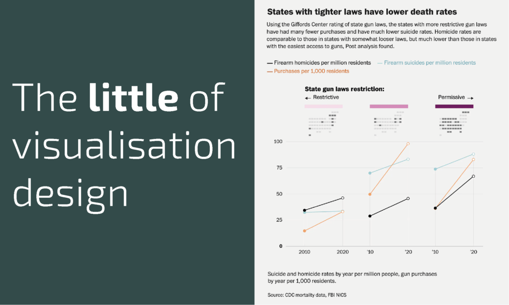
This is part of a series of posts about the ‘little of visualisation design’, respecting the small decisions that make a big difference towards the good and bad of this discipline. In each post I’m going to focus on just one small matter – a singular good or bad design choice – as demonstrated by a sample project. Each project may have many effective and ineffective aspects, but I’m just commenting on one.
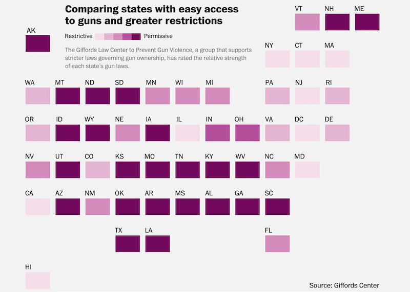
The ‘little’ of this design concerns a smart way to add further context to a colour legend. The piece in question comes from a Washington Post article titled ‘The staggering scope of U.S. gun deaths goes far beyond mass shootings‘, produced by a team of superstars, and with the specific little design element found in a chart about half way down the article.
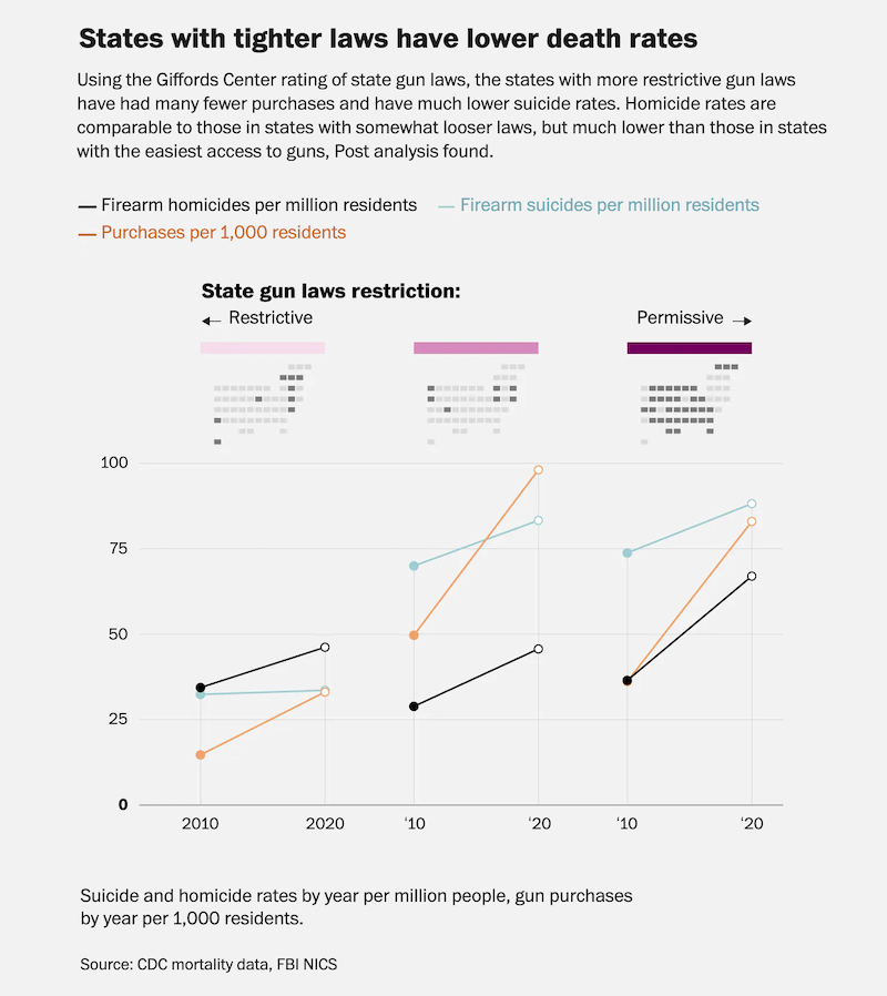
This charts presents three slope graphs, each plotting the changing rates of firearm homicides (per million residents), of firearm suicides (per million), and of firearm purchases (per 1000 residents) between 2010 and 2020. The three slope graphs are respectively plotting statistical averages for three different cohorts of US states, those with restrictive, moderate, and permissive gun law restrictions.
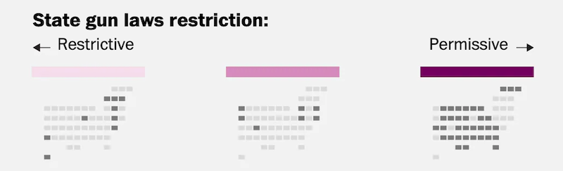
The smart feature I want to highlight here is the miniature grid map, presented under the three colour scales, indicating which of the US states align with which of the three generalised gun restriction groupings. In the full, original article page, both the colour associations and the map layout were presented in a prior chart (as shown below here), and so the audience familiarity, with both the colour meaning and with which map cell each US state relates, is already established, and can also be revisited if any further reminders are necessary.