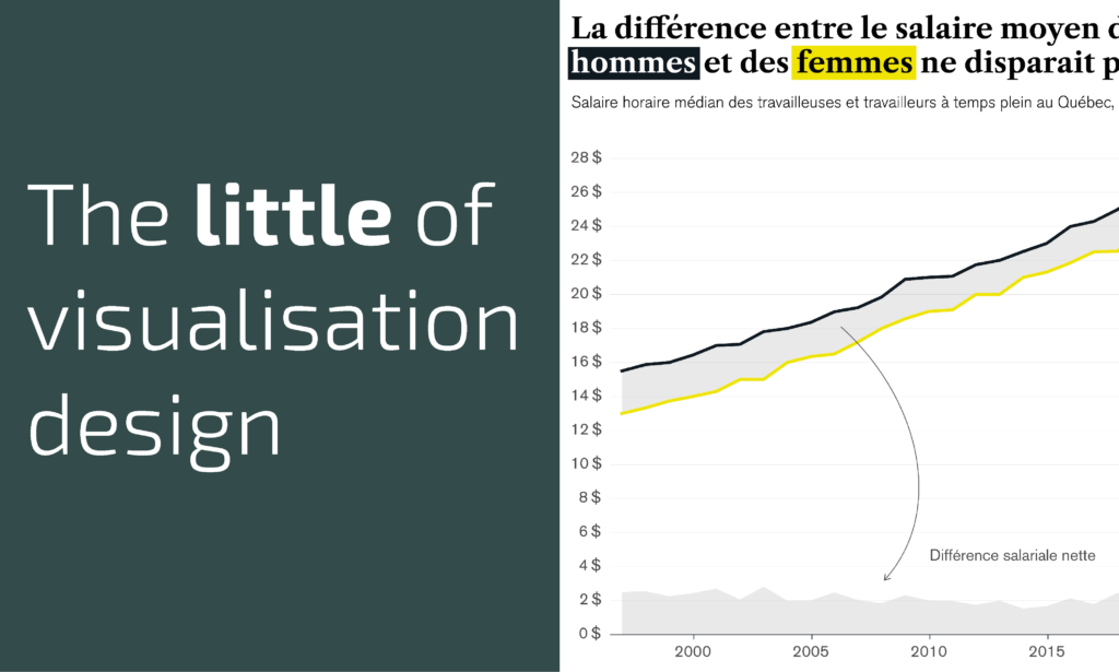
This is part of a series of posts about the ‘little of visualisation design’, respecting the small decisions that make a big difference towards the good and bad of this discipline. In each post I’m going to focus on just one small matter – a singular good or bad design choice – as demonstrated by a sample project. Each project may have many effective and ineffective aspects, but I’m just commenting on one.
The ‘little’ of this design concerns a clever charting method to display net figures. The work in question comes from Timour Scrève, Information Designer at Voilà, in an updated collection of analysis to mark International Women’s Day. Using data from the Institut de la Statistique du Québec and Statistics Canada, one of the charts displayed looks at the wage gap between women and men since the early 1990s.
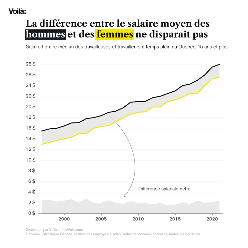
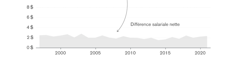
The main difference chart shows the median hourly wage trends over time for men and for women, thus exposing the gap that exists. For a reader, it can be difficult to perceive the absolute size of this gap given the baseline (in this case, the yellow line for ‘women’) shifts up and down. I think it is really smart, therefore, to embed a secondary plot within the same chart space using an area chart at the bottom of the chart to show the trends of wage-gap itself. Adding an arrow with a simple label associating the two chart regions and using the same fill colour makes it very clear to the reader what this represents.