
[Cover image from BBC]
Coverage of the Coronavirus outbreak is everywhere as news media, governments and health organisations across the globe analyse its spread and impact. Taking a step back away from the concern of the consequence of this (surely, imminently) pandemic, over the course of the past week or so it has been fascinating to digest the different approaches to communicating this topic. I appreciate it is hard to find the most suitable path that manages to both inform the public about the gravity of this outbreak whilst avoiding the triggering of unnecessary panic but I don’t feel everyone is managing to do this.
I’ve been posting a few instinctive observations about this matter on Twitter so, rather than leave them fragmented on social media, I’ve collated them into a single post that I may update if and when more themes emerge. Let me state that I’m not remotely qualified about the protocols for effective communication approaches in a health crisis like this, but these thoughts come from my perspective as a concerned citizen who also wears a visualisation hat:
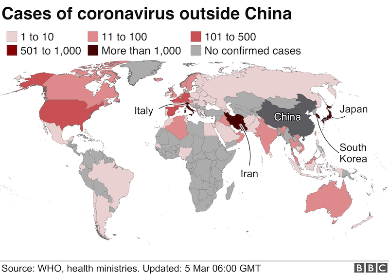
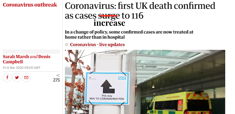
(1) It is now necessary to add more context to the numbers. Stop just publishing case totals in isolation. It has now surely gone beyond the point of being useful to just feed the public cumulative totals of cases. That will continue to grow and it will only create more context-free anxiety. Although the article from which the below image comes from does expand to look at discrete numbers of new daily cases, the headline analysis is still focusing on total cases.
More context is needed. Aside from the numbers being standardised to show rates per capita, now that sufficient time has passed since the outbreak started, it seems logical that we should also be seeing data about recoveries. Not everyone who has had Coronavirus, still has it. Additionally, not everyone who thought they had it, had it – as Michael Brenner suggests, knowing how many people have been tested and found not to have the virus may also help to dampen public anxiety.
Furthermore, when reporting mortalities, the context of these unfortunate people having pre-existing conditions does not ease the pain of those impacted but adds more context. That key word again. If your counterargument is ‘we don’t have that data’ then maybe you shouldn’t publish anything until you can provide the full perspective?
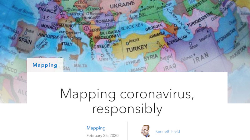
(2) When thematically mapping analysis of the outbreak and spread, consider some of these important tips compiled by Ken Field. He knows what he’s talking about.
(3) At some point soon “the where” will no longer be the key issue, besides monitoring “the where not” of regions where the virus has not spread. In terms of unearthing new understanding, it will be more relevant to think about mapping the flow and connections to learn and explain how the virus spreads. And what measures are having an impact.
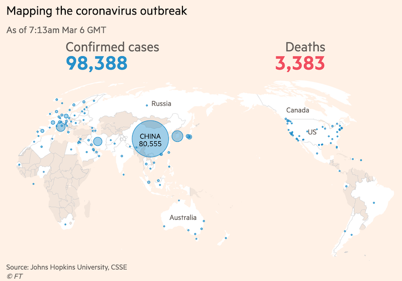
(4) The centre of this global story is not Britain, so it is sensible to see some mapping techniques being used that centre the story around the region from where the outbreak originated.
(5) Just because the outbreak started in China, the news media especially should think carefully about the impact of their photography choices. Though it isn’t the cause of race-hate, it doesn’t help prevent appalling stories like this. Here’s a good explainer ‘Why Asians in masks should not be the “face” of the coronavirus‘.
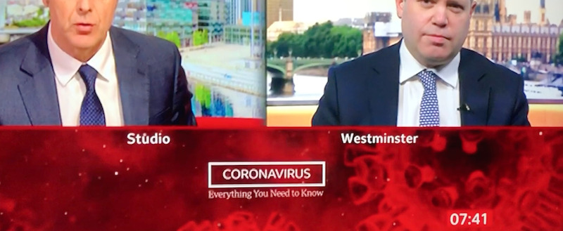
(6) It is also important for the media to have a think about dialling-down some of their imagery choices when presenting packages about this outbreak. As I posted yesterday, stop using fearsome motifs like this which simply convey blood, death, alien life-form, scary, panic.
(7) Use language responsibly and more reasonably.
(8) Don’t lie, don’t mislead, don’t misinform, and beware those who do. Should not be a surprise to say this but there are bad actors out there whose very existence is to distort the truth, either to underplay the extent of concern and/or inflate the scale of panic.
(9) As an antidote to the unhelpful baddies of this piece, it is overdue but refreshing to see expertise being welcomed in Britain again and given a suitable platform to provide necessary leadership.
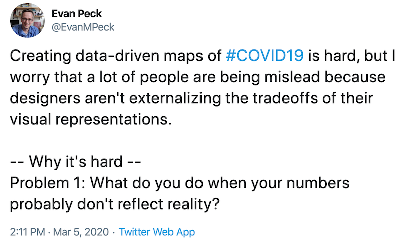
(10) This is a great thread by Evan Peck on the challenges of visualising what is known and (responsibly) visualising what is uncertain or currently unknowable.
(11) The smart people at Datawrapper (led by Lisa Rost in this case) have compiled a terrific constantly updated collection of ‘17 responsible live visualizations about the coronavirus, for you to use‘
