
This is part of a series of posts about the ‘little of visualisation design’, respecting the small decisions that make a big difference towards the good and bad of this discipline. In each post I’m going to focus on just one small matter – a singular good or bad design choice – as demonstrated by a sample project. Each project may have many effective and ineffective aspects, but I’m just commenting on one.
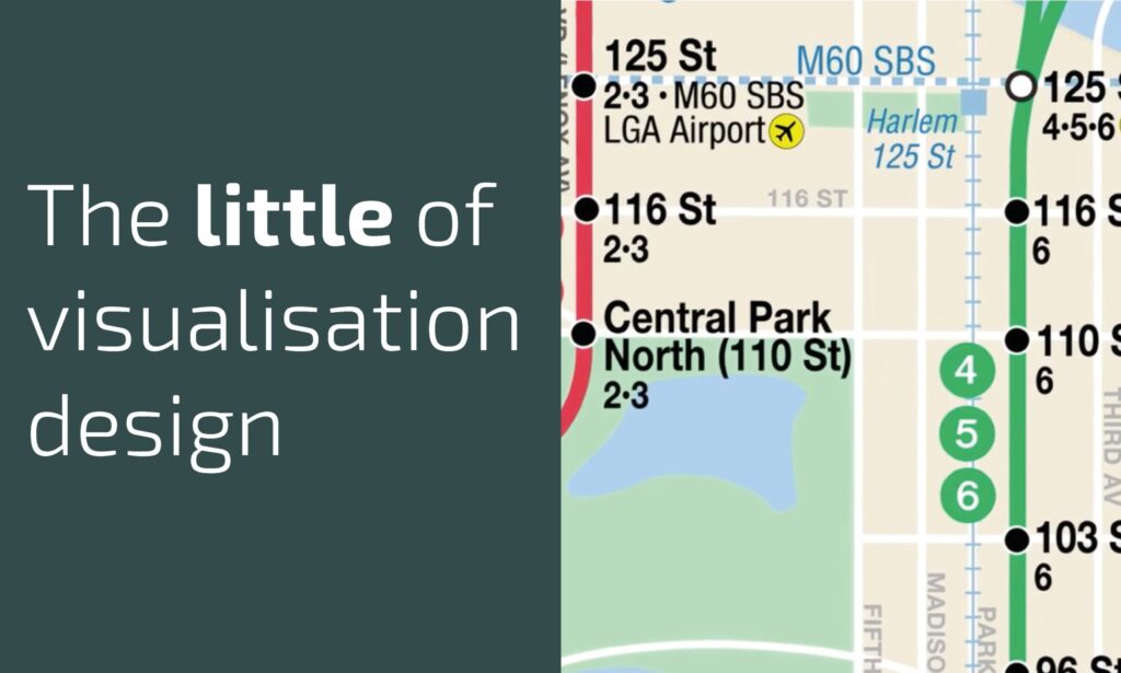
The ‘little’ of this next design concerns a smart animated transition effect used in a project produced by Antonio de Luca and Sasha Portis published on the New York Times’ and titled ‘New York’s Subway Map Like You’ve Never Seen It Before‘. The work is a really nice navigable collection of visual anecdotes about the social and political background that shaped the design of the NYC subway map. Many thanks to Jon Schwabish for alerting me to a particularly nice subtle design feature.
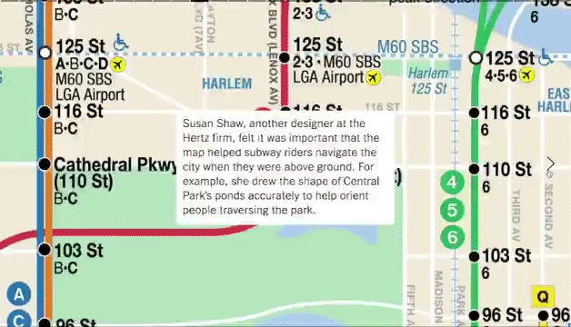
Much of the animation in this project is employed to take you on a simulated journey up, down and across the subway line routes. In this particular panel of the story, it involves a section of movement above ground, on foot. Rather than continue to use the same smooth transitioning animation, the movement now becomes more ‘stepped’ in nature, as Jon describes, giving a lovely ‘little feel of walking between subway stops’.