

This is part of a series of posts about the ‘little of visualisation design’, respecting the small decisions that make a big difference towards the good and bad of this discipline. In each post I’m going to focus on just one small matter – a singular good or bad design choice – as demonstrated by a sample project. Each project may have many effective and ineffective aspects, but I’m just commenting on one.
The ‘little’ of this next design concerns the clever offering of user-interaction prompts. The work in focus was produced by Jason Treat and Anna Scalamogna for National Geographic titled ‘We’ll Have What They’re Having‘.
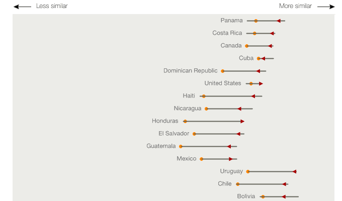
The little design choice I like about this project is how it elegantly provides an interactively driven expanded chart view. When you hover over each country’s line, showing a summary of the extent of dietary changes between 1961 and 2009, a more detailed vertical line chart comes up to show the transition of these changes at a yearly level of resolution.