
This is part of a series of posts about the ‘little of visualisation design’, respecting the small decisions that make a big difference towards the good and bad of this discipline. In each post I’m going to focus on just one small matter – a singular good or bad design choice – as demonstrated by a sample project. Each project may have many effective and ineffective aspects, but I’m just commenting on one.
The ‘little’ of this next design concerns the use irregular axis scales. The piece of work in focus was produced by Allison McCartney of Bloomberg in an article titled ‘Ford Explorer Owners Say Their SUVs Are Making Them Sick‘.
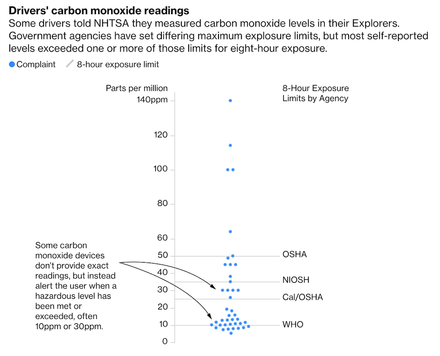
The little design choice I like about this chart is how only the relevant y-axis axis scales are displayed. Think ‘why we include such apparatus?’ – we do it to assist the reader in judging the size (or technically, relative position) of the point marks in the chart. Given the distribution of the carbon monoxide readings plotted along the ‘parts per million’ y-axis, it therefore makes sense to provide axis-scale intervals of size 10 for the range 0-60, where most items are concentrated. However, with the remaining five items being spread more widely from 60-140, the scale switches to intervals of 20.
