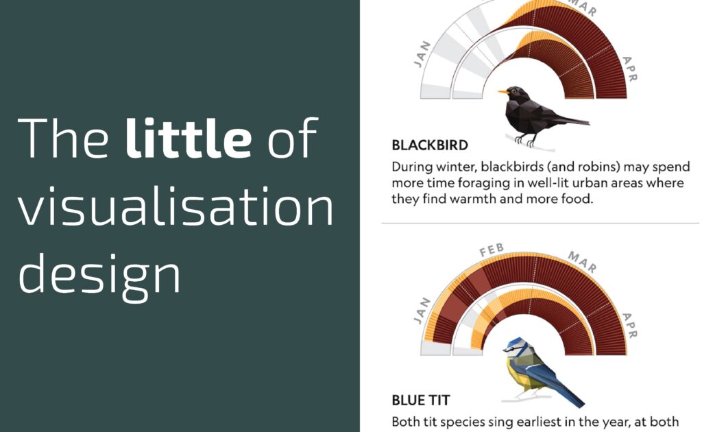
This is part of a series of posts about the ‘little of visualisation design’, respecting the small decisions that make a big difference towards the good and bad of this discipline. In each post I’m going to focus on just one small matter – a singular good or bad design choice – as demonstrated by a sample project. Each project may have many effective and ineffective aspects, but I’m just commenting on one.
The ‘little’ of this next design concerns composition choices that exploit shapes and spaces formed by charts, text and images. The work that demonstrates this idea comes from a National Geographic project titled ‘When the too-early bird sings‘, created by Monica Serrano and Ryan T Williams.
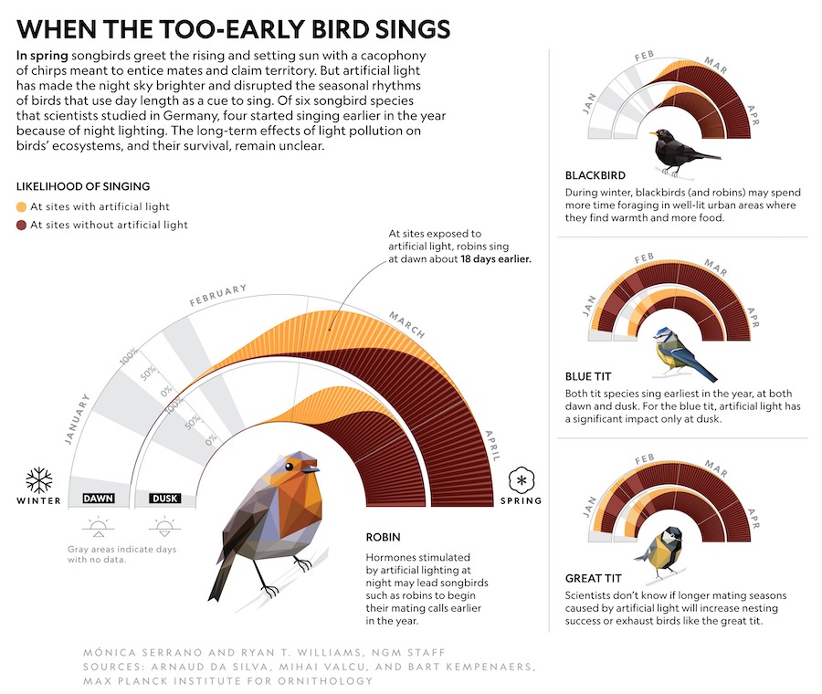
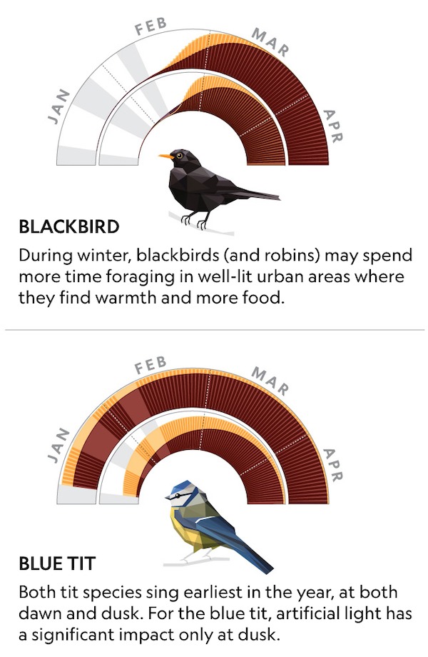
What I like in this piece is how the semi-circular chart layouts create a small shape of emptiness that perfectly accommodates the associated bird images. In the main chart, for the robin, notice how the placement of the dawn/dusk icons and descriptive text continue to create a nice archway-like balance and alignment between all elements. Furthermore, and most noticeable with the smaller graphics down the right-hand column, the layout of the left-aligned bird titles and descriptive text below each chart uses the available space so efficiently preserving harmony with the chart and image above.