
This is part of a series of posts about the ‘little of visualisation design’, respecting the small decisions that make a big difference towards the good and bad of this discipline. In each post I’m going to focus on just one small matter – a singular good or bad design choice – as demonstrated by a sample project. Each project may have many effective and ineffective aspects, but I’m just commenting on one.
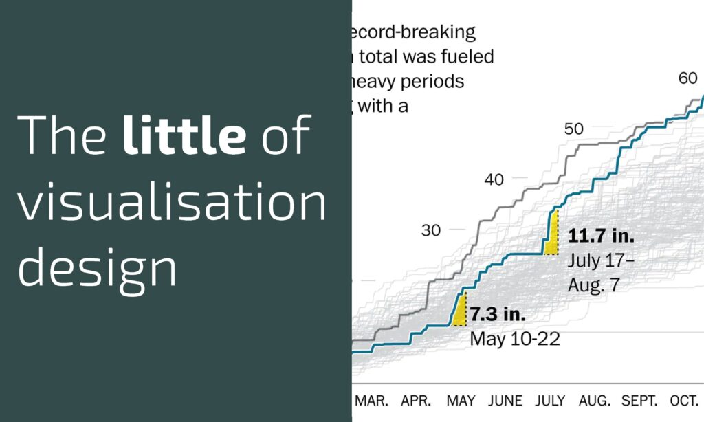
The ‘little’ of this next design concerns the use of coloured annotations to highlight key patterns in a chart’s display. The piece in focus was produced by Tim Meko for the Washington Post in an article ‘Drenched city: 2018 is now Washington’s wettest year ever recorded‘.
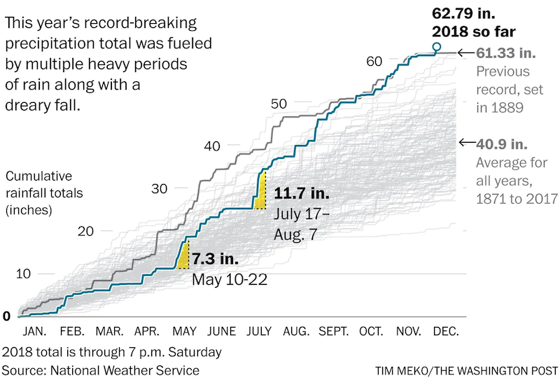
The chart shows patterns of cumulative rainfall in Washington DC with a separate line for each year going back to 1871 when records began. You see the top-most line representing the previous record amount of annual rainfall set in 1889, with 2018 now surpassing that total.
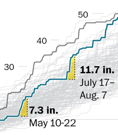
What I particularly liked in this chart were the yellow regions that draw attention to the intense periods of downpours during May and July/August. Sometimes, when you see a line slope you can lose a little orientation about the true magnitude it has grown by. These yellow snapshots emphasise just how much the total has shot up vertically within such a short period of time horizontally.