This is part of a series of posts about the ‘little of visualisation design’, respecting the small decisions that make a big difference towards the good and bad of this discipline. In each post I’m going to focus on just one small matter – a singular good or bad design choice – as demonstrated by a sample project. Each project may have many effective and ineffective aspects, but I’m just commenting on one.
The ‘little’ of this next design concerns the dissonance of seeing a negative value plotted in a way that doesn’t immediately convey negativity. It relates to a chart found in this article published on The Guardian about the demise in sales of DVDs and other products reaching the end of their life, at least in the eye of the retailer John Lewis.
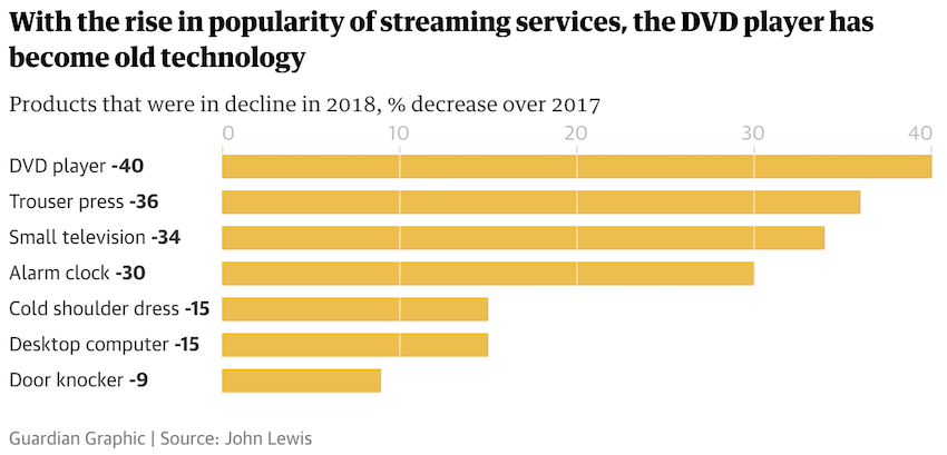
The chart above presents seven products sold by John Lewis that were in significant decline sales wise during 2018, showing their percentage decrease over 2017. The way the chart is presented, with bars going to the right and the axis labels showing positive values, is confusing given the values represented should be negative. Quite simply, I would have reversed the chart, with the labels on the right and negative bars growing to the left along a negative axis.
The Guardian know what they’re doing and this stands out as a blip. In trying to work out what might have led to this, I have a suspicion it might be because of some charting template limitations. The inclusion of the negative value labels in the category headers indicates to me an attempt to rescue things, but its rather too late.
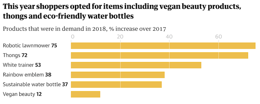
A second chart showing those products that have increased in sales during 2018, compared to 2017, merely compounds the confusion as it presents the (now positive data values) using the same chart design as the first. Though I feel this is the right way to convey this particular data, I might have considered using colour to further differentiate this chart’s positive values from the negative ones in the earlier one.