
To mark each mid-year and end-of-year milestone I take a reflective glance over the previous 6-month period in the data visualisation field and compile a collection of some of the most significant developments. These are the main projects, events, new sites, trends, personalities and general observations that have struck me as being important to help further the development of this field or are things I simply liked a great deal. Here’s the full compilation of all my collections.
Earlier this year I published a collection for the latter 6 months of 2017 and now I’d like to reflect on the first 6 months of 2018. I look forward to hearing from you with suggestions for the developments you believe have been most significant.
And so, as ever, in no particular order…
1. Lauren Tierney
There are many people and organisations doing amazing thematic mapping right now (feels like a golden age?) but I’m singling out Lauren for her relentless stream of outstanding pieces during 2018. I’d been aware of her body of work at National Geographic before her move to join the Washington Post but with the added pressures and varied nature of the news cycle, the spectrum of methods she is demonstrating in her new role is truly showcasing her outstanding talent.
2. ‘Extensive Data Shows Punishing Reach of Racism for Black Boys’

An important social issue portrayed with typical flair by the Times’s graphics team. This article is built around a series of animated simulations visualising data from a study of income inequality that “followed 20 million children in the United States and showed how adult (in their late 30s) incomes varied by race and gender”. As shown in the compelling animations, there are very different pathways available to and apparent glass ceilings for boys and girls of different races. For example, as the study found, “white boys who grow up rich are likely to remain that way, while black boys raised in similarly wealthy households are more likely to fall to the bottom than stay at the top in their own adult households”. Such a magnificent way of illustrating this data and topic that also invites you to custom build your own scenario.
3. Xenographics
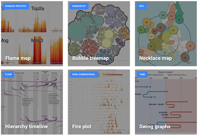
Xeno.graphics is a website created by Maarten Lambrechts offering a collection of “weird but (sometimes) useful charts and maps” to build up a repository of innovative visualisation techniques to inspire and potentially help fringe methods move more into the mainstream. In some cases it is celebrating remarkable ingenuity, on other occasions you have to ask ‘what were they smoking?’ and that’s what makes it a brilliant development that I totally wish I’d thought of.
4. ‘Roger Federer: 20 Jahre, 20 Titel’
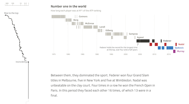
So much to like about this analysis of Roger Federer’s tennis career, designed and developed by the talented team at Schweizer Radio und Fernsehen (SRF). Personal highlights include the sidebar career timeline that doubles up as a story of the shift’s in Federer’s ranking, the seamless integration of photo-imagery, audio clips and video alongside interactive charts and text, the Gantt chart of player’s ranked number 1, and the rotated scatter plot of ‘Matches played vs. matches won’.
5. Datawrapper’s ‘Chartable’ blog
In these round-ups I do try to spread the coverage across different people and places but sometimes it is necessary to include someone or something numerous times. The ‘Chartable‘ blog is primarily (maybe entirely) written by Lisa Rost (her third mention in these posts, 1 and 2) and though it is part of Datawrapper (a second mention), it is about wider topics in this field. The articles cover insightful slices of this subject that cover classic tensions like theory vs. practice in colour usage, reading charts with log scales, and a new initiative to start a book club. Each new piece thoroughly earns the high level of social media engagement and readership achieved.
6. Jonathan Corum’s annotated talks
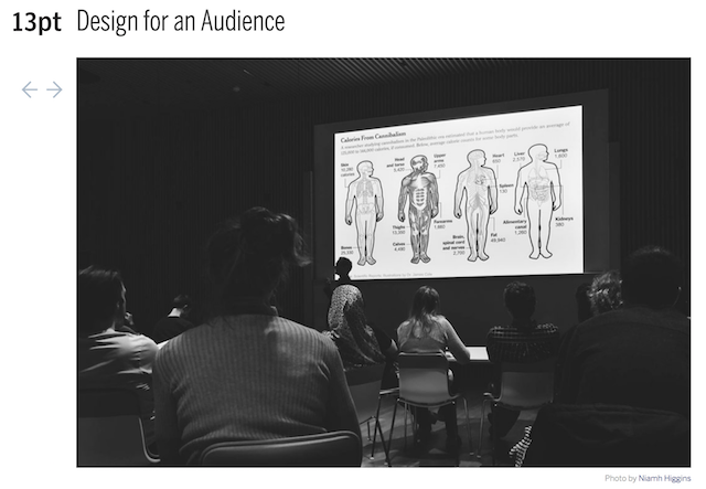
This is also the second occasion on which I’ve included Jonathan’s talks because the care shown and effort taken to share annotated slides and associated speaker notes is just so wonderful, especially when the talks are themselves magnificent. So far this year Jonathan has published two new talks: Revisiting Cybernetic Serendipity and Design for an Audience, each offering the characteristic crystal-clear thinking Jonathan articulates so well and exhibits throughout his own work.
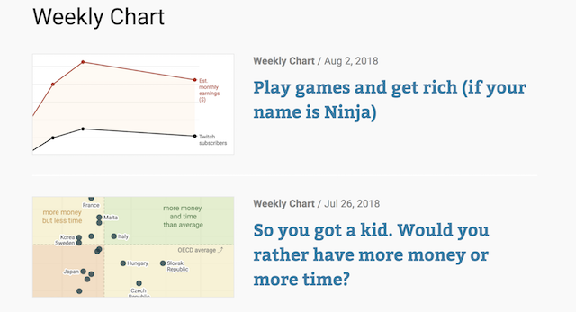
7. Day-Doh Viz
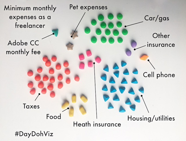
Day-Doh Viz is the focus of Amy Cesal’s involvement in the popular ‘#The100DayProject‘ movement/campaign, encouraging people to actively pursue 100 days of creativity using any medium of choice (or produce 100 creative things). Using Play-Doh as her representation method, Amy is hand-crafting a portfolio of innovative and fun visualisations about matters of finance, personal data and remakes of existing visualisations. From pieces like ‘What Does Play-Doh Smell of?‘ to ‘What happened to women in Computer Science?‘ this is an utterly joyful creative endeavour that is gaining a growing and charmed audience. It’s also a genius name (say ‘day-doh viz’ fast).
8. New tools
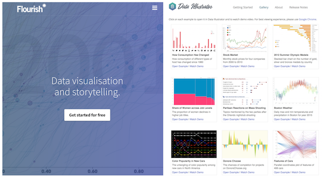
There are always new tools emerging in this field so, in a sense, it’s a bit of a free hit but I do think that Flourish and Data Illustrator represent important developments that have already received positive reaction including from yours truly. Flourish attempts to straddle the most challenging subset of technology in this field – a simple tool to create complex visualisations. As profiled in my previous 6-monthly posting in which I mentioned Adobe’s Project Lincoln, Data Illustrator is effectively the publicly available version of this development (I understand the lineage correctly) offering the means to bind data to the ‘drawing’ capabilities of Illustrator.
9. Atlas of Sustainable Development
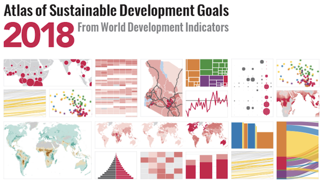
Quite a simple justification for including the ‘Atlas of Sustainable Development‘, it is one of the best examples I’ve seen of a large printed (printable) report embracing a variety of effective and elegant visualisations techniques, in this case to bring analysis of the ’17 Sustainable Development Goals’ to life. The publication was prepared by a team led by Tariq Khokhar and Andrew Whitby and they’ve done a great job in setting something of a benchmark for others to emulate and be inspired by.
10. The Guardian’s ‘Gender Pay Gap’ work
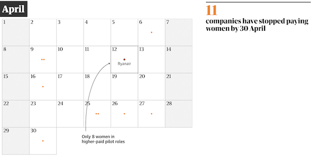
The Guardian have done a few excellent pieces around the issue of gender pay inequality but I’ve selected this one as I found the use of the scrollable calendar device to be a fantastic method for gradually unveiling (and shaming) those company’s with the widest levels of unequal pay.
Special mentions…
Here are the other highlights from the first half of 2018 that deserve a special mention:
‘How Congress Has Dithered as People Get Shot’ | A very close contender for inclusion in the main list, this was a devastatingly clever use of emptiness/nothingness to show how little progress has been made (I loved the initial sense amongst some that there had been a bug causing the data to not load).
‘Ali Wong: Structure of a Stand Up’ | A typically super bespoke piece of novel analysis and visual techniques from The Pudding team of Russell Goldenberg and Matt Daniels.
‘How 2 MTA Decisions Pushed the Subway into Crisis’ | Adam Pearce is one of the best talents in the field right now and this is a brilliant piece of analysis about the huge impact of seemingly small-scale decisions on the NY subway system.
#SWDChallenge | Similar to the popular #MakeoverMonday, Cole launched the #SWDchallenge in January offering a very popular monthly opportunity for a community of participants to have ‘a safe space to try something new: test out a new tool, technique, or approach’.
NYC Buildings | A wonderful 3D exploration of all the 47K buildings in Manhattan developed by Taylor Baldwin, supplemented by this lovely single graphic showing the buildings ordered by height
‘How France And Croatia Made It To The World Cup Final, In One Chart’ | This was one of my favourite pieces produced for the World Cup by Rachael Dottle of FiveThirtyEight, portraying an ever-growing ‘likelihood of progressing/victory’ flowchart of the matches through the competition. Pedants will note it was completed in July (beyond the 6 month scope of this piece), I would respond by stating it originated in June. So there.
‘The History of Infographics’ | Created by RJ Andrews, this is a really nice interactive journey through the key milestones of this field. (Published 2017 but I didn’t come across it until 2018 and, again, I make the rules for this post).