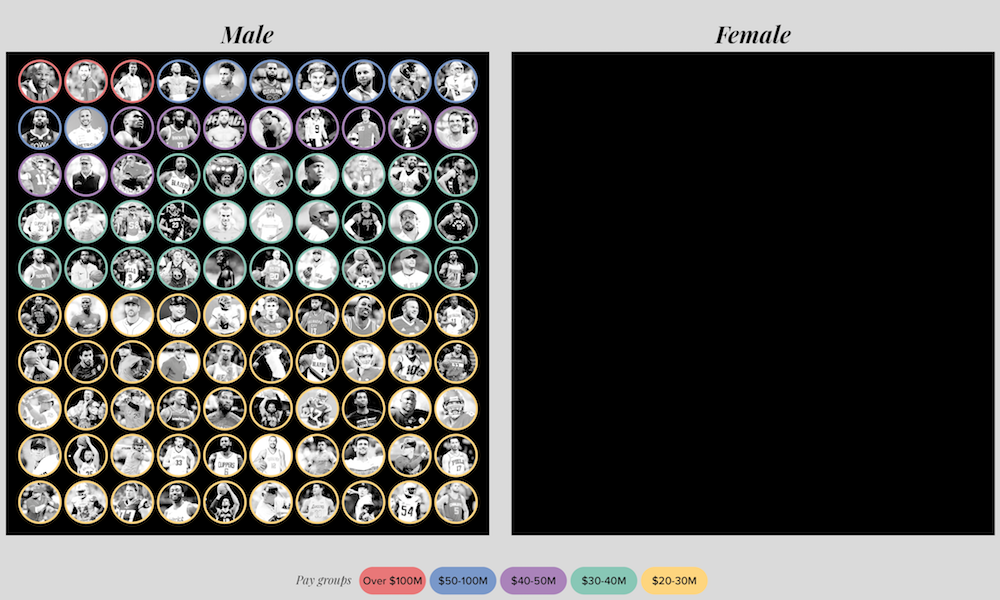
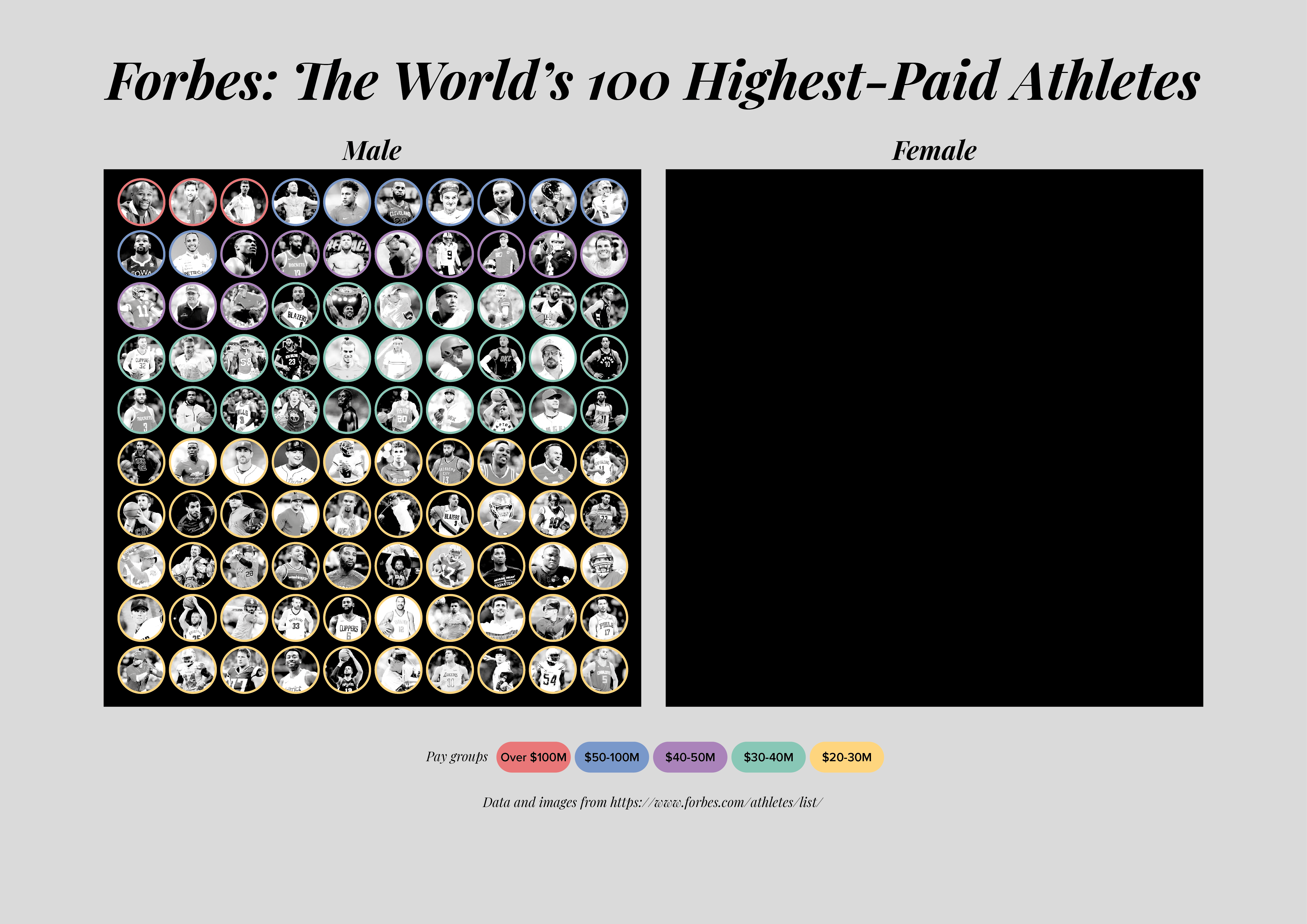
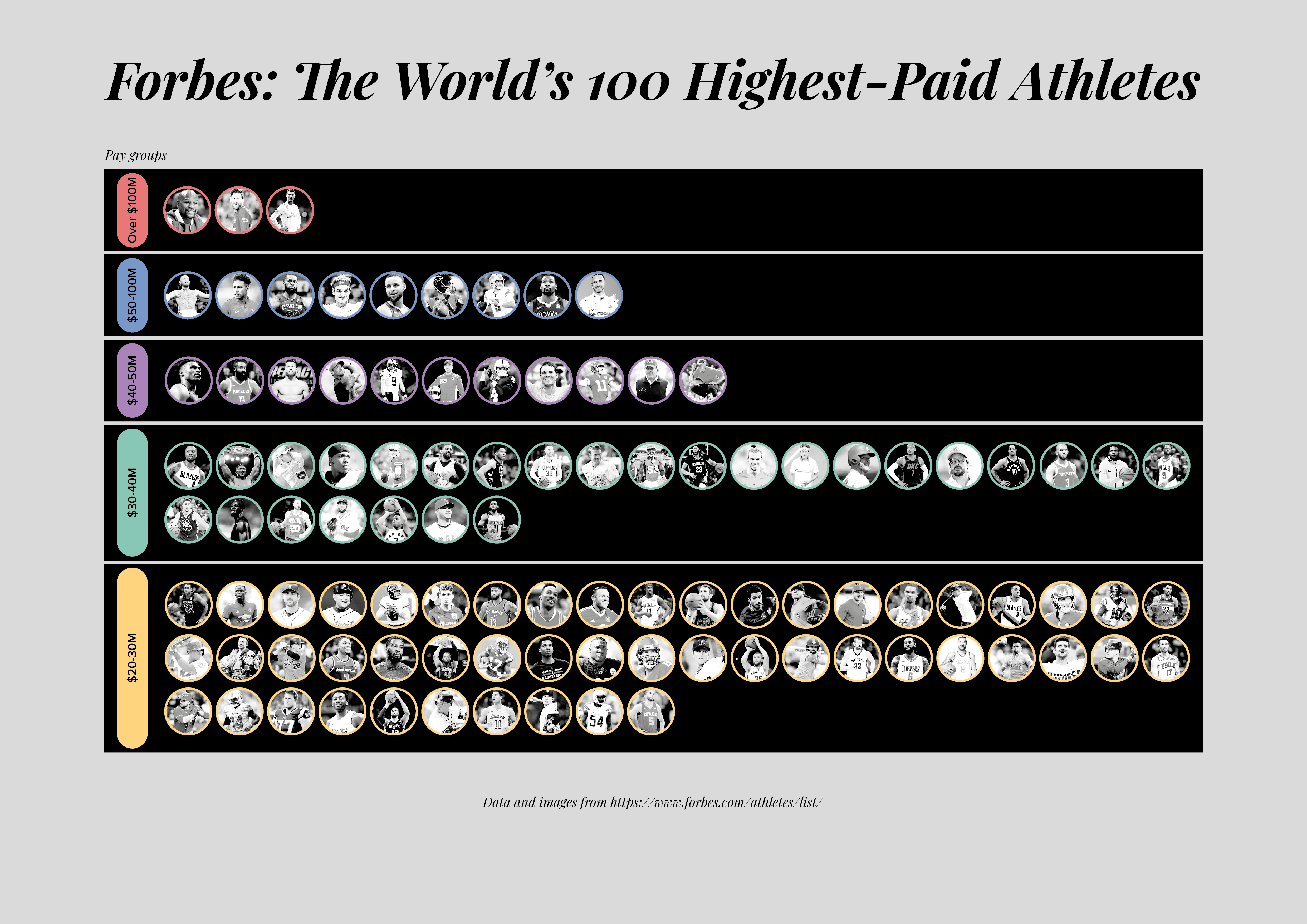
Using the Forbes ‘100 highest paid athletes‘ data, I’ve spent part of the morning work up some basic examples for my teaching materials about the value of containers to house data when it is skewed in different ways.
For example, in this dataset there are 100 male athletes and no women. Giving a home to the nothingness – creating a ‘Female’ container with no contents – helps to show this lack of gender balance representation.
Similarly, by separating out the athletes into distinct bandings, this can be a way to accommodate the outlier earnings, as shown by this simple bar chart.
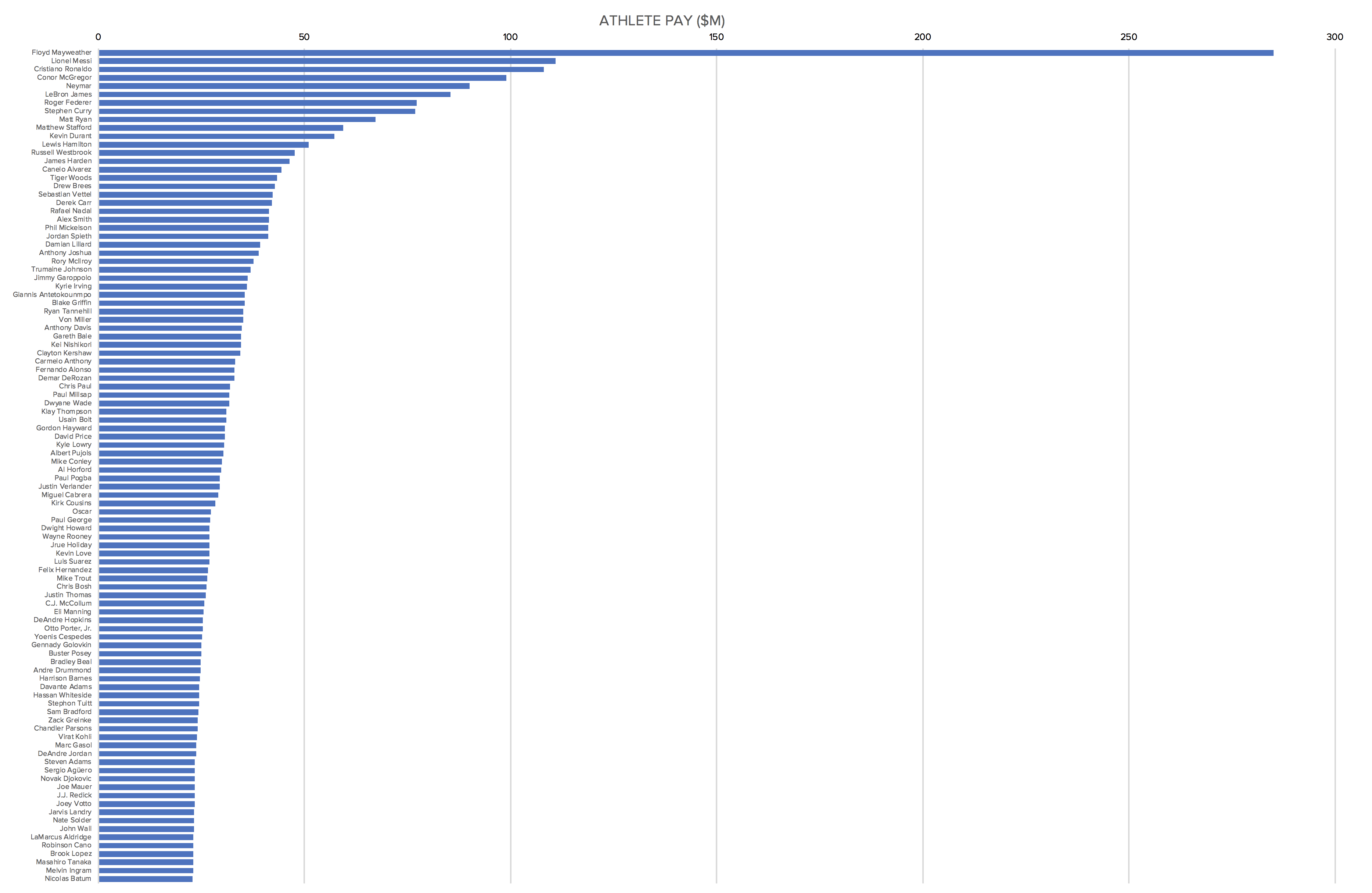
These groups are not organised into equal-interval bandings but the labels help to explain the ranges represented by each.
Here’s a short sequence of images stitched together showing the process of developing the gender graphic in Illustrator.