
This is part of a series of posts about the ‘little of visualisation design’, respecting the small decisions that make a big difference towards the good and bad of this discipline. In each post I’m going to focus on just one small matter – a singular good or bad design choice – as demonstrated by a sample project. Each project may have many effective and ineffective aspects, but I’m just commenting on one.
The ‘little’ of this next design concerns using containers to separate different scaled views of analysis that would otherwise be distorted using a single view. The visualisation in question is from a Washington Post in an article about ‘The Stock Market Decline May Not Be Over Yet‘.
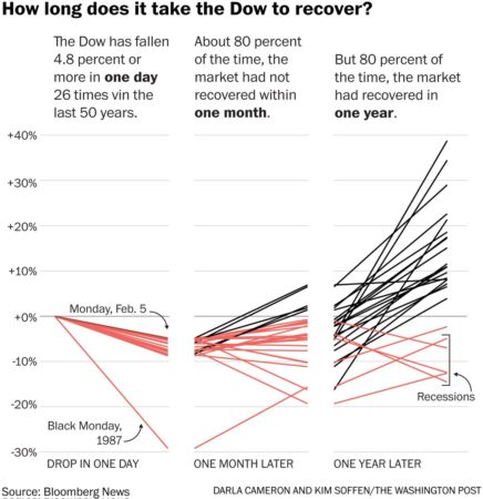
As you see in the graphic, there are three distinct containers using slope graphs to show stories of how the 26 occasions when a daily +4.8% drop in the Dow has occurred. The first view shows these 26 daily drops, the second view shows the status of the price in each case one month later, the final view shows the price one year later.
Rather than trying to somehow squeeze these distinct perspectives into a single chart, each is given separate space to breath. Using separate containers to give a home to these different frames of data is a simple tactic that helps build the narrative and preserve clarity.
