This is part of a series of posts about the ‘little of visualisation design’, respecting the small decisions that make a big difference towards the good and bad of this discipline. In each post I’m going to focus on just one small matter – a singular good or bad design choice – as demonstrated by a sample project. Each project may have many effective and ineffective aspects, but I’m just commenting on one.
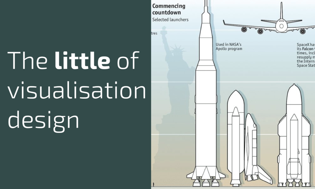
The ‘little’ of this next design concerns the use of visual aids to help establish a sense of scale. The graphic in question is taken from a piece in The Economist titled ‘The Falcon Heavy’s successful flight is another vindication for Elon Musk‘. For those without a subscription, you can see the image posted on the Head of Graphics, Phil Kenny’s, timeline.
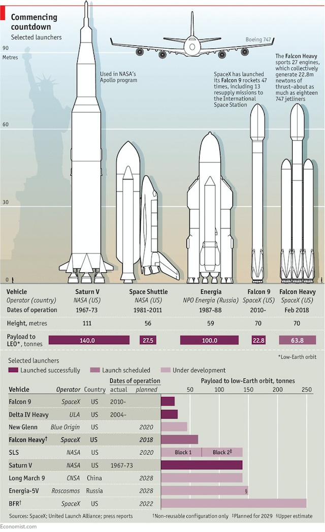
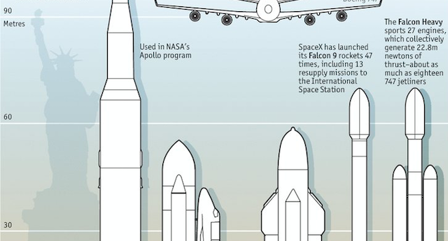
This graphic illustrates a selection of launchers (from NASA, NPO Energia and SpaceX), in light of the successful Falcon Heavy launch, to provide comparisons of size, payload and periods of operation. What I like about this piece is the subtle inclusion of the Statue of Liberty silhouette in the empty background space on the left of the illustrations. This helps provide the reader with some extra sense of scale to appreciate the size of the rockets displayed in the chart, supplementing the units of size plotted on the y-axis.
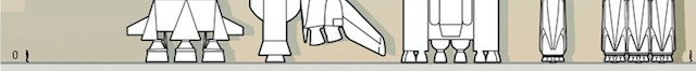
That isn’t the only useful visual comparison, as Kristine Briones astutely observed – right at the base of the chart you will find tiny human figures to the far left and far right of the x-axis. Lovely work by The Economist’s graphics team.