This is part of a series of posts about the ‘little of visualisation design’, respecting the small decisions that make a big difference towards the good and bad of this discipline. In each post I’m going to focus on just one small matter – a singular good or bad design choice – as demonstrated by a sample project. Each project may have many effective and ineffective aspects, but I’m just commenting on one.
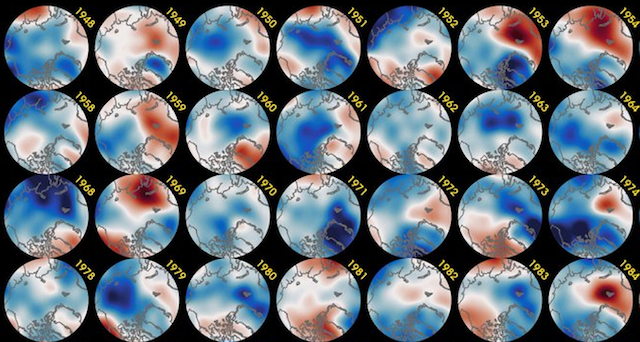
The ‘little’ of this next design concerns the creative placement of chart labels across a panel of small multiples. The piece in question comes from Zachary Labe looking at the last 70-years of autumn temperature anomalies in the Arctic.
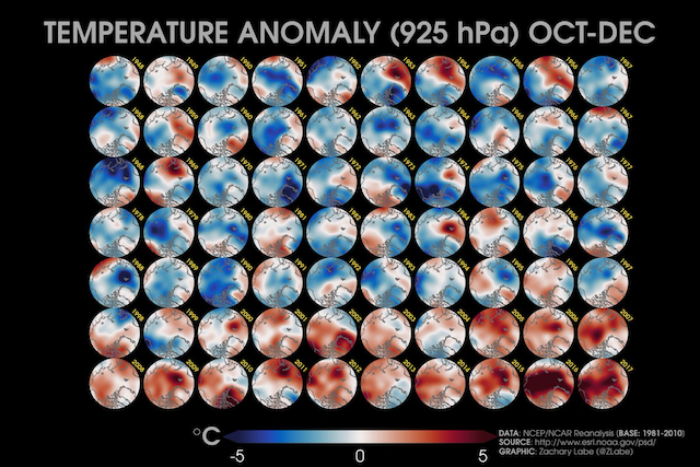
One of the features I really liked about this piece is the clever way Zachary incorporated the chart labels for each yearly slice. Rather than positioning the year centrally aligned above the circular panels, which might be the default approach, he astutely slotted them in the vacant space just above and to the right of each circle and slightly rotated at a 45° angle. Their adjacency is preserved but, crucially, the overall grid layout is nicely compacted with no wasted empty space required to accommodate the seven rows of labels.