

Almost one month ago I tweeted* my contempt for radial bar charts, having come across a particularly egregious case. It seemed to gain a bit of traction on social media but was also met by genuine queries as to my reasoning for this disdain**.

In response, I compiled a quick illustration to visually explain the distortion at play when you decoratively stretch bars into arc lengths. As this was buried in a passing tweet, I have belatedly decided it was worth committing to a blog post, as much for my own reference for illustrating this point in the future.

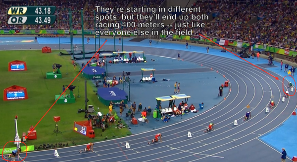
If you are still confused, think about why athletes in the 200m or 400m races start from staggered positions. This photo from SB Nation, shows how athletes starting in different lanes will have a much longer circumference to run around if placed on the outside lane compared to the inside, unless the starting positions are adjusted.
* I was particularly happy with myself for inventing, in this tweet, the new description of this type of chart as the B’arc Chart. Work wise, this was one of my strongest contributions during the month of August.
** It is also worth checking this post from Alberto Cairo about a deeper discussion around the same general issues, this time about a chart plotting duration on a radial timeline.