
This is part of a series of posts about the ‘little of visualisation design’, respecting the small decisions that make a big difference towards the good and bad of this discipline. In each post I’m going to focus on just one small matter – a singular good or bad design choice – as demonstrated by a sample project. Each project may have many effective and ineffective aspects, but I’m just commenting on one.
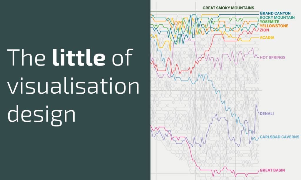
The ‘little’ of this next design concerns z-sorting and how you manage the depth-arrangement of overlapping value series. The chart in question comes from an article by FiveThirtyEight titled ‘The National Parks Have Never Been More Popular‘.
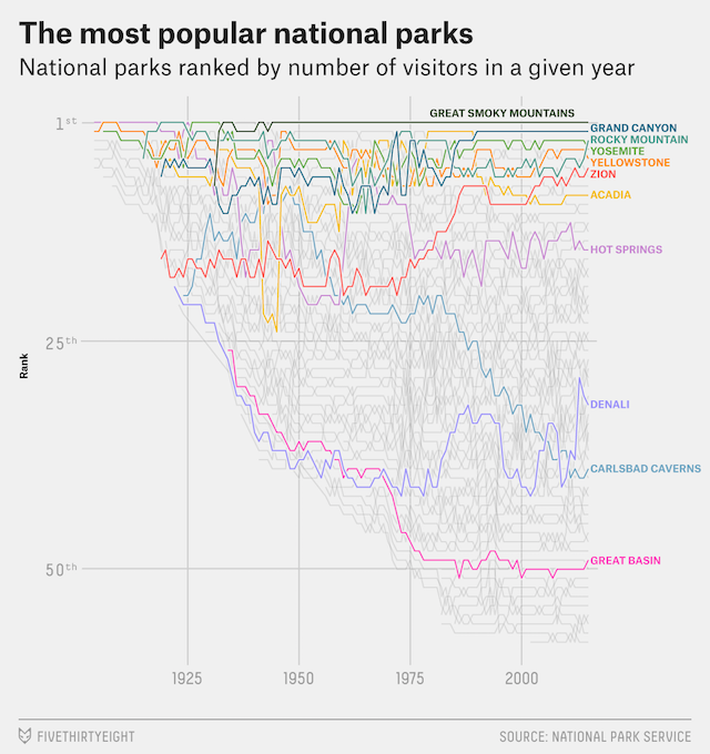
The bump chart plots the relative popularity, in ranking terms, of the US national parks going back over 100 years. With an increasing range of recognised parks and, one must assume, an ever-expanding register of visitor data, there is a lot to plot in one chart and a risk of creating lots of noise and limited signal.
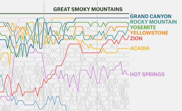
Three key things happen here. Firstly, only 11 of the parks are coloured, creating editorial emphasis versus all the other categorical series, which are included but presented in grey and without labels. Secondly, you will see there is a white outer-stroke wrapped around the coloured lines to help them pop-out a little further. Thirdly, and the main thrust of this post, is the decision to apply z-sorting on the coloured lines whereby the most recent rankings influences the overlapping order when lines meet back through the timeline. So, for example, The Great Smoky Mountains line is always on top, the Grand Canyon will then be on top of all other lines apart from the Great Smoky Mountains etc.