
This is part of a series of posts about the ‘little of visualisation design’, respecting the small decisions that make a big difference towards the good and bad of this discipline. In each post I’m going to focus on just one small matter – a singular good or bad design choice – as demonstrated by a sample project. Each project may have many effective and ineffective aspects, but I’m just commenting on one.
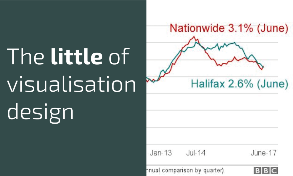
The ‘little’ of this next design continues the theme raised in the previous #LittleVis posting where I discussed reducing unnecessary thinking. The specific example here comes from a chart published by the BBC in this article about the slowing of the UK housing market.
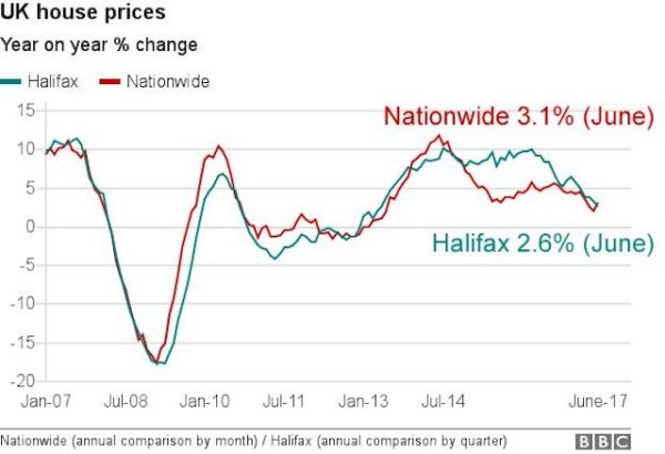
The line chart shows the upwards and downwards trends of two house price trackers changing over time, simple enough stuff until you glance at the x-axis labelling at which point it is quite easy to becoming confused about judging the ‘when’.
You might expect that with the most recent value being a June figure for 2017 that the axis label intervals would follow maybe an annual cycle for each June going back a few years. Instead, there’s a real mismatch going on. Firstly, the majority of the labels follow an 18-month interval, which feels incongruent with the year-on-year values plotted. Secondly, these 18-month intervals are pivoted around the months of July and January. Thirdly, there is missing interval label which leaves a strange 35 month gap between the final and penultimate label.
Chart apparatus like this should assist not hinder. Annotation is arguably the least technical design matter to handle, just being guided by common sense can often be a good enough indicator of what the best choices should be.