
This is the latest in a series of short articles titled ‘six questions with…’. The purpose of this growing collection of interviews is to provide a conveniently sized platform to offer perspectives about data visualisation-related topics from professionals within, around or outside of the field, spanning different industries, backgrounds, roles and standpoints. The first ‘series’ of interviews emerged primarily from research on my book, whereas this new series is much more open in scope so I will be accessing perhaps a more varied set of voices.
This latest interview is with John F. Gray. Based in Vancouver, BC, John was a freelance writer and a former West Coast editor of @BetaKit and is the co-founder of Mentionmapp.
Q1 | What was your entry point into the field: From what education/career background did you transition into the world of data visualisation/infographics?
A1 | Trace it back to my “bookwormish” childhood. Our family had limited television programming access with the rabbit ears often being deaf to the airwaves. National Geographic was my window on the world and universe (still is today). The photography and of course infographics & maps always left me with a sense of awe.
Professionally, it was meeting Niel McLaren in 2009. The journey traversed business mentorship, to friendship, to us eventually working together. He’d developed his own proprietary dataviz application, and was doing some great personal projects including the first version of Mentionmapp; and custom client work. By 2010, along with my current co-founder (Travis) they were working on custom dataviz projects for clients and I was managing the business.
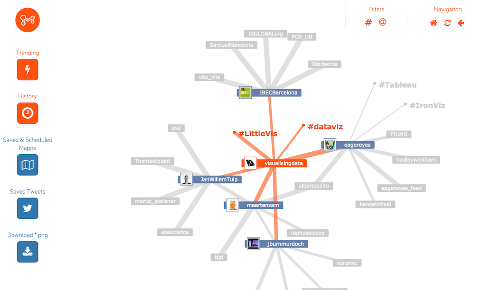
I have to include Manuel Lima’s Visualizing Complexity (Mentionmapp is on page 153); and of course you Andy *, @visualisingdata was one of the first Twitter profiles we started following, and have always found it a treasure trove of thought leadership.
Fair to say it just happened. There was no intent to call data visualization a career. The way it worked out, I couldn’t be happier to have fallen into something to care so much about.
Q2 | We are all influenced by different principles, formed through our education, experience and/or exposure to others in the field – if you had to pick one guiding principle that is uppermost in your thoughts when working on a visualisation what would it be?
A2 | It’s never easy picking just one… I’m guided by a combination of curiosity about the world in general, and having a meaningful consideration of our human condition. It’s a process of grappling with the tensions between what we know versus what we don’t know; and what we see versus what we don’t see.
I think this Edward Tufte quote nails it – The commonality between science and art is in trying to see profoundly – to develop strategies of seeing and showing.
Q3 | What is the single best piece of advice you have been given, have heard or have formed yourself that you would be keen to pass on to someone getting started in a data visualisation-related discipline?
A3 | Be intellectually honest. Take care in thinking about how you approach the data, and the questions you’re asking. It’s not being about what you want the data to tell you, and simply being an exercise in confirming your own bias.
Q4 | In your view, what is the problem, curiosity or need that draws somebody to use Mentionmapp: Give me your USP or elevator pitch?
A4 | I look at Twitter, Hootsuite and Tweetdeck and see the same thing… a linear feed of information. The problem is that we’re not really wired as linear thinkers. Our relation with time and space isn’t linear. Mentionmapp’s presenting a non-linear worldview of Twitter. We’re unfolding a network knowledge, ideas, opinions and conversations as they really are; something that’s fluid, dynamic and organic. I also don’t think software can replace our curiosity. And it’s curiosity that leads to serendipitous moments which in turn is the spark of creativity and innovation.
There’s so much happening on Twitter right now. It’s like the 5000 channel universe without syndication or re-runs, or the old AP Wire service (on steroids) typing out stories in the pre-internet newsrooms. It so easy to blink and miss something, plus it’s still hard to find unique and interesting voices. Mentionmapp’s helping people visually explore the network to discover new connections and conversations. We’re also providing new tools to archive and create reports for this visual conversation layer, in ways that spreadsheets, pie charts, and bar graphs can’t.
Ask the question – “what can I learn from seeing the world through a different lens?” I hope Mentionmapp’s a lens that will help people see social conversations differently. Maybe they’ll feel challenged into asking a few never before asked questions of the world around them.
Q5 | What has been the best demonstration of the tool’s value – things you have created yourself and things you have seen others use it for?
A5 | I’ve seen such a diversity of use cases, it’s one of the reasons I enjoy doing this so much. But, spotting this project was a Wow moment for sure (translated) “It works a botnet on Twitter designed to promote a means” splicing multiple maps together like this and tracing out a network of spam is impressive and valuable.
However, being included in this presentation at the International Journalism Festival is a significant highlight. First Draft News offers this great summary: 4 verification case studies from #IJF16
Q6 | I know you are a keen learner as both participant and witness to the evolution and growth of the data visualisation field. What are the biggest changes you have seen over the past few years? What are your hopes or expectations for where it goes next?
A6 | I remember our frustrations trying to redevelop Mentionmapp from Flash to HTML is early 2011. It didn’t go too well. We couldn’t acheive the spring physics and that organic flow we wanted. As the non-technical guy, today I look at D3 with wonder for instance. But trying imagine how new interfaces of the future will change how we see and interact with data. I close my eyes and see scenes from Minority Reports or Iron Man and think that the gap between science fiction and science fact isn’t a massive chasm. And, considering how VR & AR technologies will impact how we present information is a conversation we need to be having now. Beyond the technology and the tools, (which are only as good as the craftsperson using them) it’ll always keep coming back to crafting compelling narratives; the big aim is being able to transcend theory and talk into action.
Header image taken from a screenshot of my Mentionmapp account.
(* Let me assure you that John stated that without any form of coercion or remuneration!)