This is part of a series of posts about the ‘little of visualisation design’, respecting the small decisions that make a big difference towards the good and bad of this discipline. In each post I’m going to focus on just one small matter – a singular good or bad design choice – as demonstrated by a sample project. Each project may have many effective and ineffective aspects, but I’m just commenting on one.
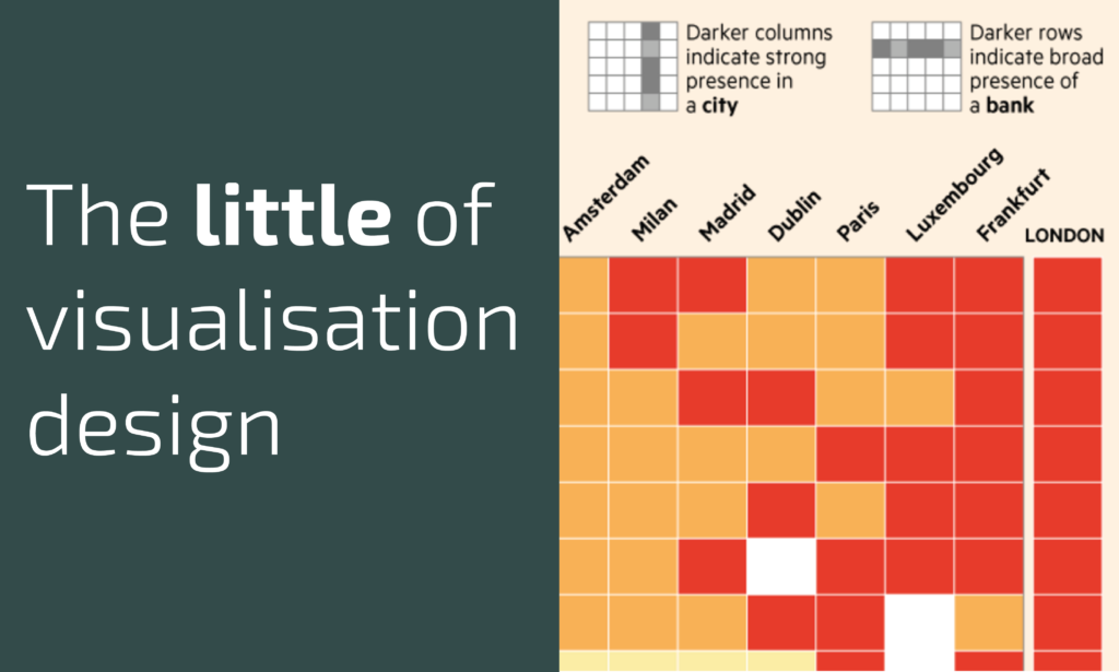
The ‘little’ of this next design concerns the use of reading guides to help the reader understand how to interpret the meaning of a heatmap display. The project in focus here was produced by the Financial Times and from an article titled ‘Frankfurt vies for UK banking jobs post-Brexit‘ and shows analysis of the presence of different banks across a range of major European cities.
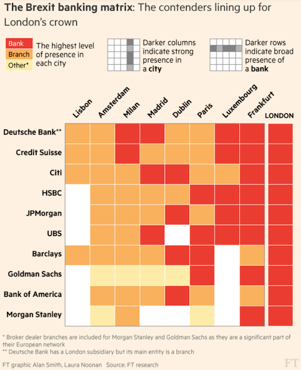
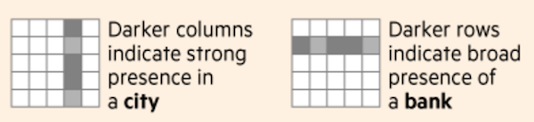
To some readers, the task of parsing meaning through the colours at the intersection of two categorical variables can be a little tricky. Knowing this, the creators include a small guide above the chart (and therefore, through its placement, intended to be seen before reading) that quickly indicates the interpretation to draw from seeing specific patterns down each column and across each row.