
Hmmm, you’re thinking, this post title smacks of cynical click bait? “You won’t believe the ways people are interacting with static visualisations!” was the first option but I eventually toned it down. Anyway, as the title suggests, this is a small collection of five six seven innovative ways that I’ve seen applied to make static, non-digital visualisations become ‘interactive’ in different ways. I’d love to see other examples you might have seen too.
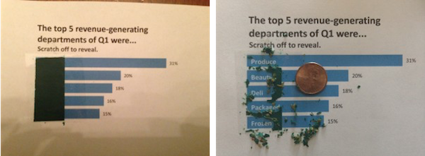
1. SCRATCH OFF GRAPHS
Developed by Stephanie Evergreen, these charts are printed on thick paper or card and then the category value labels are painted over using a scratch-off paint mix. This allows them to then be scratched off using a coin perhaps as the big reveal associated with asking people to guess the values associated with each bar.
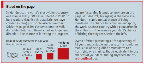
2. THROWING A DART
A well-known piece by the Economist, this printable sheets uses the likelihood of a thrown dart landing in different red regions to represent the statistic of the likelihood of being murdered in different countries during a given year.
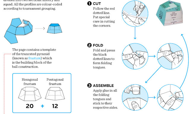
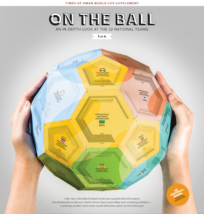
3. ASSEMBLABLE 3D STATISTICAL BALL
From the Times of Oman, this frankly incredible concept involves 32 international football team profiles that are printable, foldable and assemblable as truncated pyramids that collectively create the form a ball but individually display statistics about world cup performances that can be paired with other countries to facilitate comparison. It deservedly jointly-won the ‘best in show‘ award at the 2015 Malofiej awards.
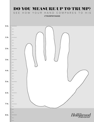
4. PRINTED, LIFE-SIZED COMPARATOR
Produced by the Hollywood Reporter, this is a printable, life-sized outline of Donald Trump’s hand so you can overlay your own hand to measure up against the orange one’s apparently tiny paws.
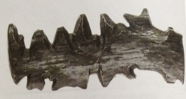
5. TACTILE WOOD MAP
I profiled these in a post from 2013 but worth including in this collection. The Inuit wood maps provide(d) a hand-held tactile mapped representation of the relief of the coastline of Greenland, allowing the Inuit to appreciate and identify the contours, islands and glaciers (etc.) of the coastline.
6. DIY DATA COLOURING BOOK
Created by Chelsea Carlson, motivated by the sense of the US election debates causing people to stress out, this project allows you to download a colouring ‘book’ of three different data visualiation templates for you to record your data feelings as while you watch the debate.
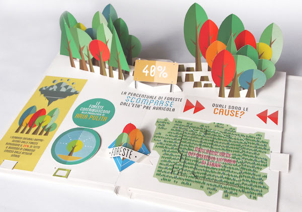
7. POP-UP INFOGRAPHICS
Created by Elena Turtas, this project about ‘The Four Books of Visualising Sustainability’ covers important data relating to subjects like global warming, emissions, resources, forests, water, energy, food via the form of pop-up infographics that leap from the flat of the page, offering different interactive mechanics to play and customise the experience.
It goes beyond just being interactive non-digitals but here’s a super collection of (currently 256) physical visualisations.