
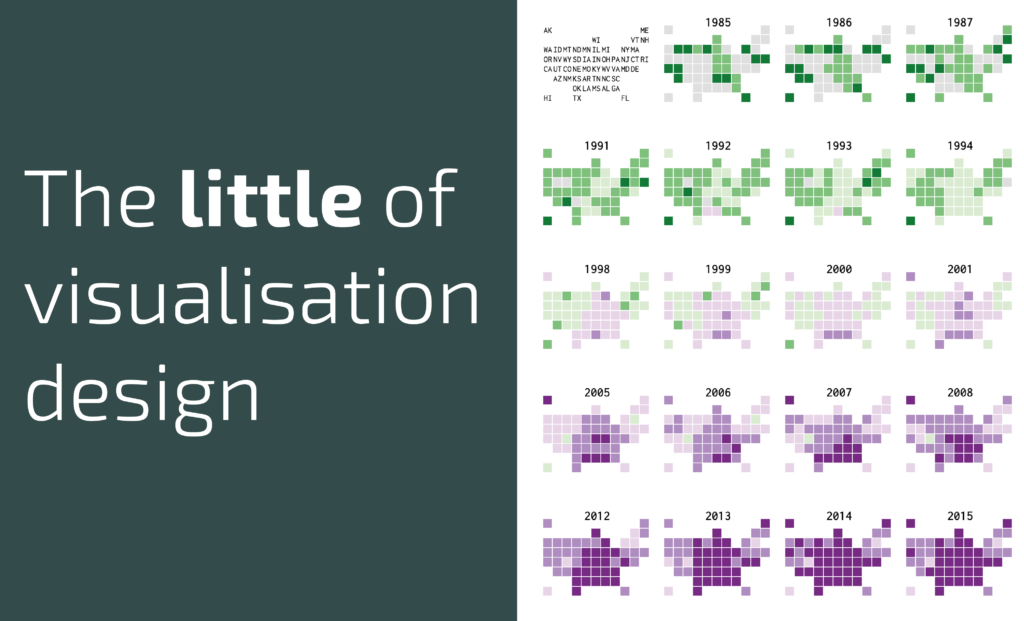
This is part of a series of posts about the ‘little of visualisation design’, respecting the small decisions that make a big difference towards the good and bad of this discipline. In each post I’m going to focus on just one small matter – a singular good or bad design choice – as demonstrated by a sample project. Each project may have many effective and ineffective aspects, but I’m just commenting on one.
The ‘little’ of this next design concerns small-multiple grid maps and a neat way of providing a state legend. The project in focus here was produced by Nathan Yau and maps the spread of obesity across the US over the past 30 years.
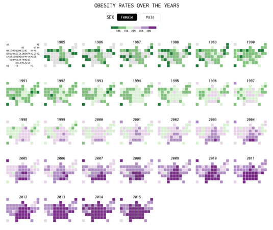
As you can see, in the top left there is a reference guide that explains which grid cell relates to which state. With any grid map there will always be some degree of state position/neighbour compromise so this helps the reader to immediately (being the first thing you logically see) orientate themselves before they then move through the sequence of yearly patterns.
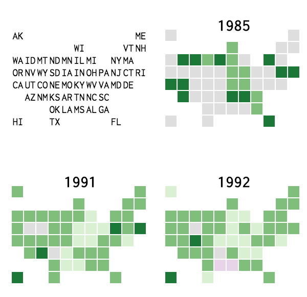
This feels a far less repetitive solution and not as visually intrusive as it would be to include the 2-digit state labels in each map and in cell. I can imagine Nathan toyed with the idea of having cell borders around each state label but I like that he didn’t do this – it is sufficiently legible through just relying on white space.