This is part of a series of posts about the ‘little of visualisation design’, respecting the small decisions that make a big difference towards the good and bad of this discipline. In each post I’m going to focus on just one small matter – a singular good or bad design choice – as demonstrated by a sample project. Each project may have many effective and ineffective aspects, but I’m just commenting on one.
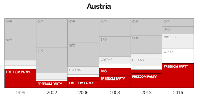
The ‘little’ of this next design concerns the use of colour to emphasise the primary editorial focus of a display rather than to represent different categorical associations. The analysis titled ‘How Far Is Europe Swinging to the Right?‘, by the New York Times, offers a political-persuasion breakdown of the voting patterns across the six most recent national elections for a selection of 20 European countries.
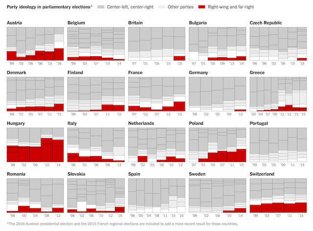
Typically, in most countries, each political party would have some established association with a given colour. Had this analysis being displayed using the party categorical colours then you would see a rather overwhelming technicolor extravaganza but a project that was editorially flat. However, the focus of this analysis is on the emergence of ‘right-wing populist and far-right parties’ and so colour (red) is only used to emphasise the constituent party stacks that are affiliated with the hard right. The categorical sorting of the stacks within further aids the sense of editorial orientation for the reader.