
In order to sprinkle some star dust into the contents of my book I’ve been doing a few interviews with various professionals from data visualisation and related fields. These people span the spectrum of industries, backgrounds, roles and perspectives. I gave each interviewee a selection of questions from which to choose six to respond. This latest interview is with Kim Rees, co-founder of Periscopic, a studio doing good with data based in Portland, OR. Thank you, Kim!
Q1 | What was your entry point into the field: From what education/career background did you transition into the world of data visualisation/infographics?
A1 | I have a Computer Science degree and had a strong focus on math and data. I was doing backend internet programming when I stumbled across data visualization and immediately fell in love.
Q2 | When you begin working on a visualisation task/project, typically, what is the first thing you do?
A2 | Data inspires me. I always open the data in its native format (e.g., Excel, RDBMS, etc.) and look at the raw data just to get a lay of the land. It’s much like looking at a map to begin a journey.
Q3 | How do you mitigate the risk of drifting towards content creep (eg. trying to include more dimensions of a story or analysis than is necessary) and/or feature creep (eg. too many functions of interactivity)?
A3 | We are extremely diligent about documenting everything at the start: features, interactivity, level of detail, etc. We’re in constant communication with the client to make sure they understand exactly what they’re getting. If we’re all in agreement, we have a very clear line that we can guard against creep.
Q4 | If you had the time and resources (perhaps more skills, new tools) to revisit one project from your past and make improvements to certain features, which project would it be and what would you change?
A4 | Our very first project was an internal one that dealt with sexual assault. We were extremely unskilled at that time. I would love to go back and do that issue justice; it’s a hidden tragedy that I would love to bring to light.
Q5 | As you will fully appreciate, the process of gathering, familiarising with, and preparing data in any visualisation/infographic design task is often a sizeable but somewhat hidden burden – a task that can occupy so much time and effort but is perhaps ultimately invisible to the ultimate viewer. Obviously, pressures during this stage can come in the shape of limited timescales, data that doesn’t quite reveal what you expected and/or substantial data that offers almost too many possibilities. Have you got any stand out pieces of practical advice to share about your practices at this stage?
A5 | Adopt as many tools as possible and become an EXPERT in them! I can’t emphasise this enough. There are many tools that will do a great deal of work for you. You just have to find them and exploit them. Yes, even Excel.
Q6 | As somebody who works with and coordinates a team of people who are likely to be juggling multiple projects at anyone time, it probably goes without saying that Project Management will be an important activity. Can you share some practical advice about how you integrate project management thinking across what is (in a large part) a creative discipline?
A6 | Great management means clearing a path. The goal of the PM is to create the optimal stage for people to do their work. This usually means keeping clients at bay, limiting meetings, distilling only the relevant information for each person.
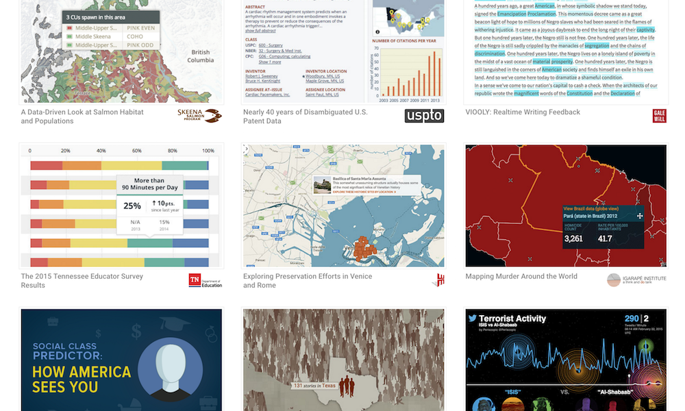
Header image taken from Periscopic’s extensive gallery of previous work.
