
In order to sprinkle some star dust into the contents of my book I’ve been doing a few interviews with various professionals from data visualisation and related fields. These people span the spectrum of industries, backgrounds, roles and perspectives. I gave each interviewee a selection of questions from which to choose six to respond. This latest interview is with Kate McLean, Smellscape Mapper and Senior Lecturer in Graphic Design. Thank you, Kate!
Q1 | What was your entry point into the field: From what education/career background did you transition into the world of data visualisation/infographics
A1 | I entered the field of data visualisation via an MFA in Graphic Design at Edinburgh College of Art. The exploratory and research-orientation of the course meant I followed a personal interest in mapping and combined it with sensory perception, deconstructing the human understanding of place in five separate sensory modalities and then seeking ways to share them through multi-sensory creations. I never thought of my work as being either infographic or data visualisation which are occularcentric, but rather to expand the graphic design field into a realm of multi-sensory experiential design. Design that you can touch and smell and taste as well as see and hear is the future of communication.
Q2 | When you begin working on a visualisation task/project, typically, what is the first thing you do?
A2 | Absorb the data. Read it, re-read it, read it backwards and understand the lyrical and human-centred contribution. Smell data, as I collect it, is different to standard raw data, mine has a human and subjective connection and demands immersion that results in empathy.
Q3 | We are all influenced by different principles, formed through our education, experience and/or exposure to others in the field – if you had to pick one guiding principle that is uppermost in your thoughts as you work on a visualisation or infographic, what would it be?
A3 | “A designer knows he (sic) has achieved perfection not when there is nothing left to add, bit when there is nothing left to take away.” – Antoine de Saint-Exupéry
Q4 | At the start of a process we are often consumed by different ideas and mental concepts about what this project ‘could’ look like. How do you maintain the discipline to recognise when a concept is not fit for purpose (for the data or analysis you are ultimately pursuing)?
A4 | By using other people as a sounding board. We can kid ourselves that we are successful in what we “want” to achieve, but ultimately an external and critical audience is essential. Feedback comes in many forms; I seek it, listen to it, sniff it, touch it, taste it and respond.
Q5 | As somebody who has experience in educating others in a design-related discipline, what are your observations about what attributes separate the successful delegates from the rest of the pack and/or the organisations most ready to successfully adopting your teaching?
A5 | What separates successful designers from the remainder of the pack are the combined attributes of “curiosity, experimentation, lateral thinking and a willingness to embrace failure.
Q6 | For many the judgment about suitable typography is purely based on instinct, maybe typefaces they like the look of and/or typefaces they have seen used elsewhere. There is clearly more to it and more depth to the thinking required. What would be your top tips to a beginner in data visualisation/infographic design facing up to the decisions about typography?
A6 | Whatever decision you make about any aspect of a visualisation / infographic design always be prepared to answer the question “why” – have a reason for every choice that you make. If you can justify it then you should use it.
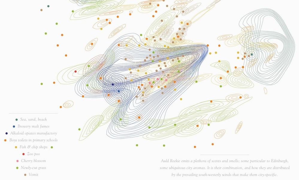
Header image taken from Kate’s classic work on the smell map of Edinburgh, ‘Auld Reekie‘.