
In order to sprinkle some star dust into the contents of my book I’ve been doing a few interviews with various professionals from data visualisation and related fields. These people span the spectrum of industries, backgrounds, roles and perspectives. I gave each interviewee a selection of questions from which to choose six to respond. This latest interview is with Lena Groeger, science journalist, designer and developer at ProPublica. Thank you, Lena!
Q1 | What was your entry point into the field: From what education/career background did you transition into the world of data visualisation/infographics?
A1 | I’ve been interested in graphic design since I was pretty young (as a kid I would spend hours fiddling around in Photoshop). But even though I took some design classes in high school and worked a few summers at a local design firm, graphic design was always, in my mind, a hobby. It wasn’t until after college (where I studied philosophy and biology) that I turned my obsession with Photoshop into a full time job and worked as a graphic designer for a university health education department. That got me interested in science and health communication, so I decided to study science journalism at New York University. There I stumbled upon data journalism and information graphics, and after graduating in 2011 I got an internship at ProPublica, where I transitioned from mostly writing words to mostly writing code. I’ve been on the ProPublica news apps team ever since, building interactive graphics and new applications.
Q2 | What is the single best piece of advice you have been given, have heard or have formed yourself that you would be keen to pass on to someone getting started in a data visualisation/infographics-related discipline?
A2 | You learn through projects, not tutorials. Pick a project, then learn the tools you need to complete it. A common question I hear about learning to code or get started in data visualization is “What language/tools/software should I learn?” The answer to that question is always “What are you trying to do?” Depending on the specific thing you want to do (analyze a data set? create a bar chart? scrape a website?), the tools and languages and programs will change. So I think it’s super important to remember that the project determines the tools, and it’s also how you learn. One more piece of advice: even if you feel stuck and frustrated, if you struggle for hours and feel like you’re not making progress, don’t worry: YOU ARE LEARNING. Take a look at Make It Stick: The Science of Successful Learning if you want evidence that the best way to learn is through the repeated struggle to solve problems by ourselves.
Q3 | We are all influenced by different principles, formed through our education, experience and/or exposure to others in the field – if you had to pick one guiding principle that is uppermost in your thoughts as you work on a visualisation or infographic, what would it be?
A3 | Try to always do something specific and unique to the data you are working with. Ask the question: What is something that could ONLY be done with this information? Let the answer guide you. Many of my favorite and most fulfilling projects have been exploiting the uniqueness of the data to do something no one has done before.
Q4 | What advice would you give to anyone working under pressure of timescales: What are the compromises you are willing to make vs. those you are not? How do you juggle an ambition to innovate within the constraints you face?
A4 | Admit that nothing you create on a deadline will be perfect. However, it should never be wrong. I try to work by a motto my editor likes to say: No Heroics. Your code may not be beautiful, but if it works, it’s good enough. A visualization may not have every feature you could possibly want, but if it gets the message across and is useful to people, it’s good enough. Being “good enough” is not an insult in journalism – it’s a necessity.
Q5 | We often hear how important ‘designing for an audience’ is but this is often easier said than done. How do you integrate this perspective of thinking into your own workflow? Do you have advice on any effective approach(es) you use for this?
A5 | I tend to try to imagine one person – my cousin, a college buddy, a neighbor – and try to design/write/produce something as if I were creating it for him or her. Having one person in mind helps eliminate jargon, reduce complexities, simplify complicated steps, and helps get me focused on emphasizing what is useful about this thing I’m making. It’s often better to imagine one person rather than the completely generic and all-encompassing “users,” whatever that means. Note: it’s important that this person NOT be a fellow journalist or data/tech expert, but if they are curious and open, the thought experiment should work.
Q6 | What advantages do you think working in a journalistic setting has in terms of ongoing development of your data visualisation/infographic capabilities?
A6 | The key difference I think in producing data visualisation/infographics in the service of journalism versus other contexts (like art) is that there is always an underlying, ultimate goal: to be useful. Not just beautiful or efficient – although something can (and should!) be all of those things. But journalism presents a certain set of constraints. A journalist has to always ask the question: How can I make this more useful? How can what I am creating help someone, teach someone, show someone something new? Those questions help focus a piece of journalistic work and serve as a metric on which to judge it.
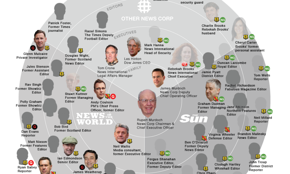
Header image taken from Lena’s work for ProPublica ‘Murdoch’s Circle: The News International Scandal’.