This is part of a series of posts about the ‘little of visualisation design’, respecting the small decisions that make a big difference towards the good and bad of this discipline. In each post I’m going to focus on just one small matter – a singular good or bad design choice – as demonstrated by a sample project. Each project may have many effective and ineffective aspects, but I’m just commenting on one.
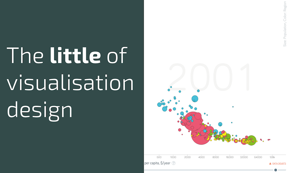
The ‘little’ of this next design concerns a really neat feature demonstrated in a project I reckon 99.9% of visualisation people are well familiar with: Gapminder. Specifically this is a new version of the classic tool, described as being pre-alpha (not sure really what that means).
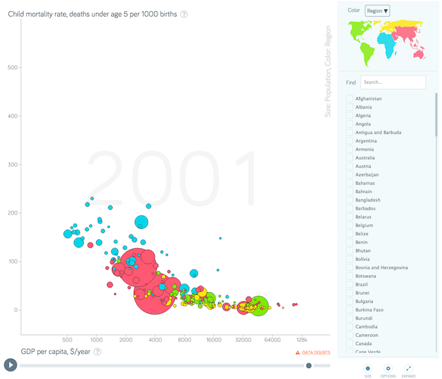
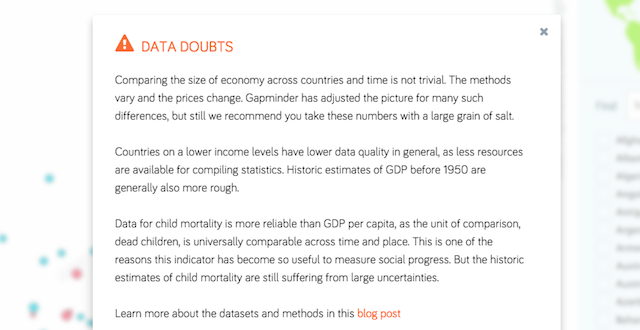
The feature I want to point out here is the ‘DATA DOUBTS’ link positioned just below the chart. Data is rarely perfect. The journey it goes through from measurement, processing, statistical treatment and finally on to visualisation will often introduce a need for assumptions, application of counting rules, small inaccuracies, rounding errors etc. ‘Good enough’ is usually a necessary attitude to take otherwise we’d be frozen by the reluctance to publish any information.
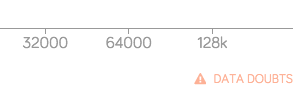
What I love about this feature is that it acknowledges doubts about the data in a very open way: it is acknowledged front and centre, not scuttling around in the shadowy outposts of the site. The trustworthiness of a visualisation has to be of fundamental importance and so this kind of feature is so refreshing to see. Clicking on the link brings up a dialogue box with a brief comment about the reliability of the data, details about some of the necessary adjustments and assumptions and a link to read more in a blog post. Really very sensible and helpful for a reader to get this kind of contextual guidance so transparently before one launches in to forming meaning from the display.