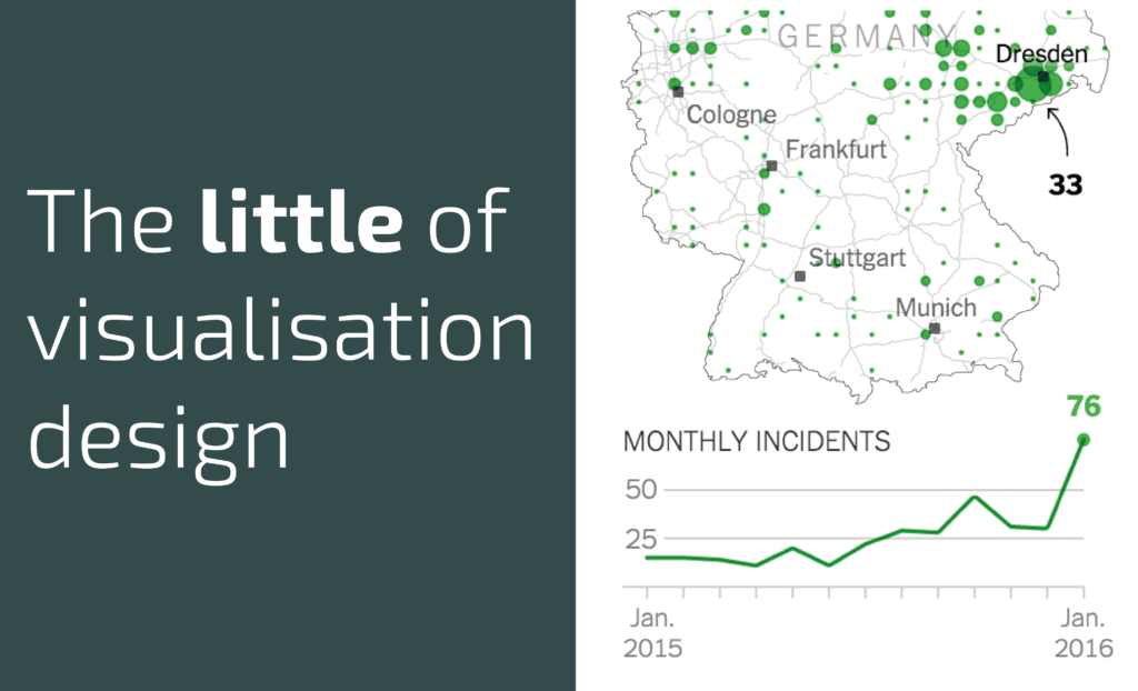
This is part of a series of posts about the ‘little of visualisation design’, respecting the small decisions that make a big difference towards the good and bad of this discipline. In each post I’m going to focus on just one small matter – a singular good or bad design choice – as demonstrated by a sample project. Each project may have many effective and ineffective aspects, but I’m just commenting on one.
The ‘little’ of this next design concerns clever axis-scaling decisions in this New York Times graphic about the trial of firebombing of refugees in Germany.
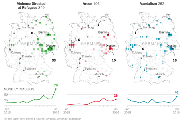
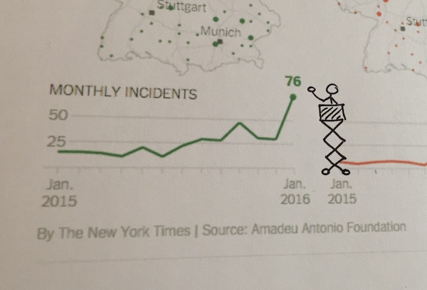
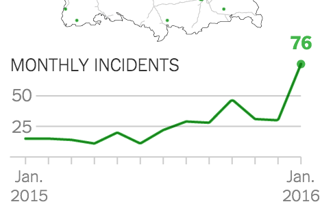
Across the three line charts at the bottom of the graphic the highest value is 76 but this is a single outlier, with 38 of the 39 values presented less than 50. By effectively setting the y-axis maximum range to 50 notice how the recent increase in incidents of violence against refugees becomes even more striking, as the line climbs up to the height of 76, far beyond the height of the chart and almost intruding on the map area. An example of a subtle but smart editorial design decision.
(Via a tweet from Gregor Aisch who I’m assuming was involved in the creation of this graphic)
ADDENDUM: A perfect suggestion from Walter Rafelsberger:
…so, to capture the essence of this post series, here’s a little Al Gore on his little cherry picker