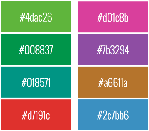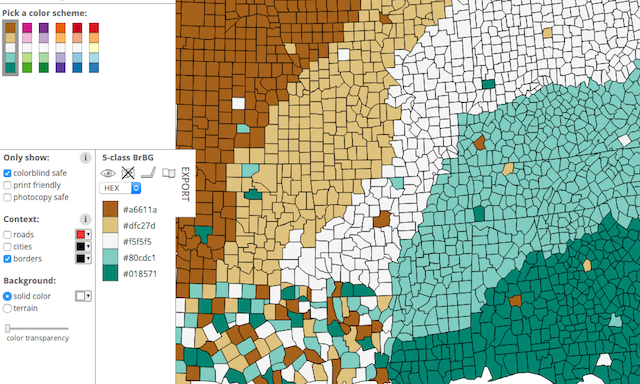
Yesterday I posted on Twitter a set of colour swatch pairings that offer colour-blind safe alternatives to the default greens and reds often used. They are from the chapter in my upcoming book where I talk about the impact of colourblindness and the recommended alternatives to consider using. The colours shown were generated from the wonderful ColorBrewer website.
They seemed popular on Twitter so I thought I should really share them with others who are not on social media. Also, and perhaps most importantly, there was a typo in one of the HEX codes so I need to correct that.
The colours on the LEFT are the alternatives to the default green, the colours on the RIGHT are the alternatives to the default red. The bottom pairing switches red to be a ‘positive’ colour based on the metaphor of red = hot = good, blue = cold = bad.