
Yesterday I tweeted about a confusing graphic from a BBC article dispelling myths about last season’s Premier League. Its a good article with some really interesting content but some of the accompanying graphics hindered rather than enlightened the points being made.
How to make something unnecessarily hard to read, dotty-donut edition http://t.co/OKBo3ZdFDt pic.twitter.com/NnNKIX67Lh
— Andy Kirk (@visualisingdata) August 12, 2015
A couple of people asked what I would do instead. Time rarely allows it but one should always be willing to offer an alternative, even if it is just quickly expressing some ideas verbally. Criticism without suggestion is empty and it is something I fall into all too often. So I thought I would quickly offer a reworking of the two main graphics that I felt caused unnecessary inaccessibility. I assumed the same constraints around space, (similar) typeface and colours as well as the inclusion of the logo and hashtag.
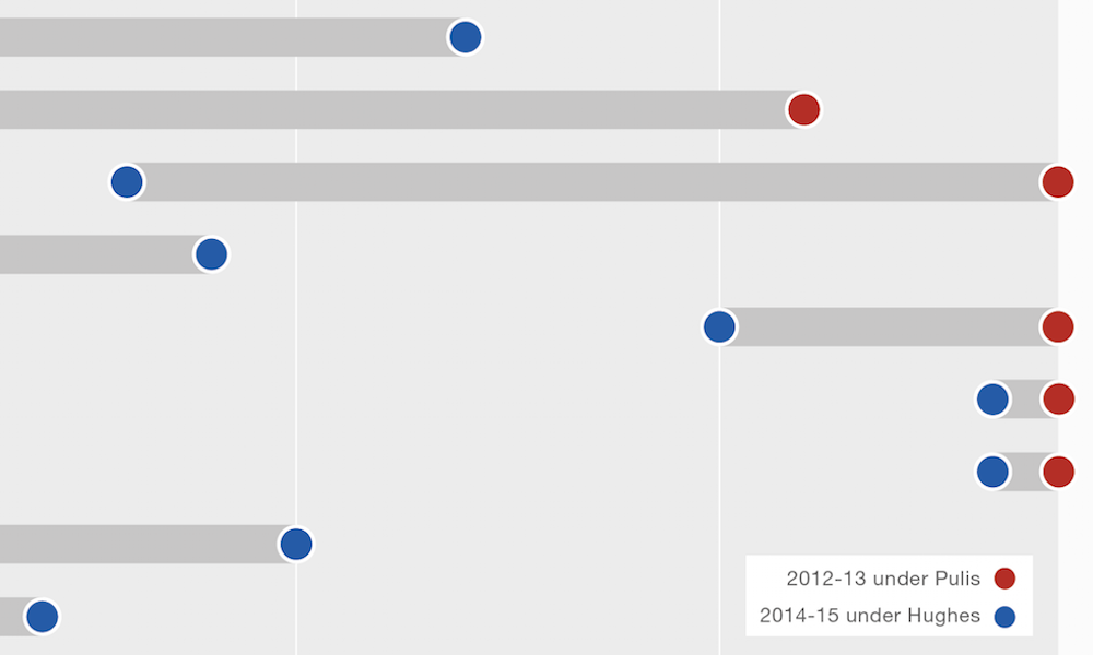
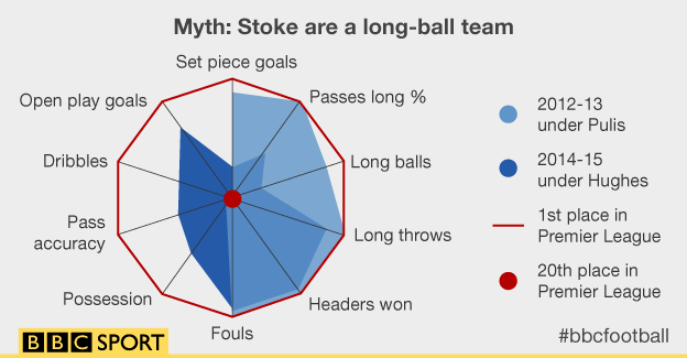
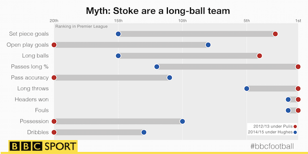
The first concerns the use of a radar chart to demonstrate how Stoke City have evolved from a long-ball team under Tony Pulis, into a more progressive team under Mark Hughes. With Radar Charts, there are almost always better solutions, especially when you are attempting to compare two series of values in the same chart. Radars really only make sense if and when there is some compelling logic for the radial arrangement of values (usually temporal, spatial or, occasionally, intuitive groups).
The redesign uses a connected dot plot to draw out the differences in rankings between the different measures. The measures themselves are re-ordered to try and group related ones together.
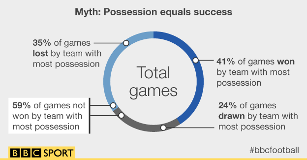
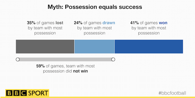
The second relates to the main graphic I mentioned on Twitter, which looks at dispelling the idea that teams with the most possession have the most success. The donut chart was reasonably fine until the dots landed. Due to their placement within the arcs there is an implication of meaning, especially when we see the two adjacent dots for the call out aggregating the loss and drawn match percentages. Unnecessarily confusing when all we need to learn about is 4 numbers.
The redesign is very simply a stacked bar-chart. To be honest it still doesn’t add loads of value as a visual, you are essentially getting most of your understanding from the value captions but the stacked bar better aids showing the ‘did not win’ aggregate. I’ve switched the colours to perhaps better suggest bad, medium, good.
Comparing the before/after versions I suspect that the labelling size and prominence of colour of my redesigns would need fine-tuning. It is interesting to see how faded they look when you shrink the final png file down. In the native Illustrator version they look far more vivid to the naked eye. That’s a good lesson in testing out your prototype designs in the size and setting in which they are likely to exist, to see for yourself how they look. Anyway, I’ve not got time to undertake endless iterations but you get the idea.