
To mark each mid-year and end-of-year milestone I take a reflective glance over the previous 6-month period in the data visualisation field and compile a collection of some of the most significant developments. These are the main projects, events, new sites, trends, personalities and general observations that have struck me as being important to help further the development of this field or are things I simply liked a great deal. Here’s the full compilation of all my collections.
At the end of December I published a collection for the last 6 months of 2014 and now I’d like to reflect on the opening 6 months of 2015. I look forward to hearing from you with suggestions for the developments you believe have been most significant.
And so, as ever, in no particular order…
1. Tessellations of the Nations
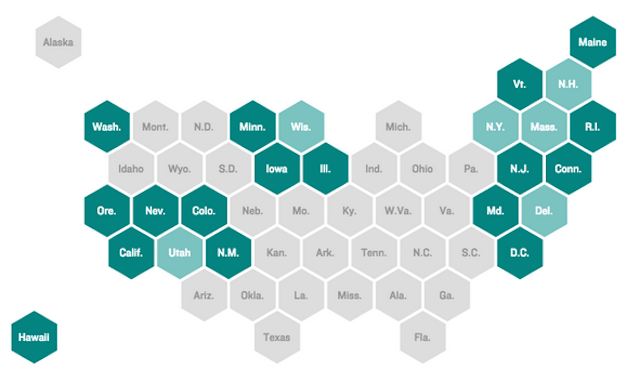
If you’ve not tripped over a hexagon or squarified grid map during 2015 you’re not doing this ‘tracking the visualisation field’ right. They are everywhere and have stirred much debate, in the US especially, about their use and their optimum formation (FlowingData, David Yanofsky, NPR). The UK has seen its fair share too, from the BBC’s flagship election night outdoor graphic, other newspaper’s coverage or After The Flood’s ‘London Squared‘ work, and Europe too, with David Taylor’s offering. Some experiments have got a little extreme but let’s not rule out, just yet, the emergence of the lizard grid map being the star of the remainder of 2015.
2. Mobile or desktop first?
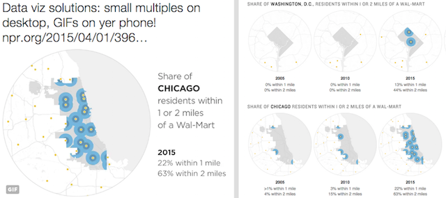
This is perhaps not much of a surprise but feels like a worthwhile signpost for observing increasing conversations and experimental techniques concerning the desktop-mobile multi-platform conundrum. Driven largely by newspaper and media organisations facing growing proportion of visitors landing on their content via mobile, it is more than just about responsive design, it is about fundamental publishing strategies. The question of desktop-first or mobile-first is not just about following trends of web design in general. For some the mobile is now the primary landing place and so visual projects will be increasingly designed to succeed to best effect with device dimensions and capabilities in mind. For others, the canvas of the desktop will always be preferred as the best way to fully express the breadth, depth and potential functionality of advanced visualisation work – the mobile version will be where the compromise exists. This was expressed to some degree by Scott Klein (in Oct 2014) when describing ProPublica’s tactics for translating desktop projects onto mobile being either to ‘smallify or simplify’. NPR’s Brian Boyer recently tweeted the notion of “small multiples on desktop, gifs on your phone” when discussing this Walmart project. The Knight Foundation’s investment of $2.6 million to create a mobile lab inside the Guardian US “to experiment with new and engaging ways for people to consume news on smaller screens” is a sign of the importance of the evolution of reading/consuming habits and it will be fascinating to see what emerges.
3. Dear Design Student
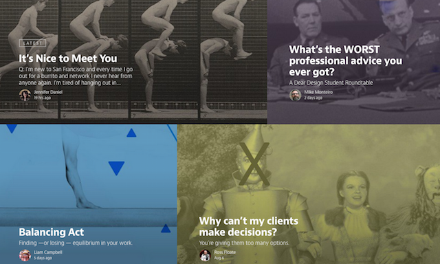
I really loved reading the growing collection of articles in the ‘advice publication’ Dear Design Student, launched by editors Mike Monteiro, Jennifer Daniel and several others (not to relegate their role, Mike and Jennifer are just the names through which I learned about it). The intention of Dear Design Student is to offer “advice on design from people who work for a living” and whilst it goes far beyond the boundaries of data visualisation – design in general – and is aimed at those beginning or thinking about launching their journey into this world, there is already tons of wisdom that is useful for anyone. With a growing band of contributing writers hopefully the initial momentum will be maintained and the excellent content will continue. Send them questions and they will answer…
4. Mike Bostock’s New Chapter
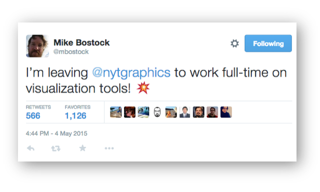
This is probably the epitome of a ‘significant development’. One of the biggest news items so far in 2015 was the Twitter announcement from Mike, made on May the 4th (oh, I see what he did there…), that he was leaving the New York Times graphics team to spend his time developing visualisation tools: “It’s hard to go beyond incremental maintenance of open-source projects while publishing on deadline. Long thoughts take time. And there’s still lots of room for improvement in visualization tools, particularly for discovery. Need less arcana, better interaction. Don’t have the answer yet, but it’s what I want to focus on. So, here I go. Adventure!”. Given Mike’s track record and seismic contributions to the field already one can only be rather excited at the prospect. Good luck Mike!
5. Guardian Graphics
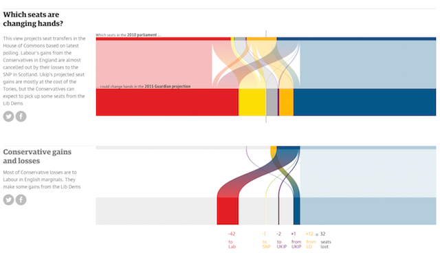
Over the past few ’10 significant’ collections I have profiled the quality of work coming from the Washington Post and the Financial Times, now it is the turn of The Guardian, and specifically the UK operation. It wasn’t so long ago that the dynamic work and profile of the Guardian Data Blog was hugely influencing the prominence of the data-driven movement away from the fringes and increasingly into mainstream consciousness. Following the departures of significant names responsible for the newspaper’s growth on this front and also for its most celebrated visual output (such as Simon Rogers, Michael Robinson and Alastair Dant, to name but a few), it would be fair to say the Guardian’s UK work (the US team kept the momentum going) dropped somewhat off the radar for 2-3 years. The London visuals team have now re-emerged helped by some class signings bolstering existing talents such as Aron Pilhofer, Xaquín González Veira, Feilding Cage, Carlo Zapponi, Giulio Frigieri, Cath Levett, Pablo Gutiérrez, and Daan Louter as well as several others I’m sure to have forgotten. Their work before, during, and after the UK Election was particularly outstanding. My only wish would be that they create a single place to collect and publish all their work as most other newspapers have done…
6. Writer’s Block

I thought this was a beautifully designed and astutely judged project looking at the story of censorship in Iran and produced by the team at Small Media. Aside from the evidently deep research that went into curating the content – in what I can imagine is a data-dark topic – the interactive digital version is a real joy to work through, with innovation and astute flourishes coming out of every pore. There is also a printable report version which is wonderful to see being offered as an alternative package. Do yourself a favour and give yourself time to fully consume the content of the project, not just skimming the design surface.
7. Mike Monteiro IxDA Talk

A second entry for Mike Monteiro in this list. Titled ’13 Ways Designers Screw Up Client Presentations’, I found this Keynote Mike gave at Interaction Design Association 2015 conference offered some extremely valuable insights. Whether you are working as a freelancer or studio/agency or even just in an organisational setting with ‘internal’ clients, this talk will give you some super helpful tips. For those with no patience to watch a 1hr video, here is a companion article available on Medium.
8. Dear Data
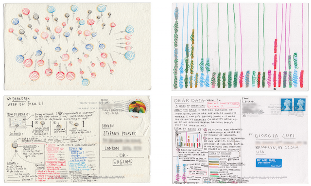
Another entry that contains ‘Dear…’ something in the title (is that a meta-trend in itself?). Dear Data is a lovely, year-long ‘artisan’ visualisation project by Giorgia Lupi and Stefanie Posavec that explores “how two girls who switched continents get to know each other through a collection of handmade postcards: small data-driven self-portraits they draw and send across the pond each week”. Using postcards as their canvas, they hand draw visual depictions about the weekly themes they select based on the primary data they collect. Pen pals for the modern age.
9. Design/Redesign
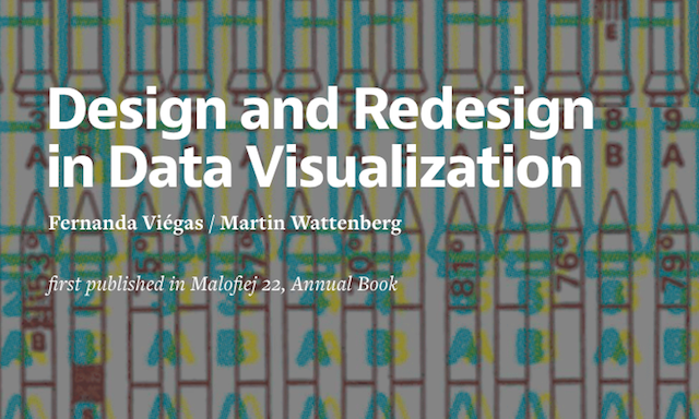
The nature of criticism in data visualisation is something that has been a concern to me for a few years now (2012 article). For the field to develop then constructive critique is absolutely, well, critical. However, I do believe we collectively, as a field, need to be better at delivering on the key word there – constructive. Maybe due to the nature of Twitter being so popular for data visualisation content discussions yet offering a relatively poor platform for holding conversations especially with nuanced debate we have veered off track a little again. This excellent piece by Fernanda and Martin presents some really valuable critique of the standard of criticism in the field and I urge everyone to read it and practice what it recommends. “We need more criticism, and redesign is an essential part of visualization criticism. But with so much of it happening on the web — in public, instantly in view of everyone involved, available to the world without context or preparation — it can be a difficult process. In this [article] our goal has been to start a conversation about how criticism can be most productive, and cause the least stress, for those involved.” Let me emphasise the word collectively – I certainly recognise that I need to do a hell of a lot better myself at this and this recent post was an attempt to demonstrate this.
10. What is code?
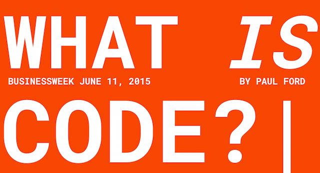
An outstanding article that, simply put, answers the question it poses by providing deep historical, practical, and technical insights that make it a truly accessible read for the non-expert and enlightening even for the expert, I’m sure. It is a long read – 31,558 words to be precise – but for any non-programming data visualiser out there it offers a wonderful entry point into this world and is well worth your time.
Special mentions…
Here are the other highlights from the first half of 2015 that deserve a special mention:
America Changes Its Mind | There’s something about this project that really struck a chord with me. I just thought it was such a clear and well-executed profile of the interesting dynamics of change in the US covering some of the most compelling current topics of concern.
On Repeat | A consecutive yearly mention for one of Lena Groeger’s talks. Last year I loved her ‘Wee things’ presentation at OpenVisConf 2014, this year she followed up with another excellent topic titled ‘That’s the power of loops‘. The main link for this special mention points to the follow-up article that includes so many brilliant examples.
Statistical Atlas of the United States | Great project from Nathan Yau to recreate the Statistical Atlas, historically produced by the Census Bureau until cuts took hold, using data from the 2010 Census and deliberately employing similar ‘vintage’ styling to the original from 1874.
Mr Chart Maker | I wasn’t there in person but heard so many echoes of ‘wow’ following coverage of NICAR 2015 about from Gregor Aisch’s lightning talk where he presented his Mr Chart Maker tool, developed internally for creating charts at TheUpshot. Sadly, I wouldn’t hold your breath waiting for this to be Open Source, not through a lack of will but down to the incredible amount of hidden work that goes into such developments. This does seem indicative of a trend for some organisations to construct their own in-house chart-making products.