
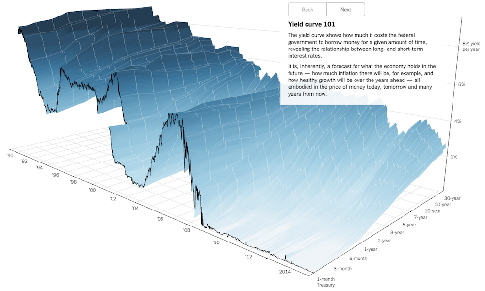
Earlier this week TheUpshot published a new interactive project visualising the ‘Yield Curve‘. Created by Gregor Aisch and Amanda Cox the work provides a “3-D view of a chart that predicts the economic future”.
It is a terrific piece of work because, as with any good visualisation, it makes understanding accessible, providing a visual explanation of a potentially (at least for me) complicated subject matter.
The most striking immediate feature is the initial 3D display. Whilst the project received lots of deserved praise online I am conscious that being positive about a 3D work might strike some as going against the grain: as we know, 3D is one of the reliable punching bags for visualisation angst. However, I thought it was important to explain why 3D doesn’t just work but is essential in this case.

The first matter is that we have three dimensions of data. When we are lambasting 3D displays, the ire is usually focused on the use of 3D as purely decoration. This introduces an artificial axonometric or isometric projection creating unnecessary and unhelpful distortions to the task of interpreting, for example, the relative heights of bars or angles of pie chart segments. In the Yield Curve project we do have three dimensions of data: we have Year on the x-axis, the % Yield on the y-axis and the Yield Term on the z-axis.
The second reason why 3D makes sense here is not just that we HAVE three dimensions of data but that their relationship is critical to the analysis. How the % Yield alters across the different short- and long-term periods by year is the essence of the analysis. Whilst we could (and the interactive eventually does) decouple these variables to show a range of reduced, two-dimensioned displays, initially we want to get a sense of the overall undulations and contours of the connected dynamics of this relationship. And ‘getting a sense’ is key because you can’t easily or confidently read of the heights of the waves from the 3 axes, that is not the intention, but you do at least get an initial gist of the substance of the situation.
The third reason in support of this approach is perhaps the most important, and it comes down to this little guy:

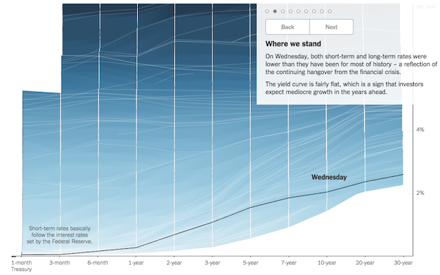
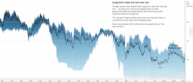
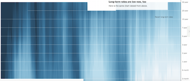
Having this navigation sequence enables us to look around and beyond the 3D display. Having opened up with the big-picture 3D view next we will want to take different perspectives to observe the different slices of interest from each angle and have a better chance of reading the chart, not just feeling it.
This series of alternative displays is perhaps the crucial reason why something like the below still deserves the criticism for its use of 3D. Without the ability to move around it front on and side on we have to consume a three-dimensional object in a two-dimensional space.
As we click through the series of additional displays, we have seamless transitions pointing the camera at the sides of the chart and from above, looking at the 3 relationships individually. We also have further scenarios and comparisons to consider.
It is a very well considered, brilliantly executed demonstration of explanatory visualisation at its best and an example of when 3D really works.