
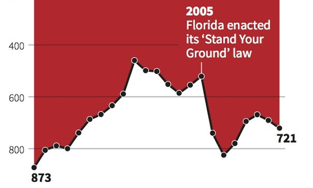
I’m posting this as a separate discussion thread but in follow up to the previous post about the Gun Crimes chart and the issue of confusion vs. deception. Taking a helicopter/big picture view of this discussion, Tom MacInnes has raised an excellent observation:
@visualisingdata @Jon_Peltier interesting how many people did see the intent as deceptive. Speaks of a low level of trust.
— Tom MacInnes (@tommacinnes) April 15, 2014
So many people have reacted so badly to that chart, I’m actually quite shocked.

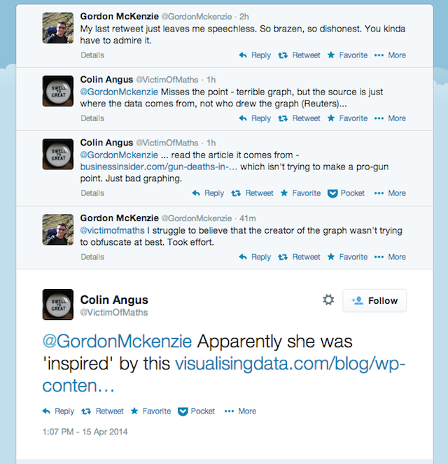
Even with the designer’s own explanation (clearly showing the motive for the choice as being inspired by a design metaphor) there are still very angry and accusatory views out there, illustrated by this exchange:
What is it that causes such an evident lack of trust? Is it the subject matter of gun crimes that is inherently so emotive that anything that remotely creates confusion or leads to misreading is playing with fire? Is it the lack of trust about work emanating from the media? I would have thought that the provenance of this graphic coming from Reuters, with its international scope and (in my view) non-political leaning would be something that would remove some of the ire, but clearly not.
At the end of the day, clearly it is a good thing that there is a large (and growing?) audience out there capable of calling out graphics for potential shortcomings. Just maybe not necessarily with the quantity of pitch forks we’ve seen today and maybe directed less towards accusation of corrupt intent and more towards appreciation that a design choice maybe hasn’t quite worked out.
I have to say I feel a great amount of sympathy Christine having to read the volume of flak her work has led to. She has responded to the criticism positively (below) and I truly hope this doesn’t deter her or other designers from having the courage to occasionally pursue non-standard charting approaches.
@kfury Thanks for raising this, I appreciate the feedback. Agree that the inverted y can be confusing & perhaps too misleading in this case.
— Christine Chan (@ChristineHHChan) April 15, 2014