
Overnight I saw quite a few tweets spinning off an article ‘How to Lie with Data Visualisation‘. Initially, I mistakenly thought this had been written by Aatish Bhatia but it was actually from Ravi Parikh. It is a good article picking up on some of the classic subjects of our ire (Fox News, truncated y-axes).
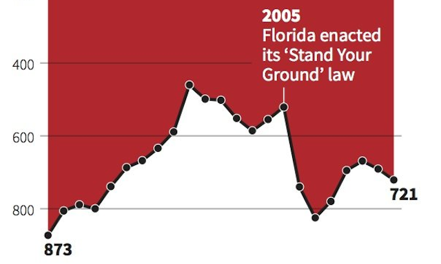
I did, however, disagree with the inclusion of this graphic produced by Reuters.
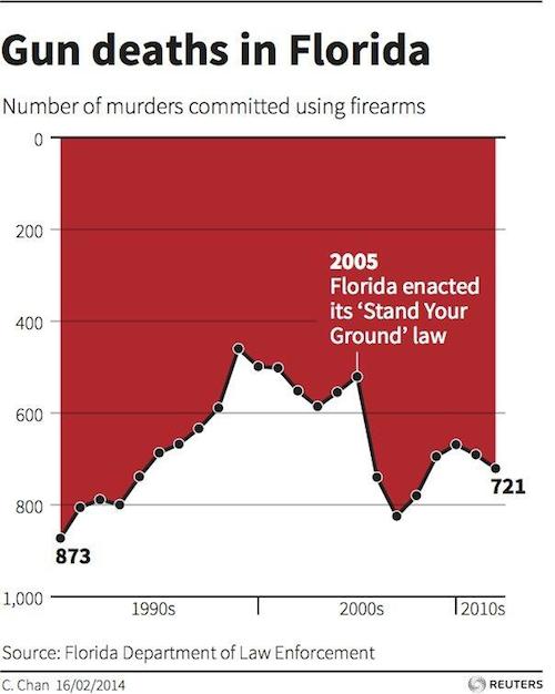
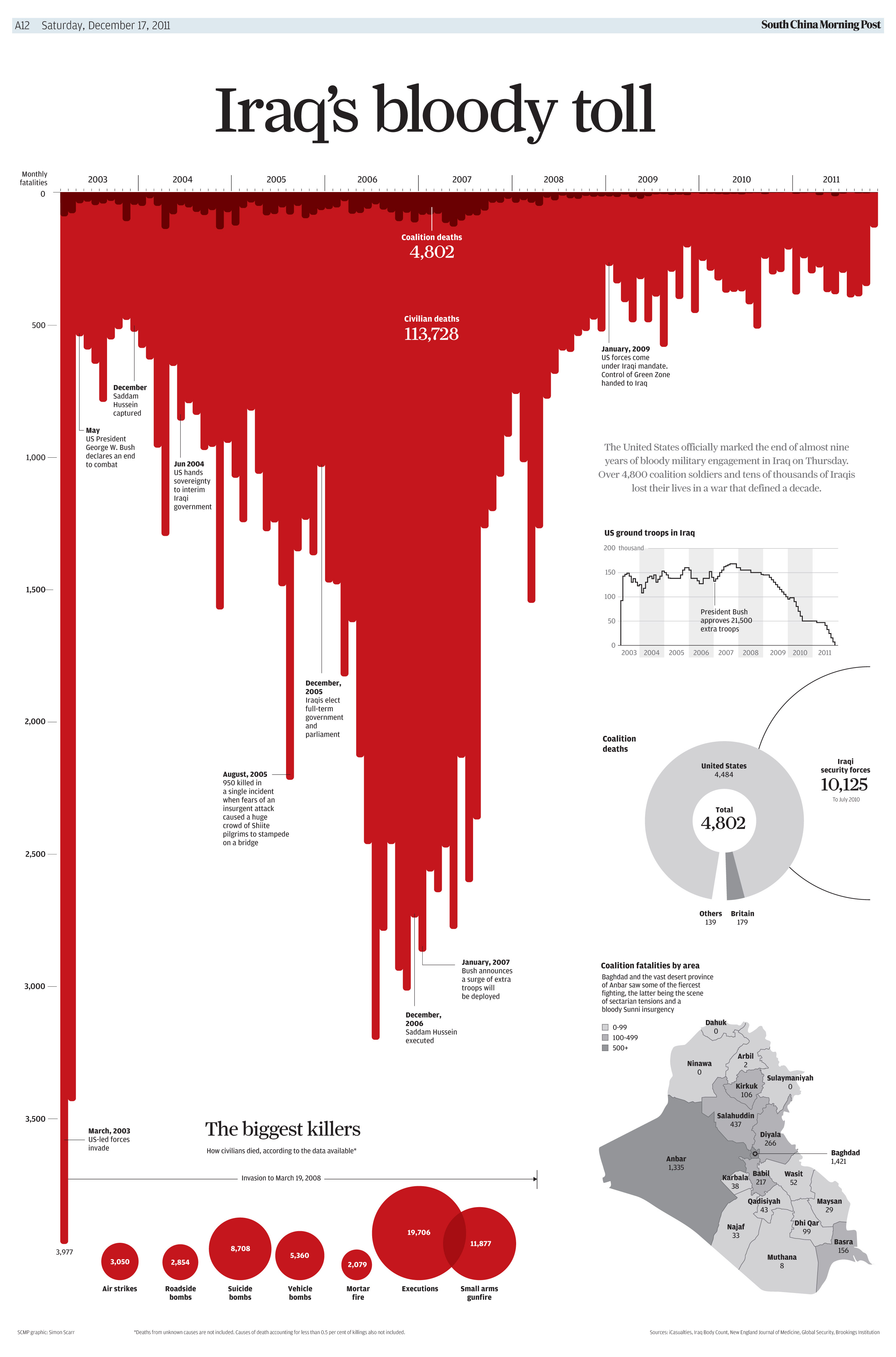
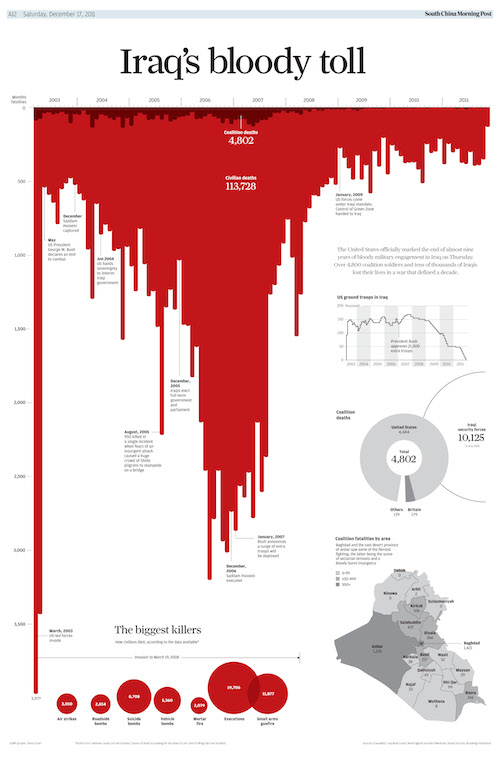
I couldn’t see the ‘lie’ demonstrated by this graphic that would force it to join those others on the naughty step. For me to read it I look at the more red equals the more deaths. Focusing on the shape of the colour rather than the passage of the line reveals the changes over time and the y-axis labels support the fact that a higher vertical position means a lower count of deaths. Once again, for me, it was clearly just an upturned area chart used to achieve the metaphor of a blood effect, and likely inspired by the below graphic produced by Simon Scarr (then of the South China Morning Post now of Reuters).
Simple, right? Well, not necessarily. The response on twitter through some good discussions has largely been supportive of the article’s stance and less so on my seemingly contrarian view. (I feel like I’ve been here before…).
So here’s a few further observations and thoughts.
(1) I think a key discussion here is the distinction between confusion and deception. I’m not going delve too much into the semantics of language definition but my sense of the difference is that ‘deception’ is generally something you knowingly intend, ‘confusion’ is a by-product effect of something not being clear. I’m not necessarily defending or celebrating this particular graphic, I’m really remarking that, unlike some of these other cases, there isn’t anything in my experience reading the graphic that felt like deception.
This was further reinforced by seeing a reply from the designer, Christine Chan, to a question about the graphic.
@john_self My inspiration for the graphic: http://t.co/QIvwwdaFQo
— Christine Chan (@ChristineHHChan) April 15, 2014
(2) Everyone’s own reaction is entirely legitimate. Regardless of whether someone is telling you this is the best or the worst visualisation ever made, how you respond to it and how well you draw interpretations from it are entirely for you to resolve. I’m not defending me here, by the way, just saying we all have different responses based on all sorts of factors such as our experience, knowledge of a subject, interest in a subject, taste and graphical literacy
(3) The issue of graphical literacy is incredibly interesting and important. The ability to read and interpret chart types is something we are not trained to do. We ‘get by’ through experience, practice and exposure. Some people find different charts and graphics easier to read and interpret than others so there is rarely a common experience. As designers, our objective has to be to try help overcome any obstacles people might experience in the readability of our representations, either through our design choices or through explanatory annotations. I will be posting much more about one of my current projects working with a research team hosted at University of Leeds to explore this matter of graphical literacy amongst the general public.
(4) On a similar matter, I include the Iraq graphic in most of my training workshops (and it is admittedly in my top ten graphics ever). I am therefore especially familiar with and potentially more primed to ‘get’ a graphic that uses a similar device of the upturned dribbling blood effect without it having any misleading impact on me.
(5) Some great points were made about the effect of the area chart’s colours creating a figure-ground illusion that means we can naturally be drawn towards the dominant shape of the ‘white’ area chart (and in the upward direction we normally might expect an area chart to be directed) more so than the big area of colour. I didn’t experience this but clearly others have, particularly likely caused by the x-axis labels being at the bottom of the chart (thus almost framing the ‘white’ area chart). In contrast, several mentioned that the bar charts in the Iraq graphic almost ‘punctured’ this figure-ground illusion and had the x-axis labels across the top.
