
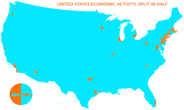
Yesterday there was a fair bit of twittering about a map that was ‘doing the rounds’. The map shows where 50% of the GDP of the US comes from geographically. I came across it via a tweet from Ian Sefferman, based on a map created by a user on Reddit named ‘atrubetskoy’.
Given the discussions that ensued (storified below) I felt a need to offer a contrarian view to the largely critical or indifferent opinions aired.
So, to start with, is it an incredible map? Not really. Slightly dramatic adjectives are not really my bag and I think one can set themselves up for some verbal jabs if the subject does not turn out to be ‘extraordinary’. But then Twitter is often about the Wows, Oh My Gods and Greatest Evers…
If it isn’t incredible, why did I retweet it? Because I think it is interesting. Not really a movie poster caption is it but I simply think the subject is interesting. The map itself is adequate, all it needs to be really, though the use of a year’s supply of cyan makes my eyes grimace.
Why, then, do I think it is interesting? Whilst I know roughly where the major cities of the US are, the size and population-density extremes of the country fascinate me so I find it interesting, particularly as a non-US person.
But the map basically shows where people live and don’t live? Yes and here is the crux of the matter. The point most critics are making is that it isn’t surprising that 50% of the GDP of the world is generated from the large cities of the US.
Alberto Cairo wrote up a quick post about this matter:
“For some reason, they [designers/journalists] think that it’s surprising that large U.S. cities are responsible for generating 50% of the GDP.”
No, I don’t think it is surprising, though I can see that a RT including the word ‘Incredible’ would imply an endorsement for a sense of surprise.
“So what? Is that insightful at all? According to the U.S. Census Bureau, more than 80% of the population lives in urban areas, and it seems that 40% lives in the largest metropolitan regions, so this map is just revealing population density”
Yes, it basically is. It won’t be an exact match as it is a single person’s calculated view of where 50% of the US GDP comes from (if 10 different people did this map again we might see slightly different approaches used to calculate the 50% and therefore slightly different shapes forming).
But, without seeming to be wielding a sword back in Alberto’s face, so what if this is all it is really revealing? I get that GDP is essentially a proxy indicator for where people are living yet I still have a novel interest in learning about the dynamics of the US. I *know* that there is not a uniform distribution of where people live (nowhere on earth has this) but it is still revealing for me to see anything that represents a proxy of this skewed population. I don’t think the map claims to be doing anything different to this so, in that sense, it doesn’t mislead or make false claims.
Several have referred to the xkcd ‘Heatmap’. Whilst I agree with the sentiment and potential relevance of this graphic, I think it is making different points to the core issue here. I use this diagram in my teaching to emphasise that just because you have spatial data doesn’t mean you need to map it. Also, often, you are simply mapping the geographical attributes of the data collection method not the phenomena itself. Besides, I actually think this cartoon inadvertently shows there is value from mapping these three subjects because you learn that basically all your site’s users subscribe to Martha Stewart Living and consume furry porn.
Anyway, I digress. Back to my main argument. One person’s ‘interesting’ is another person’s ‘knew it’.
On “Who Wants to be a Millionaire”, Chris Tarrant (the original UK host) used to make the comment to help (admittedly, usually the idiot) contestant that a question is only easy when you know the answer. I think in visualisation, the opposite idea is true: an insight only fails to be surprising or interesting if you already knew it. I think this can blinker some of us (myself included) if we see things we know, “why would anyone else find it interesting, everyone knows that…”.
I have seen this play out in my training session where I have witnessed different reactions to a subject matter similar to this. Showing Derek Watkins ‘Posted’ project – the animation of the expansion of post offices in the US between 1700 and 1900, once again a proxy of population expansion itself – to a group in the US tends to be met with slight indifference. Not that they don’t ‘like’ the visual design but they are already familiar with the story it portrays, the dominance of the east of the country and then the rise of the west coast as events like the gold rush lure populations west. When I shown this to groups in all the other regions I’ve visited – the UK, across Europe, India, South Africa, Australia – there is far more engagement and intrigue.
My closing point is that the objective of visualisation is not just to surprise, enlighten and reveal new things to all. If you can, wow, oh my god and the rest. But sometimes it just reinforces, maybe showing something we know but from a different angle. That’s ok. It is still legitimate to serve ‘just’ that objective.