
To mark each mid-year and end-of-year milestone I take a reflective glance over the previous 6-month period in the data visualisation field and compile a collection of some of the most significant developments. These are the main projects, events, new sites, trends, personalities and general observations that have struck me as being important to help further the development of this field or are things I simply liked a great deal. Here’s the full compilation of all my collections.
At the end of July I published a collection for the initial 6 months of 2013 and now I’d like to mark the closing of 2013 with my latest perspective. I look forward to hearing from you with suggestions for the developments you believe have been most significant.
And so, as ever, in no particular order…
1. HelpMeViz
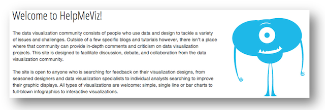
HelpMeViz is a really great idea from Jon Schwabish, motivated by the lack of a suitable platform outside of Twitter to offer the community a means of satisfactorily commenting and providing in-depth critique on data visualisation projects. The site is open to anyone who is seeking feedback on their visualisation designs to submit their work and commence a conversation. It is designed to be very inclusive and especially constructive, welcoming to all levels of designer and for any type of visualisation work. Over time, I would anticipate there will be plenty of functional enhancements incorporated in to the site but, for now, I urge anybody seeking advice/evaluation for their work to give it a go. Likewise, any folks in the field who are able to offer such advice, please do contribute.
2. Earth Wind Map
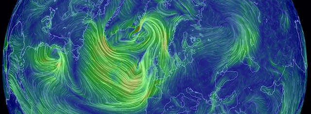
So new on the scene is this project that the D3 paint over Africa is not even dry. This is the beautiful Earth Wind Map, created by Cameron Beccario, and inspired by the hint.fm Wind Map project of 2012 (great to see the attribution). It is entrancing to the point of hypnotic.
3. News-Graphics Job Changes
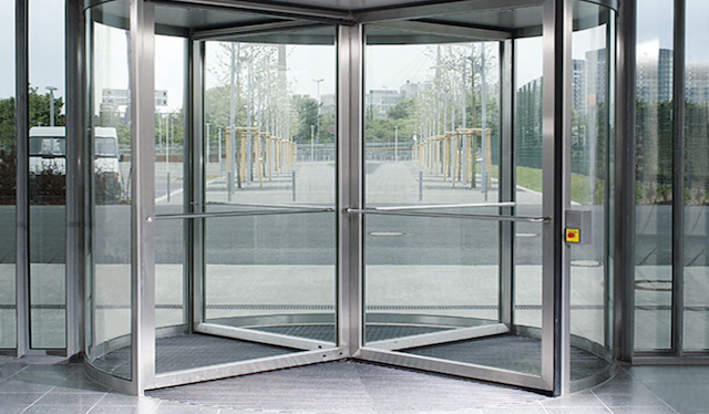
This rather stretched revolving-door metaphor is intended to visually summarise the flurry of changes amongst newspaper graphics editors and interactive designers witnessed over the past few months (and 2013 in general). We have seen numerous arrivals, departures, promotions and movements between some of the top newspapers, particularly in the US, as the graphics teams shuffle their packs. Names such as Gregor Aisch, Kennedy Elliott, Jennifer Daniel, Alan McLean, Wilson Andrews, Javier Zarracina, Alvin Chang, Derek Watkins, Simon Rogers, Alastair Dant, John Burn-Murdoch, Simon Scarr and Richard Johnson are just some of those I can recall moving roles during this period.
4. Subtleties of Colour
A really excellent 6.5-part series of in-depth articles about the use of colour to display data from the pen (or keyboard tapping fingers) of NASA’s Rob Simmon. It is a brilliantly comprehensive, well-structured and – importantly – accessible discussion on the fine balance between right and wrong in this critical aspect of visualisation design.
5. Age of Buildings
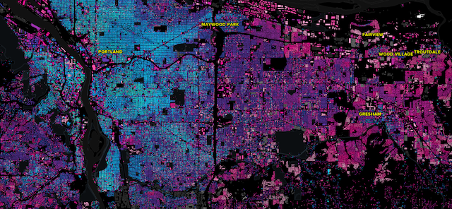
One of the most prevalent project topics over this last period has involved the creation of absorbing, interactive displays to explore the patterns of the ages of a city. These projects use different portrayal methods (colour, shade, 3D spikes) to capture the tapestry of the age of the buildings across various cities. A selection of the most prominent projects I have seen were for Portland (OR), Chicago, Brooklyn and Amsterdam.
6. WTFViz
What the Flip…? WTFViz does what it says on its Tumblr-shaped tin: a celebration of visualisations that cause severe head scratching and confused wonderment. It is the trash compactor of the visualisation field. Rather than Han Solo and gang wading amongst the detritus we can thank Drew Skau for rolling up his jeans and getting in amongst the stink. For a more positive celebration collection check out the prettier counterpart site ThumbsUpViz and the more noble collection of trash that is Accidental aRt.
7. Living United States Presidents
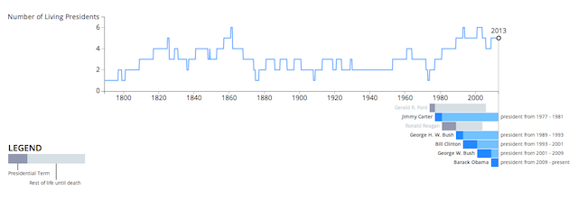
A very personal choice for this entry but I just really liked the insights from and the execution of this project that explores the concurrency of living presidents past and present. We are seeing more and more floating bar/Gantt chart works, for which I raise both thumbs, and this approach works so well for this project. The interactivity is superbly judged too, just utilising the hover event across the line chart’s timeline. The final result is a great demonstration of the discipline in reduction and simplicity, without treading into the murky waters of minimalism.
8. Mars Curiosity Rover
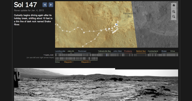
This project from Jonathan Corum and Jeremy White of the New York Times tracks the Mars Curiosity Rover on its daily journey exploring Mars. It provides a route map of its day-by-day position and distances travelled, an annotated timeline of each day’s adventures as well as presenting key images collected by NASA. Regardless of whether you are a space science enthusiast this is just such a brilliantly accessible and endlessly fascinating way to tell the story of little Rover’s expedition.
9. IXT/NZZ Swiss Maps
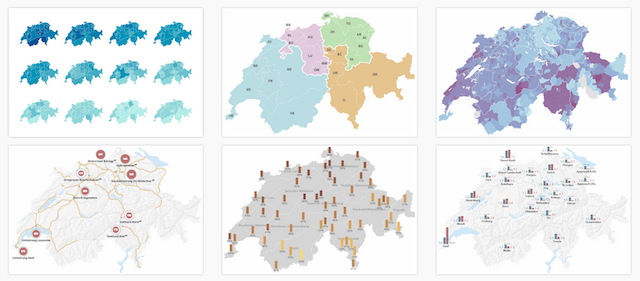
Another mapping-related entry in this list concerns the fabulous series of work produced by Interactive Things for Swiss German-language Newspaper Neue Zürcher Zeitung. Working with the editorial team at NZZ, the 4-week project aimed to reveal new connections and developments within Switzerland through cartographic representations. Here’s the original and translated collections.
10. RAW
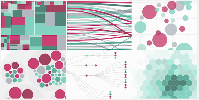
Hopefully evidence of more offerings like this. RAW is a tool developed by Density Design lab that undertakes a middle-man role, sitting on top of the D3.js library but providing an interface to create custom vector-based visualisations. Inevitably you lose some of the design control but that is a worthy sacrifice if it helps take away the pain – and potential obstacles for many – of hardcoding from scratch.
Special mentions…
Here are the other highlights from the latter half of 2013 that deserve a proud nod from their creators having just missed out on the prestigious main list by the width of a dart (disclaimer, darts are not used for these selections. The magic 8 ball does a good enough job):
Black Budget – Really strong project from the Washington Post to explore the US ‘Black Budget’, spanning dozen agencies that make up the National Intelligence Programme.
Sci-Fi Spaceships – Incredibly detailed, painstakingly crafted and beautifully composed illustration to create a single graphic that visually compares the size of some of the most notable starships from science fiction
Bechdel Test – Outstanding exploratory visual analysis of the Bechdel test in movies.
Finding the Quiet City – Lovely project from the New York Times to crowd-source the quiet parts of New York’s boroughs, mapping their location and descriptions, and occasionally including short audio and video excerpts.
Jobs Board – Already mentioned on my previous 6-monthly collection but Lynn Cherny’s data-vis-jobs Google Group goes from strengh-to-strength with an increasing frequency of new opportunities. Check it out and contribute!