
To mark each mid-year and end-of-year milestone I take a reflective glance over the previous 6-month period in the data visualisation field and compile a collection of some of the most significant developments. These are the main projects, events, new sites, trends, personalities and general observations that have struck me as being important to help further the development of this field or are things I simply liked a great deal. Here’s the full compilation of all my collections.
At the end of 2012 I published a collection for the final 6 months of 2012 and now I’d like to mark the first half of 2013 with my latest perspective. I look forward to hearing from you with suggestions for the developments you believe have been most significant.
And so, as ever, in no particular order…
1. Emotive Visualisations
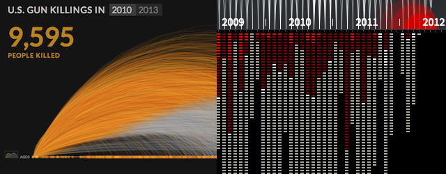
During this period we have seen the emergence of a number of projects that portray emotive subject matter. The US Gun Deaths project by Periscopic and Out of Sight, Out of Mind work by Pitch Interactive. Both projects were entirely self-initiated (ie. not client work) motivated by a personal connection and response to the subject matter in question. The great success of these projects, in my mind, is the portrayal of a more humanised view of a subject’s underlying data, seeing it more than just names, numbers and words but as people, as victims. The design characteristics employed, such as the dramatically slow pace of each project’s opening, helped to convey both the resolution of the individual and the shock of the aggregation. I wrote in detail about the Gun Deaths project, as did Alberto Cairo, and Robert Kosara commentated more generally on the emergence of this style of visualisation. Also check out Jonathan Corum’s counterpoints and forensic analysis of the Gun Deaths visualisation. Next up? Here’s another subject with a compelling dataset and endless possible narratives.
2. True Infographic Craft
Last time out I raised the idea that I felt quality infographics were starting to reclaim the agenda, after a few years of trash. There’s still a mixed bag but it only serves to remind you of the quality of great work when you see it. Aside from the usual customers, I wanted to particularly focus on celebrating two masters of the craft, whose work has been particularly visible on my radar over the past 6 months: Richard Johnson, Assistant Managing Editor for Graphics & Illustration at Canada’s The National Post, and Adolfo Arranz, Senior infographic artist and illustrator at South China Morning Post. Check out their respective portfolios and take pleasure from the technical brilliance each brings to their graphics, both characterised by their natural illustration talent.
3. Accurat
If there was one name that kept popping up on sites via my numerous RSS feeds, or mentioned all over my twitter timeline, it was Giorgia Lupi and her team at Accurat. OK, that’s two names but you get what I mean. The output of work from Accurat has been quite phenomenal over the past year, in particular, with a veritable deluge of fascinating new pieces for the La Lettura segment of Italian newspaper Corriere Della Sera as well as their own projects. The style and concept of this body of work is quite unique. Whilst some pieces can be occasionally tricky to decode, the sheer imagination in approach mixed with eye-watering precision (whilst also often working within the constraints of static work) sets them apart as one of the most innovative design studios in the field today. For her own part, Giorgia has been a frequent name on the speaking circuit and,whilst I haven’t crossed paths with her yet in 2013, I have seen plenty of coverage of the great impression her work has created.
4. Stephen Few’s Tableau 8 review
One of the most significant articles published during this first six months came in the shape of Stephen Few’s highly critical but typically well-constructed post about the shortcomings, in his view, of the latest version 8 of Tableau. Irrespective of your level of agreement with Stephen’s points, you can’t fail to acknowledge his passion and clarity of conviction, coupled with an unmatched willingness to enter into conversations with anyone about the subject (a trait that sets him apart from other peers who pursue the opposite approach). However, I digress. The inclusion of the article in this collection isn’t so much about the specifics of the points raised by Stephen, rather the ripples/waves of discussion and discourse this initial piece triggered. The comments boxes alone under Stephen’s article are required reading, if nothing more than to understand the classic polar dynamics of this fascinating field. Also check out Simon Rogers’ own responses and a subsequent discussion triggered by Chad Skelton (round 1, round 2). For what its worth I think several of Stephen’s points are legitimate but also find Tableau 8 has some great features and continues to be an essential tool in the visualisation designer’s armoury. Ouch, this fence really hurts…
5. Storytelling and Long-Form Journalism
Snow Fall. Right, I feel better now I got that out of the way. Officially this landmark project arrived in December so falls between the jurisdiction cracks of this collection and my last one. However, rather than adding an unnecessary extra grain of sand to the Sahara quantities of coverage this has received, I will focus instead on its broader theme: digital storytelling. This has unquestionably been the year of ‘storytelling’ as the most discussed topic and (mis-)used term, with a lot of interesting discourse and attempts at definitions spilling out of every corner of the subject field (notably here, here, here and all articles here). The great success of Tapestry conference in February was a sign of the interest in this concept but, perhaps significantly, it still remains a somewhat elusive concept, particularly in its application to data visualisation. It will be interesting to see how this develops over the next six months – watch this space. Going back to the influence of Snow Fall, there was a real ripple-effect of emulators and other worthy envelope pushers (yes, I did just use that phrase), here are just some of them: Guardian Firestorm, NZZ Fukushima, Hollow Documentary and WaPo Swing of Beauty.
6. Wealth Inequality
This one has quite a straightforward reason for its inclusion: I just thought it was a thoroughly super piece of work. It is a short film that unpicks the misconceptions people have about the true extent of wealth inequality in the US. It’s creator remains something of a mystery (it’s no ‘Murder She Wrote’ plot, admittedly) but I hope he or she is aware of the great reception this has had right across the field.
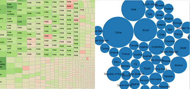
7. Data Visualisation Census
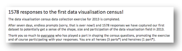
This isn’t as biased and self-indulgent a choice as it may seem. The data visualisation census I coordinated earlier in the year felt like a great success with over 1500 participants sharing basic details about themselves and their involvement/interest in the field. The inclusion of this event in the top ten is as much a personal thanks to all who took part and all who spread the word. Frustratingly, I’ve not had time myself to dive into the data as yet but it really is there to serve the field and for everyone and anyone to utilise as they wish. If nothing else, it gives us a snapshot baseline from which to see the future growth and expansion (hopefully!) and also to look at the demographics of the field, speaking of which…
8. Gender Issues
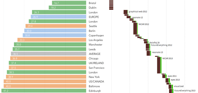
One of the main initial takeaways from the census related to the balance of gender ‘participation’ (practitioners, bloggers, designers, speakers etc.) in data visualisation. It is something that has been discussed before, indeed I posted about it last year, however, 2013 seems to have stirred a renewed energy to try and shift the imbalance away from the apparent 3:1 men:women ratio. At the moment this ‘energy’ would be best described as individuals trying to affect change at a ‘grass-roots’ level. Moritz Stefaner was one such person who helped to shine a light on the lack of gender balance amongst speakers at conference events, where the visibility of women practitioners and thought-leaders is a particular issue for organisers to address. Hopefully the more analysis, discussion and awareness we raise about this issue the healthier and more accessible the field will be in years to come.
9. Jobs and Opportunities

This is something that I’ve raised before in a previous collection but there definitely seems to have been a constant flow of interesting job opportunities emerging during the first 6 months of the year. This, of course, can only be a good sign in terms of the field’s growth and penetration into everyday business. Aside from Lynn Cherny’s super useful ‘Data Vis Jobs‘ board, there were many other opportunities flying around. Most of these will now have closed and probably filled but some of the headline roles have included: Guardian US Interactive Journalist, Interactive Journalist at the FT, Head of Audience Data and Analytics at the BBC, jobs at Time Warner, short-term projects at World Bank, Data Visualization Engineer at Nordstrom, Data Visualization Engineer at New York Times, Data Scientist at New York Times, Visualization Coordinator at NCSU Libraries, Data Scientist Job at the Bill & Melinda Gates Foundation, Sr Infographics & Datavisualization Specialist at NBCU, *Newsroom developer at Boston Globe*
10. ‘Learning To See’
This is a very personal selection and does not really represent a trend or larger-scale highlight of the first 6 months. This article from Oliver Reichenstein has been my favourite so far this year, I’ve read it and re-read it a number of times because it contains is so many valuable thoughts about the importance of ‘learning to see’. I also love the ‘time-remaining’ note on the sidebar which reveals it takes about 26 minutes to read. Make the time to read it.
Special mentions…
Here are the other highlights from early 2013 that deserve a part-generous, part-sympathetic round of applause, given they just missed out on the prestigious main list:
Boston Globe – The Boston Globe had a great 2013 with some super work especially their real-time, round the clock data-journalism coverage of the Boston Bombings and subsequent manhunt.
OpenVis Conference – I wasn’t in attendance and so am basing this on anecdotal evidence and reviews but it appears the OpenVis Conference, organised by Boucoup (Boston theme developing here?), was a great success and should be a great one to look out for in 2014.
Impact of Superstorm Sandy – Really liked this work by Derek Watkins and Laura Kurgan, from the Spatial Information Design Lab at Columbia University: a really elegant interactive visualisation serving as a platform for ongoing investigation into the impact of Superstorm Sandy across the Tri-State region
John Nelson – I know John will be less than happy at a second consecutive special mention 🙂 but he continues to create a stream of great work and articles on his blog.
Stephen Wolfram – My final mention is for the most comprehensive blog post I have seen all year, by Stephen Wolfram, sharing with the world a huge amount of analysis to form ‘Data Science of the Facebook World’