

This week Periscopic released a striking new project titled ‘US Gun Murders in 2010‘. It has already been showcased on all the major data visualisation and design sites, and rightly so. I love it. I think it is a superb piece of design execution but more than that, it is an extremely clever and well thought through project and I have tweeted to that effect. However, there was a tweet posted back in November by Robin Richards that has stuck with me and I think needs to be taken on board.
Would be brilliant if when people when something is ‘great work’ they say why it is. context is everything.
— Robin Richards (@ripetungi) November 21, 2012
It is all well and good declaring that we like something but, as this tweet expresses, sometimes taking the time to explain this in more detail is important, not necessarily for Robin who is an experienced designer but certainly for beginners in the field to help learn ‘why’ something works so well.
So, I felt I should add a bit more detail to my declaration of love for this work, picking out a few features that resonated with my ‘like’ senses. Here is a blitz of all the main reasons I would hold this up as a great data visualisation project:
The clarity and choice of narrative/editorial angle
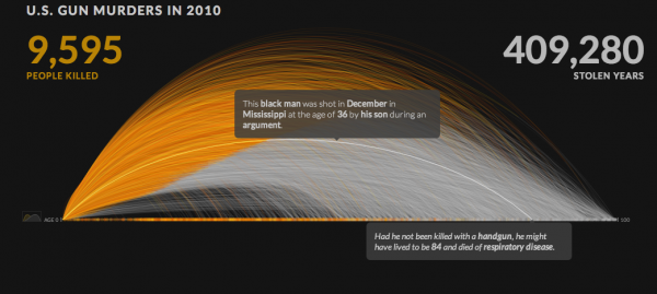
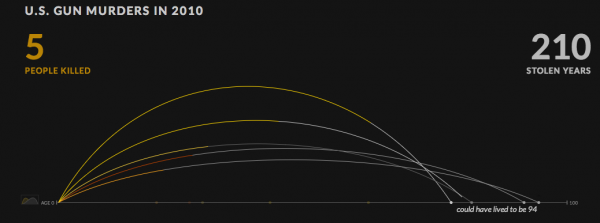
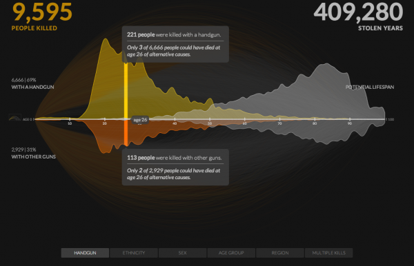
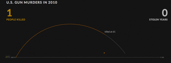
- Showing stories for each life lost and humanising the tragedy by calculating the potential lost years: the fundamentally tragic wasted chance for these people to live their full projected lives.
- Using the full resolution of the data provided/accessed
- Provides both an explanatory and exploratory experience
Data representation
- The metaphor of the arc of life connecting birth, death and potential lifespan through a single path.
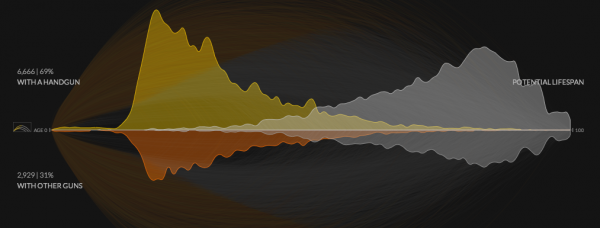
- The alternative views showing the distribution
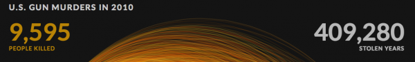
- The sheer impact of the headline statistics
- The hidden-cleverness of the calculations/profiles that have been used to determine the possible or typical lifespans
- The detail of each case available via a click/hover exploits the reality of the available data and elevates the human stories
Interactivity/Animation
- The animation is relentless, the incremental build up of so many lines just heightens the shock at this story.
- The speed of the animation is well-judged.
- The little act of the dot dropping like a stone to the ground as the life is lost is an inspired (if clearly a sad) device.
- You can click on and hover over every property of the chart to dig into the layers of detail that sit behind these
- The availability of variable filtering lets you explore a variety of different scenarios, demographics and angles to this subject
![]()
- The clicking on the age distribution/arc view toggle lets you see the age distribution details
- Choosing one of the filter options provides a split in the data, above the line is the data as selected, the below the line is the complementary story
Colour
- The colour choices work so well – deploying a limited colour palette to its full potential
- The flame-like impact of the central graphic (as pointed out in this FastCo Design article) there is an implied metaphor of the flame being extinguished
- The ghostly, grey line that continues the potential life span after death.
- The choice of black background gives it a suitably sobre and sombre backdrop.
Arrangement
- The placement, size, position, sequencing and hierarchy of every pixel is deliberate and aids the communication
- The central visualisation dominates the display, keeping the interactive features within the landscape of most VDU specs
- Further features are available a scroll-away, but don’t impinge on the main display and don’t appear as available until the animation has concluded
Annotation
- The slow, steady explanatory introduction to the animation provides a guide of what we are about to see through a handful of illustrated and annotated examples.
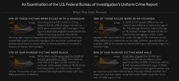
- The responsibility taken to pick out a number of key insights via the excellent ‘What the Data Reveals’ section
- The detail of the ‘Methods and Sources’ provides full recognition of where the data has come from, what has been done with it and also a nice attribution to acknowledge the influence/inspiration provided by peers
- The detail provided through annotation across the entire piece turning abstraction into precision, feeling data into reading data.