This is a guest post from Jon Schwabish, an economist and data visualization creator. You can reach him at jschwabi@yahoo.com or by following him on Twitter @jschwabish. Many thanks to Job for his efforts to keep us poor folk who aren’t able to make it to this great flagship event.
Cheers from Seattle! I’m going to try to do my best to cover Visweek in Andy’s absence. This is my first time attending Visweek and like many conferences, Visweek is a series of concurrent sessions so it’s impossible to see everything. After my first full day, I’m excited by the amount of information on display and the knowledge being shared and I’m really looking forward to the next few days.
In the Morning
I started my morning by browsing the BioVis posters in the main hall. Reading some of those posters was like reading a foreign language; they are clearly written for the science community and not for the person interested in general data visualization. I’m sure the tools, research, and research strategies are interesting, but they were not for me.
Okay, so onto my favorite part of my day and the reason why I came out a day earlier than I had originally planned: Jerome Cukier, Jeffrey Heer, and Scott Murray did a full-morning hands-on d3 training to a packed ballroom. (The tutorials and slides can all be found here ).
If you’re not familiar with d3, it’s an amazing tool that can do all sorts of great visualizations. (See these sites for more information: http://d3js.org/ and http://bost.ocks.org/mike/). If you don’t have programming experience in some of the standard web languages—HTML, SVG, and CSS (and I don’t)—getting started in d3 can seem overwhelming, but the presenters did a great job of showing us how we only need the basics in those other packages to get going in d3.
I think the conceptual part of the talk got off to a great start with this slide from Jeff Heer:
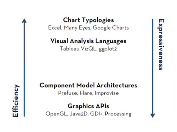
In it, Jeff made the point that there are some tools (for example, Excel and Many Eyes) that can help us be efficient at creating data visualizations, but are lousy at allowing us to be expressive with the data. On the other side, there are tools that (for example, OpenGL and Processing) are not so good on the Efficiency side, but allow us to be more Expressive in choosing and creating chart types. The d3 toolkit, he argues, fits right into that sweet spot.
The rest of the morning was filled with a great step-by-step tutorial, led primarily by Scott and Jerome. A few months ago, I spent several intense weeks trying to learn d3 (and only survived because of occasional emails from Jerome and Scott), and many of the questions from the audience were exactly the sorts of things that tripped me up. The explanations from all three presenters were clear and immensely helpful. If you’re looking to get started with d3, these slides are the place the start.
In the Afternoon
After a great lunch with Noah Iliinsky, I started my afternoon at one of the more academic-oriented research sessions. Okay, so I missed the mark on this one—these papers were out of my comfort zone and beyond me. I’m sure they were informative to people who are familiar with the field, but I didn’t get much out of them. The only thing I will say is that many of the slides were pretty bad—lots of text, lots of bullets, and bad graphics. At the very least, I expected a higher level of presentation quality from a conference on visualizing information.
So I left that session and headed over to the Connecting the Dots—Showing Relationship in Data & Beyond tutorial with Marc Streit, Hans-Joerg Schulz, and Alexander Lex. I missed a bit of Hans’ talk, but did get to see the other two tutorials and they were excellent, especially Alexander’s. (Slides from the three talks can be found here).
My favorite of the three was Alexander’s talk on how to link data. As a very simple example, think about his tutorial as ways to best visualize subgroups within a scatterplot, though his lesson extends to all sorts of places where linking data is important. He went through three major classes of links:
1. Proximity: grouping/linking by placing entities in close proximity;
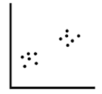
2. Similarity: adding a glyph, label, frame, or background;

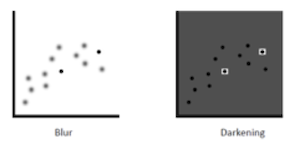
a. Similarity could also involve blurring or darkening the background and not necessarily highlighting the variables of interest;
3. Connectedness: connected items with a line or curve or surround items with an outline, surface, or volume.
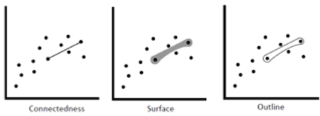
He spent time discussing the pros and cons of each and in the end, it was Alexander’s bottom-line takeaway that will stick with me: “Connectedness trumps everything else and can even be perceived faster than color”.
That concludes my first day at Visweek! I’m looking forward to tomorrow’s sessions, including a keynote from Mary Czerwinski (Microsoft) and papers on eye trackers, and uncertainty visualization, among others.

