
In the build up to next week’s US presidential elections, there are naturally many visualisation and infographic projects being released. A couple of contrasting projects have caught my eye about the ideological breakdown of the US Congress.
First up we have the ‘A Visual History of the US House‘, the latest project from the mouse of Nathaniel Pearlman, which depicts ‘the progression in political ideology of every House seat from 1789 to 2010’.

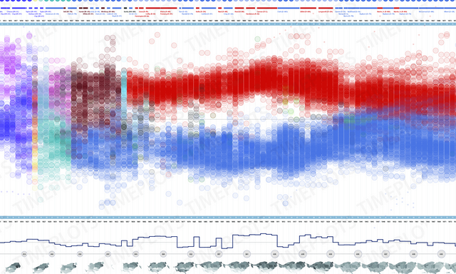
The image below takes snippets from this work, which is actually a poster that can be purchased. You can take a zoom look at it in close up here. As ever with Timeplots posters there is an INCREDIBLE amount of detail and care taken over every pixel of information being presented.

Then, we have a piece done by xkcd.com showing the ebb and flow of partisan attitudes down the years for both the Senate and House. Click on the image to bring up a full version and a large resolution graphic to allow you to see the similar level of fine detail here.

Here are a close up of the two main legends on this graphic which attempt to aid understanding.


These are both important pieces in demonstrating that sometimes visualisations have to be complex in order to preserve the essence of the data and story being told. Not everything has to be instant, not everything has to be ‘got’ in 5 seconds. Like the written word, somethings (like instructions) need to be clear, concise and rapidly digested and others, like novels, can be much more considered and slowly-immersed works.
However, the critical point of this experiential process is when you pass the initial ‘form’ judgment – how attracted have you been to the work, has it grabbed your attention, does it offer a subject matter on which you have an interest to learn/read about. This is where we move into the functional stage and where we need to start to feel like we are going to get something out of it. Both these pieces require a great amount of patience and willingness to invest time in learning how to decode and then interpret the graphics.
I think the Timeplots piece is much more accessible and therefore effective than the xkcd version with which I struggled quite a bit to get my head round, especially the break-off branches. Its kind of a mixture of a stacked area chart and Sankey diagram so involves a great deal of work to understand, even with the excellent attempt at annotated explanation.
This shows the fine balance all designers are faced with when depicting relatively complex data stories. Can you attract the reader through its form, can you keep them there through function and then deliver to them a learning experience.