I want to share some impressive work I’ve recently come across from a Toronto-based project/group called Bio.Diaspora. Last week the team was featured in the Lancet Infectious Disease Journal as part of a special report on Mass Gatherings and Health. The report focused specifically on the potential health risks posed by the mass gathering and transit of people attending events like the Olympic Games. You can find out more information about this story on the BBC and CBC, as well as through watching the animated visualisation below.
I got in touch with David Kossowsky, a GIS mapper, cartographer and graphic designer, to find out more about the work of Bio.Diaspora and some of the visualisations they have been working on.
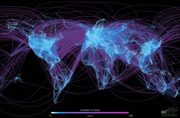
This image shows a visualisation of the global airline transportation network consisting of all commercial flights worldwide.
While this image in its entirety does not necessarily provide information that can be used to assess an infectious disease threat, it does provide one with a greater understanding of how interconnected the world is due to air transportation, and how easy it is for some diseases to spread across very large areas in relatively short periods of time.
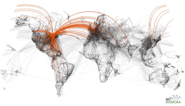
This image shows a similar visualisation with Toronto’s flight paths isolated and highlighted:
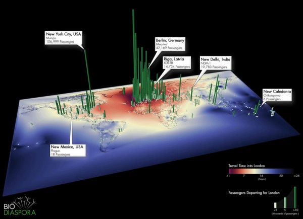
With the 2012 Olympic Games in London a key facet of their recent study, this next image shows direct flight paths out of London to the rest of the world.
This image can aid analysis by showing how many flights arrive from originating cities to a source city of interest. An image could also be created to show the opposite effect – how many destination cities a person is able to fly to from a potentially infected city or origin of interest.
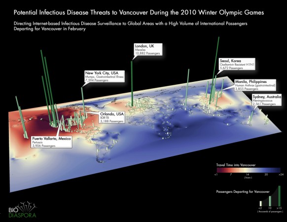
This 3D bar map shows passenger volumes entering into Vancouver during the 2010 Winter Olympics.
In order to better understand the risks involved around mass gatherings such as the Olympics, it is important to see not only where people are arriving from, but also the volume of passengers arriving. The base layer of this map shows an interpolation of global travel time into Vancouver. Because diseases vary in their latency periods, a person flying from one city to another may board an airplane infected but asymptomatic, and only develop symptoms while in the air or upon arrival at their destination city. By understanding the temporal nature of diseases, one can make better recommendations towards entry and exit screening at airports.
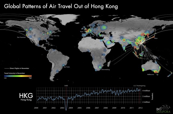
The final image shows travel out of Hong Kong to the rest of the world during the month of November, one of the world’s busiest air travel hubs.
With an overlay of both flight pathways and passenger volume intensity, one is able to see the zones which have the most passengers arriving from Hong Kong. The line chart at the bottom shows the monthly number of passengers leaving Hong Kong over a projected 12 year period. Interestingly, passenger volumes display consistent patterns in their seasonal growth and decline over time. Even when a major event impacts travel, patterns return to their normal ways after a fairly short period of time.
So how were these visualisations created?
All images were created with ESRI’s ArcGIS suite, and edited through Adobe Creative Suite. For the flight lines, raw flight data was obtained and processed, and the flight paths were calculated through Python scripting. The Bio.Diaspora technical team now focuses much of their time on web application development. We are also exploring other methods of data visualization, specifically 3D interactive techniques created in Processing and alternative ways of displaying data with and without the use of geographic maps.
If you want to find out more about Bio.Diaspora’s work, visit their site or follow them on their new Twitter account.

