
The Google Zeitgeist report for 2011 has been published reviewing the most popular news, events, people and stories according to search queries typed into Google during the year. This year’s report contains a baffling 3D visualisation to present the top 10 lists.
")
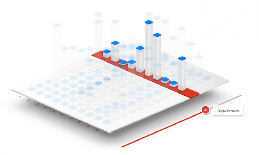
Here you have a 3D, multi-series bar chart with a slider device to help you navigate through the 12 months of the year. Not only do you have to contend with having to adjust your eyes to the 3D plane, but for some reason only the tops of the bars are actually visually distinguishable with the bars themselves ghostly transparent.
If you wish, you can attempt to compare the top 10 by selecting two search terms and following the progress of each query through the year, with the slider now moving you through chunks of 4 weeks, with display showing 3 lots of 4 week periods. Good luck with that. I would suggest a ruler, a sharpie pen and a defaced monitor may be your only hope of pulling that off.

Still struggling? Don’t worry because at least there is a ‘help’ prompt to guide us through this impenetrable design…
")
Outstanding, thanks for that.
I’m inclined to give this a ‘Worst visualisation of 2011’ badge because of its score on a disappointment index (an index I’ve just launched in my head today). Sure we’ve had an endless stream of shocking infographics but you don’t expect anything off them, they are an easy target. You just genuinely expect more from Google. For such a data and technology rich, innovative organisation this project just fails on so many levels.