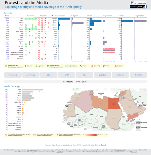
I’m delighted to share details with you of a challenging visualisation project I’ve been working on in collaboration with the team at the engine room. The title of the work is “Protests and the Media” and explores the recent uprising in the Middle East and North Africa, termed the Arab Spring. This data visualisation project specifically looks at the relationship between the severity and extent of each country’s protestations, the consequence in terms of government response and the level and spread of coverage in the media.
(If you can’t see the embedded closr.it widget above, please click here)
The closr.it viewer above allows you to explore the full graphic. A rapidly constructed, semi-interactive web version is also available to provide an alternative route in to this analysis.
Christopher Wilson, who leads the engine room team, has published an excellent blog post and visualisation page on his site which accompany this post and provide much more background to the purpose and motivation behind this project, the process of identifying the key indicators and the task of gathering the data. He also provides narrative on the insights to emerge from studying the resulting analysis.
The aim of this post is to share with you the design process that was pursued, explaining some of the key decisions made and the design choices that formed the finished work. I am going to structure this around the three key themes that shape any visualisation project: message, data and design. A fourth theme, which relates to the constraints and restrictions around a project, runs throughout and so is incorporated within the others.
Message
Showing due consideration to the issue of ‘message’ is possibly the most under-appreciated dimension of a visualisation task – the clear defining of the motivation and purpose for the analysis and what it is you are attempting to communicate.
As I’ve said in my introduction above, the key purpose behind this project was to explore the relationship between media reporting and severity or seriousness of the uprisings taking place across this region.
We wanted to determine what role the media was playing in the reporting of the protests and government responses. Was the breadth and volume of coverage consistent with the relative magnitude of protest and government response? If we looked across a diverse range of media agencies would we discover dis-proportionality in the focus of reporting, which could suggest evidence of editorial bias, geopolitical interest and sectarianism in the coverage?
This would be a complex ‘message’ to construct, not least because of the relationships that existed (or not) within and between the data. The size of protest and severity of government action would be a fairly subjective matter based on a likely combination of several different indicators and data collections.
Creating a satisfactory visualisation solution, one which offered a cohesive and accessible route into being able to understand the situation, would therefore prove a difficult challenge.
Data
(For true insight into this dimension I would recommend you read Christopher’s blog post and visualisation page which provide a detailed and interesting account of the challenges associated with identifying, sourcing and gathering the data.)
For this visualisation task I was provided with the following data, captured for each of the key twenty countries involved in this story (you can access the dataset via this Google Spreadsheet):
Context
- Population
- Date protests started
‘Severity’
- Max number of Protesters
- Deaths
- Arrests
- Repression Codes
- Concession Codes
Media coverage (all online reports and English language only)
- Media reports search start date
- Number of BBC reports
- Number of AJE reports
- Number of Reuters reports
- Number of Guardian reports
- Number of CNN reports
- Number of Press TV reports
- Number of Al Arabiya reports
- Number of Fox News reports
There were also a number of immediate calculations provided such as the maximum number of protesters as a % of population, arrests as a % of protesters and deaths as a % of protesters. This would help standardise the data and aid cross-country comparison.
There were three key challenges relating to the data element of this project.
Firstly, we were battling against the clock. As a live, evolving and ongoing story, data recorded about the ‘Arab Spring’ would be constantly changing and its quantities increasing. Just getting access to the data and validating it was hard enough (for the researchers, that is, I can’t take credit!) without having to accept the need to eventually draw a line under the data collection and produce the visualisation quickly to ensure it was still sufficiently ‘current’.
(Incidentally, the nature of this challenge has provided a real glimpse into the conditions that exist within the world of visual journalism – I take my hat off to all you who succeed in such a high-pressured and relentless, yet creative, environment!)
Secondly, the ‘severity’ data in general was quite problematic due to the wide distribution of values and the presence of significant outliers within each indicator, such as the size of the Egypt protest and the volume of Libyan arrests and deaths. This variation would restrict some of the visualisation methods that could have been used.
Thirdly, if we recall the purpose of this visualisation, it was to reveal (a) the patterns of media coverage (b) in the context of the seriousness of the uprising and (c) the nature of the response from the governments. Essentially, that would be two quantitative, one qualitative and one categorical variable (of country). However, the data we had would not conveniently map on to this simplistic model. It is important to remember that you can only make a visualisation as simple as the data allows, anything else can only be achieved by diluting the data communication.
A sense of ‘severity’ could only realistically be formed by subjective means, with the reader forming their own opinions about the extent of uprising, revolt and reaction each country had experienced by scanning the indicators separately. This meant the visualisation design would have to be opened-up more than was originally conceived, but in doing this it would allow the data to breath and the communication to flow better.
Design Process
Sketching and exploring – My initial scoping work involved sketching out possible layouts and structures, constantly remind myself of the need to create a solution that responded to the requirements outlined by the project’s purpose. The interplay between the data for severity, government response and media coverage was key so the design would need to create a cohesive story between these elements. Sketching different layouts would allow me to judge the potential sequencing and positioning of the different visual elements.
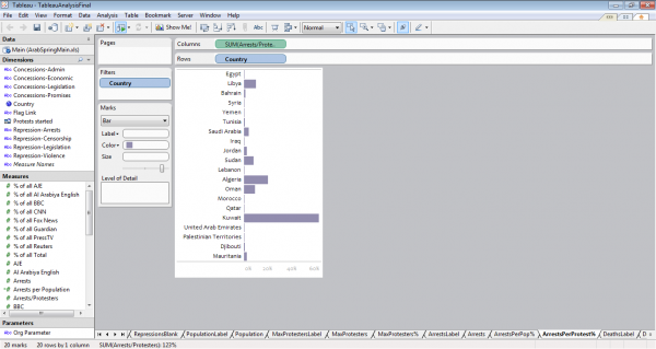
Complementing this stage, coming at it from the opposite direction, I always begin projects by thoroughly exploring the data, understanding its characteristics and visual potential. The most efficient and dynamic tool currently available for doing this is Tableau, which offers outstanding flexibility and ease of use to greatly help experimenting and digging around your data set.
Establishing limitations – In becoming familiar with the data I was able to identify the outliers, as mentioned above, and get a real feel for the sorts of physical properties each data element might offer. My aim was to try and achieve a static design, one which could survive the conditions of such a live data exercise as this, particularly as I didn’t have the time or resources to invest in developing a dynamic visualisation using one of the main programming languages or packages.
It was clear early on that there was going to be no simple or effective way of overlaying these distinct data clusters into a neat, single solution. For example, the media coverage data, in particular, would require the use of small multiples to exhibit the different geographical reporting trends between agencies.
Most times you will find that trying to combine multiple indicators and previously separate graphical displays on to a single display loses far more than you gain. With this design I was not looking to simplify the data any further than it allowed.
It is important not to underestimate the potential of the viewer to make global sense of distinct visual components, the key was to make these accessible and intuitive in their interpretation. Sometimes you have to invite the viewer to do some work to draw insights and this is an occasion when that attitude is necessary.
Having established clarity on this matter I was able to focus on the three sections of data almost as separate challenges.
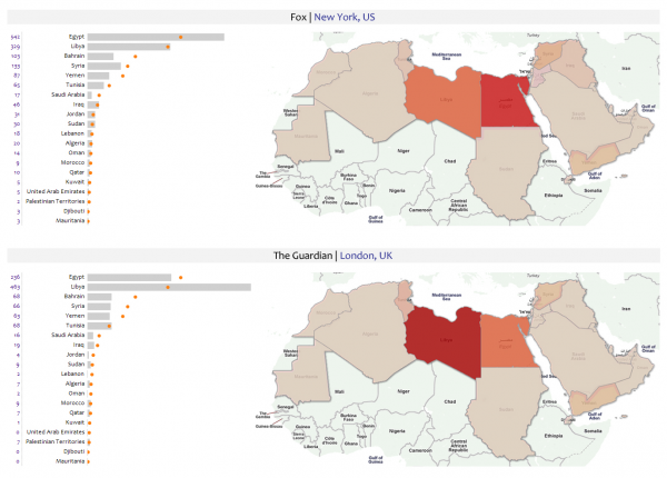
Media Coverage Data – The first data I tackled was the media coverage. The task was to present the trends for each media agency’s reporting characteristics and drawing out inconsistencies. There were two visualisation approaches to achieve this: 1) choropleth mapping and 2) simple plots against an average. These would be combined into an overall trellis of small multiples, allowing the eye to immediately pick out patterns and trends across the whole.
A key decision required here was to choose whether to focus on the absolute or proportions of reporting. I decided that this wasn’t a judgment of media power or resources (for which the BBC, for example, would stand out) but more about the profile. I therefore standardised all the data to reflect the percentage of reports for each country out of each agency’s total.
To create the maps I imported the data into a Google Fusion Table and merged it with a data file which had KML data for displaying polygons of all the countries in the world. I generated the map and customised the display, such as modifying the choropleth value range from 0% – 50% (the maximum proportion of any country) and using color brewer to deploy a best practice colour palette. I kept the value displays to an opacity of about 75% so that you could still make out the country labels underneath.
I then customised the map using the Google Fusion Table Layer and Google Maps API to reduce the colour domination of the terrain, remove some principality labels and finally remove the distraction of the water. With the basic map design complete, I ran the output for the eight different agencies and cropped the images in Photoshop. The final task here was to manually add in labels for some of the very small countries that are difficult to spot.
The bar charts were generated using Tableau. I set up a dual axis chart with the individual media agency (bar) plotted against the overall average across all agencies (the orange dot). This would reveal any inconsistencies in coverage against the typical profile.
One of the key decisions to make was the sorting order of the country labels. Alphabetical is the traditional sequence but my aim is to make every visual decision carry a meaning. I recognised that the focus was on media coverage so the countries would therefore be best sequenced in descending order according to the % proportion each country had been reported on overall.
To satisfy the appetite of viewers wishing to see the absolute values for the media reports, I set up a separate Tableau worksheet for this field, exported both the bar plots and this table as images and connected them in to a single graphic in Photoshop.
The overall effect created by the small multiples seems to work quite well. The eye is shown to be extremely efficient at being able to spot patterns and differences across these displays, on the maps seeing instantly the darker reds for Egypt/Libya with the western organisations through to the greater balance with Reuters, the dominance of Syria and under-reporting of Libya/Egypt with Al Arabiya, and then in more detail the relationship between each media outlet and the average.
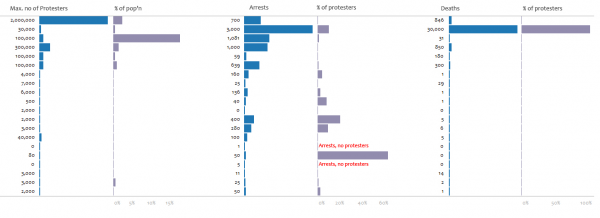
Severity Data – For the severity data I tried a wide range of methods (scatter plots, heat maps, log axes) and even considered excluding the outliers to allow the other values to achieve more prominence, but all were ultimately unsatisfactory and ultimately the good old bar graph or just a straight table of values were left as the only viable options.
Separating the absolute (eg. Max protesters) and contextual indicators (% of population) into separate columns was more advisable than trying to merge into a single display. This separation facilitates the process of interpretation much better. Nothing could help bring greater prominence to the lower end bar values, which were difficult to read (hence why I included the numeric values as well), but ultimately a small value will always be a small value – the lack of a substantial bar for these lower end bars and the difficult of seeing their values is itself a message.
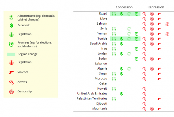
Concession and Repression – This was a fairly straightforward task, based on a blank image of a Tableau table and using Illustrator and Photoshop to create an array of simple icons to represent the concessionary and repressive actions each country’s government had taken. They were coloured to depict the positive (green) and negative (red) responses, with the regime change an overall outcome represented by a green bar. The difficulty was really about how and where to position this graphical element overall. Ideally it needed to be conveniently visible alongside the severity data to help form that subjective view of where you might expect media reports to be focused on – the greater the repressive tactics or concessionary actions, the higher profile the story, you would expect? In the end it was placed to the left of the severity data, as the first part of the story of each country’s experience.
Final Visualisations – The final visualisation was compiled by bringing together all the different ’tiles’ and layers into a single Photoshop graphic. This was quite an intricate process because there were many different elements coming together and my obsession with layout accuracy meant everything had to be positioned with exact pixel-perfection. The final piece was generated as a jpg file and then published using closr.it to enable viewers to explore the large graphic without sacrificing resolution.
In order to give viewers an alternative way of experiencing the data an accompanying interactive was hurriedly put together, using fairly crude html/asp programming. With more time and resources this would have been a much more sophisticated and immersive development but it does at least let you see the detail of individual media outlets in closer proximity to the severity data.
Final Reflections – Hopefully, the design provides an effective solution to the challenge set. It allows the viewer to make subjective judgements themselves about the seriousness of each country’s experiences and compare this understanding with the media coverage patterns and the extent of government response.
As with any design challenge the problem context (the aim of the work) and the range of variables and data structures you’re working with will always dictate the design approaches that are feasible and which ones are not.
Over to you?
What can you do with the data? The solution described above is but one approach to visualising this data. If you have creative, alternative ideas, and a bit of time on your side, why not access the dataset via this Google Spreadsheet and have a go. We’d be really excited to see some different designs to take this debate further, especially if you can bring them alive through interactivity.
Thanks
Finally, I’d like to thank Christopher for approaching me to join this project and congratulate him, Alix and all the other collaborators who worked so hard (and so late) to carefully source, validate and compile the data. It was a very good team effort!

