This is the sixth article in my Visualisation Insights series. The purpose of this series is to provide readers with unique insights into the field of visualisation from the different perspectives of those in the roles of designer, practitioner, academic, blogger, journalist and all sorts of other visual thinkers. My aim is to bring together these interviews to create a greater understanding and appreciation of the challenges, approaches and solutions emerging from these people – the visualisation world’s cast and crew.

David McCandless is a data journalist and information designer based in London. Over the past 2 years David has emerged as one of the most prominent visualisation designers, largely through his exceptionally popular book “Information is Beautiful” and accompanying website.
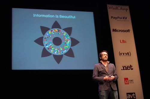
Other than Hans Rosling, it would be fair to say that, through his book, his ongoing design work and several high profile public appearances, David was the most talked about star of the visualisation scene in 2010. It is therefore self-evident that I would wish to invite him to take part in an Insights article and I’m extremely grateful that he was able to find time from his extremely demanding schedule to offer his thoughts on a range of issues.
![]()
You’ve had a varied career to date – can you provide a brief narrative of the key milestones in your education/training/career background that led up to your current data journalist/information design career you enjoy today?
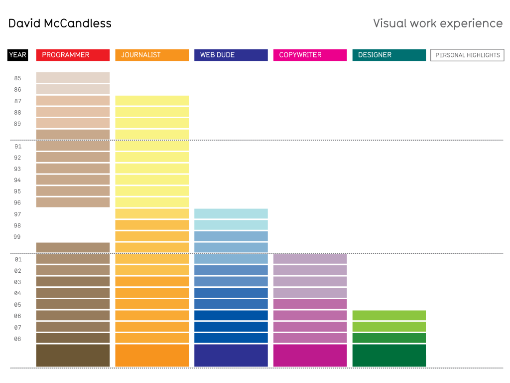
Sure. I’m 38 years old and have been a professional journalist for 23 years (since I was 15).
1986 (aged 14) – hacking column for cult ZX Spectrum magazine, Your Sinclair. I would break into games and work out how to give players infinite lives.
1989 – Studied English at University Of London. Dropped out aged 19.
1990s (20s) – Wrote for video games magazines Zero, Pc Zone – UK Doom Champion
1997 (26) – Freelance feature writer on technology, web and game culture. For Wired Magazine US & UK, The Daily Telegraph, The Evening Standard.
1999 (28) – Wrote & edited seethru.co.uk, part of an interactive drama on BBC 2 in the UK. One of the first websites to feature something called a “blog”.
2001 (age 30) – Freelance reporter for The Guardian, Telegraph and Independent. Writing about web culture and anything “strange and interesting”.
2003 (32) – Freelance conceptual copywriter specialising in digital advertising. Clients included Orange, Amnesty, BBC. Won 2 webby awards, one silver pencil and over 14 separate industry awards.
2006 (35) – Wrote the The Internet Now In Handy Book Form! a spoof of the internet. Self-orchestrated viral campaign.
2007 (36) – Creative Director working in advertising. Started designing infographics. Had the idea to do a book of information maps and charts called “The Information Atlas”
2008 (37) – Wrote and designed ‘Information Is Beautiful’. The book took 1 year of solid work to design and refine. Plus 6 months of research. 6 months of doubt.
- Aug 2009: InformationIsBeautiful.net website launched
- Feb 2010: Information is Beautiful book released (called ’The Visual Miscellaneum’ in the US)
- late 2010: German, Spanish & Finnish versions of the book released
When/what was your “aha!” moment in terms of information design – when were your eyes opened to the world of visualisation and what defined some of the techniques you employ today?
2007 I was a working journalist and having to stay on top of loads of different subjects, keep copious notes and track the developments and ideas in the various fields I was interested in and writing about.
This was fun but hard work. I’m into loads of different subjects: tech, philosophy, science, culture, sub culture, history etc. So I was generating a lot of material.
I was researching a piece about Evolutionism and Creationism. It was generating huge amount of notes as Evolutionary Theory is made up of loads of different camps, all with slightly varying perspectives. At the same time, Creationism is made up loads of different camps, all with slightly varying perspective. I wanted to try to depict them all.
So, to keep track of all these different camps, I drew a visual map, and tried to sum up, distill, each camp into the minimum words.
In the end, I had this pretty interesting diagram. I looked at it and thought: “Hmmmm, I don’t really need to write the article now. It’s done the job of delivering the information.”
Then I thought: “Maybe I could do this to loads of subjects? Instead of writing an article, this diagram could be the article?”
I then started looking at my notes and article ideas with that in mind. That was it really.
How would you define your visualisation/design style?
I’m always going for simplicity and clarity and space. Partly as a response to information overload. But also because journalism and design share a common goal – they want to make things clearer.
Who would you describe as being the most influential authors, writers, designers or academics behind your visualisation techniques and design identity?
Key influences: Edward Tufte, Ben Fry, Robert Horn, Judith Donath, Marshall McLuhan, Wurman, Otto Neurath, Gerd Arntz, Bureau D’Etudes, Stamen.
Um, I look at everything – I subscribe to design blogs and look at them everyday. So I would say I’m influenced by information design as a whole, and by the web. Alas, a lot of the blogs I look at don’t necessarily have back-links to the designers, so I don’t often know whose work I’m looking at (that’s a reason why I always put a prominent signature on my work)
Many readers will probably own or will have read a copy of your book “Information is Beautiful”/”The Visual Miscellaneum”, what motivated you to write the book and how did you identify the visualisation subjects included?
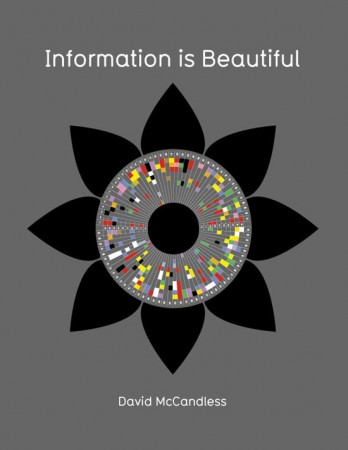
After starting to play with infographics, I suffered a good six months of doubt. My agent wanted me to do another book and asked me what I had. Meekly, I presented this idea of a “mapbook of ideas”.
In terms of identifying the visualisation subjects included. I just followed by ignorance and frustration mostly! I set about trying to answer questions I wanted answered. And to fix things that frustrated me about information – the reporting of abstract billions dollar amounts, patterns in media.
I also had some cool ideas – like Time Travel or Wikipedia Edit Wars – that couldn’t wait to visualize.
But I think frustration, ignorance, boredom, bewilderment can be as inspiring as joy or curiosity or conversation. Those ‘negative’ feelings are a sign that something isn’t working. And an opportunity to design a solution.
How long did it take you to construct the collection of published designs?
It took a year of solid work.
Any plans for a follow-up?
Yep. I’m going to be announcing something soon.
![]()
[click for full image view]
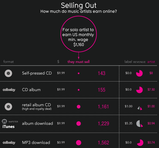
What was the motivation/curiosity that sparked the research behind this piece of work? Was it simply the topical nature of the digital economy bill or was it something you had been working on for a while?
A friend (thanks Neilon) sent me a link to blog post by the Cynical Musician called ‘The Paradise That Never Was‘.
In it, he lamented the fact that the potential of the web as a golden, global marketplace for ALL musicians, not just those on major labels, had never really appeared. He felt record companies had quickly colonised and contracted the space. So that musicians ended up being screwed. As evidence, he produce his pitiful micro earnings from Last.fm etc and compared it to the minimum wage.
I thought it was a fantastic insight. But also the linking of the data to a real world figure that we can all relate to (the minimum wage) really de-abstracted the numbers.
I felt it was a great approach.
As a user of Spotify and other music services, I felt appalled that musicians were being so ripped off. I wanted to find out the truth about the figures.
So I set about applying the same metric to all the main online services (US, UK & Global) and double-checking the figures.
(Incidentally, I had to get the Spotify figure leaked to me by an industry insider. It’s a very closely guarded secret).
You always provide a detailed background behind you/your team’s data research – presumably your journalistic leanings shows a strong ethic around accuracy and thoroughness –what proportion of the overall project duration was spent gathering data vs. the actual design preparation and execution?
There was a huge amount of research that went into this. It was very difficult to keep on top of the figures and to decode the various systems and proportions music services use to calculate revenues. Also there were several different categories of earnings (physical sales, streaming, downloads etc) so I had to juggle apples, oranges and pears.
I would say it was 80% research. 20% design.
What software/techniques do you use to handle the data/ analysis and prepare it for the visualisation?
I just use the spreadsheet function in Google Docs.
My approach is always to create well-designed spreadsheets – using colours, filled bars, separators, bolds, emphasising key figures, de-emphasising less vital numbers – so the spreadsheet is as legible and understandable as the final design. You should be able to understand the issue if you look at the spreadsheet.
Also, the spreadsheet often acts as the ‘skeleton’ for the design. If you’ve structured the data well, so that the meanings is clear, then the visual design is often pretty straightforward. You essentially just design what’s in the spreadsheet – perhaps using visualisation techniques to lead the eye, emphasise data and make it attractive.
In terms of the design, how did you arrive at the concept of your display? What sort of alternative solutions were you considering? Were there any constraints that restricted the solutions you could arrive at (eg. time, space, layout etc.)? Can you explain some of the deliberate decisions you made around the visual properties in the design? I’m particularly interested your decision process around the growing pink bubbles representing the variable ‘need to sell…’ and the common difficulty of representing hugely diverse ranges of values like this on the same graph.
The image went through 5 main drafts. That’s unusually low for me actually.
I wanted to run it as a blog post, rather than a larger visual. So the width had to be 550 pixels wide. I wanted people to be able to mount it in their own blogs.
Running stuff at 550 width presents some problems, mainly that the fonts have to be small. Legibility etc becomes an issue.
Draft 1 – The key stand-out, easiest-to-understand metric in the whole dataset is ‘how many a solo musician must sell to hit minimum wage’. So this acted as the central spine of the design. This section was given a key colour to further emphasise it.
It worked well because there’s basically a massive visual punchline when you get to the bottom. In the early drafts the punchline is even more massive because I got my calculations wrong on Last.Fm
Draft 2 – I also wanted to convey the proportions of each type of sale a musician makes. Which I felt was interesting and added visual variety. So I started using pie charts.
In the meantime, I started adding visual elements or representations for each sell. I thought it created more visual variety.
It was a fairly simple design – essentially it’s a table. But I was refining and re-calculating the data right from the start.
From a process point of view, do you tend to sketch ideas out on paper first or go straight into ‘playing’ with the data, exploring different compositions and iterations?
I sometimes sketch. Sometimes the data shapes the image (as in this case). Other times, you just try different approaches until one works.
Generally, I think if you move into digital too early, you can get stuck in the ‘purity’ of it. I’d say stay on paper and sketches for as long as possible. You can debug a sketch pretty well. So if it works on paper, especially when you show it to other people, it’ll probably work onscreen.
Other than using (presumably) Illustrator, are there any other software tools that you use to help create the final designs?
Nope.
Are there any particularly intricate or advanced features of this software that you could share?
Not really sorry.
Of course any design brief could be delivered in many different ways. On reflection, is there anything you would wish to change, add or remove from this design? Have you received any suggestions or comments that you thought represented good ideas?
Looking back on it now, I would probably de-clutter it a bit more. Maybe lose the $ column. And perhaps centre the final bubble. It annoys me that it’s not centered. Otherwise, not bad!
I think one commenter said, I should add an infinite sized bubble for all the radio plays an artist gets that nobody pays for. Hmmm, good point.
![]()
How do you see the state of the visualisation field right now (ie. encompassing data journalism/information design) both in the UK and worldwide?
Pretty exciting. Expanding rapidly. All the infodesigners I know are busy, busy, busy.
I despair a little at the infographic dreck that has appeared. But I think the good pieces are still rising to the top and being seen.
There still seems to be a boundary between journalism and information design though. Still I think many designers and journalistic are falling into the pitfall of thinking just visualising something makes it good or interesting enough. I’d love to see more designers getting some journalistic training – and more journalists getting some design training.
Do you see any regional differences in techniques or approaches to visualisation across Europe compared to the UK/ US other parts of the world? Alternatively, does visualisation exist as a genuine global community progressing and evolving collectively?
Not sure really. As I said, I look at design pretty agnostically. I don’t often know where it comes from.
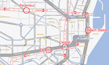
You recently accompanied David Cameron to India, how did this come about and what were the key insights that struck you from your experiences on this trip?
My name got on a list! I was as surprised as you. It was quite a mad trip. The Indians we met were as hungry for data visualisation and information design as we are.
You were also recently invited to go on BBC’s Newsnight programme, debating the issue of data visualisation and in particular the issue of aesthetics. Do you have any reflections about how the subject was presented and how the subsequent discussions went?
I was flattered and amazed to be asked to appear. I haven’t done telly for a few years. So I’d forgotten what it was like. Specifically, I forgot how TV journalism reduces debate down to two opposing polarities: for and against. Which I think for a topic like information design is a lame approach. How can you be against information design? It’s just a technique!
So I was caught on the hop a bit and felt quite bemused by what was going on. I thought we might have a debate about its potential and its limitations. But no.
One of the criticisms I hear (and generally agree with) about the visualisation field is that it is good at celebrating and promoting itself inside the community but struggles somewhat to effectively penetrate beyond into the wider business community.
That could be true, though I’ve had many people approach me from the business world wanting visualisations, tools and insights.
There are clear benefits for the communications industries: journalism, advertising, marketing, web.
But I think businesses hungry for new insights and innovations may be disappointed by what this field can offer.
I think data visualisations can provide insights – sometimes. But the data has to be worked and moulded and played with journalistically – to reveal those insights. I’m not sure visualisation per se or automated tools can do this. You need a brain.
Data needs humans to be interesting.
How do you go about articulating and selling the benefits of data visualisation to those new to the subject, especially given that a direct return on investment can be somewhat tenuous?
It’s self-evident isn’t it? Information design either works or it doesn’t. If it does, it’ll conveys its message and be understandable to virtually anyone. Like a road sign. Or an iPod. No selling of benefits required.
I’m extremely grateful to David for taking part in this interview especially as his time is unquestionably in very high demand right now. He has offered a great insight into his life as a prominent visualisation designer and readers will find some invaluable advice contained within this article, especially in terms of career pathways and design process. I wish him all the best in his ongoing quest to conquer the world of visualisation in 2011 and look forward to his announcement of a follow up to his book. For those of you who don’t already follow David in any shape or form, you can buy his book here, visit his blog and see his relentless stream of new designs here and follow him on twitter via @infobeautiful.

