
Over the past couple of months I’ve noticed a number of new examples of streamgraphs working their way around the web. It has prompted me to finally get around to visiting this subject because these graphs always seem to stir great debate, one which seems to perfectly encapsulate the ongoing challenges faced within the visualisation field.
From my own point of view I’ve so far sat very much on the fence, failing to form a specific opinion about where I stand on these graphs. Attracted by their aesthetics but concerned by the ease of their legibility I’ve decided its about time I investigated further.
The purpose of this post, therefore, is to share some of the examples and background information that I have unearthed about streamgraphs to help myself and hopefully others better understand the context of their design and usage.
A journey down the stream
First, lets take a look at some of the applications of streamgraphs. In some cases these are also known as theme rivers (now a trademark) and steam graphs (largely by those responsible for slight typo’s) but for the purpose of consistency I’ll stick with streamgraphs.
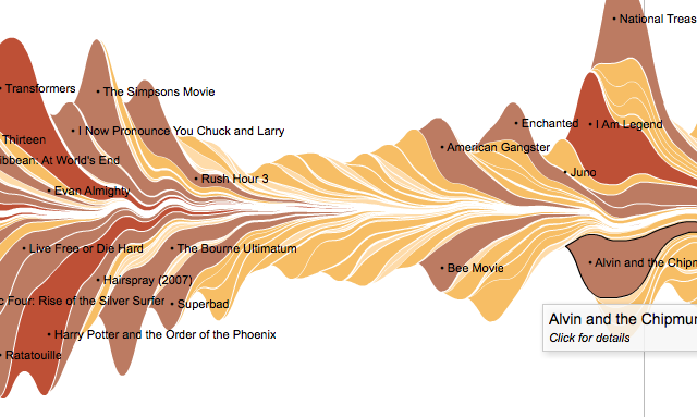
Perhaps the best known example of a streamgraph was published in the New York Times in February 2008 depicting the ‘Ebb and Flow of Movies: Box Office Receipts Over Past 20 Years‘.

It is an interactive visualisation which reveals the patterns of the amount of money films over a 21 year period make at the box office. The total takings are shown by the varying heights the shapes reach over time. The colour scheme represents the gross takings and the length of each shape reveals its longevity in the cinemas. Clicking on a particular film’s shape will bring up a brief overview of that film with further links to other web pages such as review sites.
The print edition of this graph was presented with a vertical layout (perhaps this is where steamgraph becomes a valid label!?) to fit the natural layout of the newspaper as well as accommodate the lack of interactivity:
")
At the Malofiej 2009 awards the print- and online-editions of the NYT graphic shared the Peter Sullivan Best of Show Award – a real success for it’s collaborating team comprising Lee Byron, Amanda Cox, Matthew Bloch and Shawn Carter (apologies if any other contributors are missing from this list).
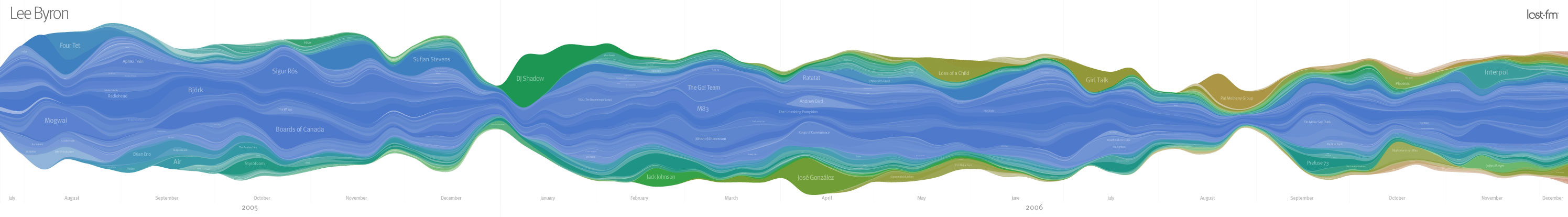
This visualisation built on previous work by Lee Byron who, through his undergraduate studies, developed an innovative means of presenting the changing trends in users’ last.fm listening history. This work showed a stacked graph of all the artists a user has listened to over time with the height representing the number of listens. As Byron describes, “the poster is a sort of virtual mirror, reflecting very personally significant events made visible by the changes in listening trends”.
A paper entitled “Stacked Graphs – Geometry& Aesthetics“, authored by Byron and Martin Wattenberg (2008) provides some fascinating explanatory detail behind this development, both in terms of the technical approaches as well as the design decisions made. I would urge anybody serious about improving their knowledge about visualisation to have a careful read of this paper. It provides great information about the challenges, decisions and constraints associated with crafting innovative visualisation approaches that strive to balance aesthetic appeal with the safeguarding of legibility.
Whilst the Byron et al examples has unquestionably been the most prominent demonstrations of a streamgraph, the approach to visualising multi-layered or stacked themes of data over time first emerged back in 2000 in the work of Susan Havre, Beth Hetzler and Lucy Nowell, detailed in the paper “ThemeRiver: In search of Trends, Patterns and Relationships“.
This paper describes the development of an interactive system called ThemeRiver and includes a proof-of-pinciple demonstration using a text analysis engine to analyse the textual content of Fidel Castro’s speeches, interviews and other articles over a 40 year period:

The ThemeRiver interface design is described as “simplifying the user’s task of tracking individual themes through time by providing a continuous ‘flow’ from one time point to the next”. Furthermore, “we believe this metaphor is familiar and easy to understand and that it requires little cognitive effort to interpret the visualization”. According to the authors, plotting these thematic patterns over the period against the context of key historical milestones facilitated analysis of possible relationships between Castro’s words and topics and the events that unfolded.
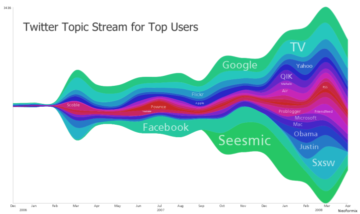
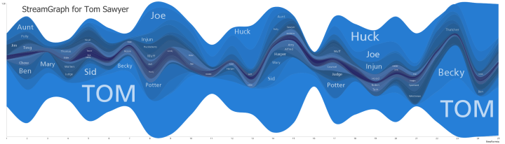
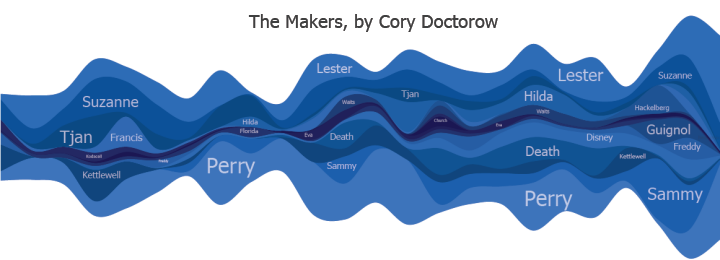
Back to more recent examples, another prominent developer of streamgraphs is Jeff Clark, a designer based in Toronto. The images below present (1) analysis of the most prevalent and interesting topics discussed by the top 100 Twitter users and (2) communicating the ebb and flow of the various characters throughout the books ‘The Adventures of Tom Sawyer‘ by Mark Twain and (3) ‘The Makers‘ by Cory Doctorow.
Jeff has also produced work for the Harvard Business Review presenting analysis of over half a million tweets referring to the iPad, identifying some of the key text, meme and sentiment trends contained within these tweets and demonstrating how visualisation tools working with Twitter data can provide marketing analysts with important consumer insights.

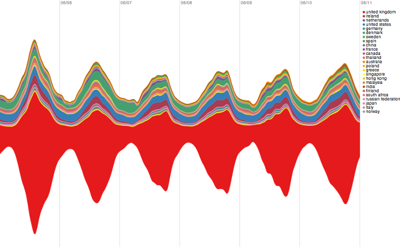
Continuing the theme, following the recent World Cup, Twitter produced a streamgraph to “illustrate the global nature of the games and how fans’ interest and enthusiasm built over the course of the tournament on Twitter”. Each country’s flag and colours are used to represent the volume of tweets using each ‘hashflag’, with the size of the waves fluctuating with the frequency and consistency of tweets containing each country’s hashflag. In the background, a busy line graph shows the frequency of Tweets per second across the entire service. I find a confusing visual aspect of this graph design is the inclining central axis about which the waves and flows are presented? This is an unexplained, different approach compared to the previous streamgraph examples.

Further examples come from one of my favourite interactive visualisation designers, Moritz Stefaner, who was influenced by Lee Byron’s Last.fm work and developed an iterative range of visualisation solutions to present patterns in the models of tagging structures used on various websites, depicting trends to show how tags emerge and decay in use over time. You can read more about this work here and here.


Another solution to the challenge of presenting multi-layered data comes from Martin Wattenberg’s Baby Name Wizard which is an interactive display of hundreds of thousands of instances of baby names through the years, allowing you to filter individual names and see their individual patterns of popularity.

")
Next, the relentless innovators at Stamen have recently announced a new visualisation project to explore the incredible the volume of data that is all the IP addresses on the internet. The start-off point for their work has been to come up with a basic metaphor for the project but rather than starting off with a traditional map approach they “wanted to get a sense for the overall flow of things” and so deployed streamgraphs, here to take a look at some specific data around the trends of visitors to British gambling websites.
Stamen have also previously worked on a project to display the changing strength of digital signals that overlay urban landscapes. Their visualisation displays the relative strength and density of networks encountered over time as a participant walks through a city. Each new network creates a new vertical bar and a new colour on the spectrum, fading and disappearing as the signal strength comes and goes. The height of each bar represents the combined strength of the wireless networks currently in range. Open networks are presented above the central line with a white background and closed/private networks are below the line with the grey background.
This next work, by Jure Leskovec, Lars Backstrom and Jon Kleinberg, attempts a similar multi-layered approach for a “Meme-tracking and the Dynamics of the News Cycle” project to present the rhythm and flow of news stories across millions of news and media sites and articles over time. The difference with the other streamgraphs approach here is the use of a fixed baseline axis, which I’ll come on to later.

Reaction and debate
As I mentioned in the introduction, the use of the streamgraph approach has been met with particularly polarised reaction. The achievement of the Malofiej award for the NYT graphic team, a significant recognition from an esteemed panel, has stirred great debate particularly due to the increased profile and exposure this award created.
A journey around the many design and visualisation blogs reveals strong sentiments of appeal towards the graphic approach, certainly in terms of the aesthetics with terms like “pretty” and “attractive” especially commonplace. In their paper Byron and Wattenberg recognise that “the visual appearance of the graph drew people in or kept them looking at the graphic”.
On the VisualJournalism website, Gert Neilsen admires the elegance of the NYT streamgraph as a technical solution to this complex data challenge but questions the focus of the underlying story behind the graphic, taking the wording of the project’s title to imply an as-yet-undefined purpose. Moreover, he questions if it “would it be too rude to call this category ‘Fun With Numbers’? or a more polite version: ‘Art With an Infographic Function’”.
Whilst the majority of commentators seemed enthused by the visual appeal of the streamgraph approach (a minority unearthing imaginative, x-rated visual comparisons!), the issue of legibility appears to be the central factor determining overall opinion.
This is acknowledged by Byron & Wattenberg and Havre et al, the latter recognising the fundamental challenge of the design: “ideally, a visual metaphor facilitates discovery by presenting data in an intuitive, easy way that lets users interpret the presentation and data without undue strain. Further, the visualization should not mislead the user”.
Alberto Cairo, who taught online graphics and was a successful graphics director at El Mundo Online, takes a hardline view describing it as “one of the worst graphics the New York Times have published – ever!”, explaining that our knowledge of the science of cognitive psychology shows the brain is unable to handle overly complex graphics of this nature without sufficient context. In the article referred to above, Gert Neilsen continues to ask if the graph is “too sexy for its own good?” raising a number of technical aspects that undermine the accuracy or readability of the data points and theme shapes.
There are some very interesting comments on a FlowingData post that followed the publishing of the NYT movie streamgraph. A number of people seemed capable of drawing decent insight from the graph such as which films were instant hits, failures or notable ‘slow burners’ as well as the macro-level seasonality of moviegoing in general. Several praised the data density achieved and the use of colour to distinguish the shape topics and to encode total takings. In the narrative that accompanies the Stamen ‘IP address’ visualisation, there is an acknowledgement that some people confuse the shapes displayed either side of the central zero-axis and take them to represent positive and negative values. Further comments describe the process of data reading as overly complex and confusing because of the nature of the sloped scales and lack of a coherent axis. This issue is acknowledged in both academic papers mentioned above.
Forming my view point
Visualisation is an optimisation problem. It is about communicating or conveying data in as effective a way as possible, squeezing the maximum value and purpose out of every design variable to achieve and maintain engagement through aesthetic appeal whilst enabling accurate insight to be drawn from the data displayed.
As I often mention in my posts I tend to rely on the simple formula message + data + display to inform my own process of crafting a visualisation and also to judge the success of other designs. It must have a clear message and motivation for being created, it needs to be accompanied by accurate, complete and relevant data, and then packaged and presented with effective design and appropriate display choices.
As I grow increasingly aware of the hidden challenges and significant constraints designers face when executing these projects I have now evolved this formula slightly to include the factor of context – a hugely influential factor on the other components in this formula. To be clear, context is not referring to the message or motivation behind the piece, but the restrictions that exist around the project that largely effect the options available to the designer, whether this is time, physical space, necessary format or practical necessity. Going back to optimisation, this is, crudely, about making something as good as it can be. Often as judges of people’s output we find it easy to criticise without appreciating the limitations inherent in a project’s context nor arriving at a better alternative suggestion.
This is the environment which I feel is particularly prevalent with the discussions that have engulfed the streamgraph. Yet, reading about the background of the developments presented above reveals a very careful, sensitive, delicate, thorough and deliberate journey through the optimisation challenge created by attempting to effectively display such large datasets. Moreover, the designers have clearly got a healthy respect for the dual demands of legibility and visual appeal and an acute awareness of the potential shortcomings that may still exist.
So what do I think? Up until researching this post I was tending towards the view that streamgraphs were very elegant visual constructions that didn’t work particularly effectively as a means of communicating data.
My better informed view is that a streamgraph is a fantastic solution to displaying large data sets to a mass audience (as per the objective introduced in the Byron & Wattenberg paper). They are, however, at their best when existing as an interactive exploratory tool enabling users to take a journey along the flow of patterns, following their curiosities, forming and testing hypotheses as they learn about the data. Techniques such as sorting, filtering, brushing, selecting, panning/zooming, constructing/deconstructing and hiding/showing graphical apparatus supports thorough exploration of the data on both a macro and micro level.
From a technical execution perspective they are fantastic. The complexity of the calculations and layout algorithms, of the interactivity demands (such as the re-drawing required to respond to a change of resolution) and the juggling of design decisions around shape, ordering, labelling and colouring represent hugely impressive technical achievements.
I believe streamgraphs work significantly less well when they exist as a static or print version. Visualisations as technically sophisticated as this, that present data as vast and complex as they do, naturally require subtle trade-offs. Unfortunately, these trade-offs become exposed without interactivity. The main problem facing static streamgraphs lies in the difficulty of reading data points formed by uncommon shapes.
Studies conducted by noted author William Cleveland demonstrated the difficulties in accurately assessing the values formed by curved and sloped shapes like those in the streamgraph. The diagram below is taken from “Graphical Perception: Theory, Experimentation, and Application to the Development of Graphical Methods”, Cleveland and McGill (1984) and compares variations of two curved lines on the left with a single line on the right representing the size of the difference between the points along the curved shapes. This experiment reveals the high potential for mis-reading the values of sloped shapes.

With an interactive version, a number of approaches are available to overcome this problem. Firstly, you could include the option for users to show/hide subtle vertical gridlines which would create a vertical path to help the reading of the shape heights. A second option would be to recognise the macro version of the streamgraph as an interface device and enable users to select (and therefore filter) a particular shape of interest which would then dynamically become the sole focus of the graphical landscape. An example of this type of transition is found in the NYT graphic which looked at “How Different Groups Spend Their Day“.

This graph displays the percentage of people involved in each activity category across the 24 hours of a typical day. You’ll see that the ambiguous shapes are similar formations to those found in the streamgraph, but the power of this graphic is that you can select a specific category and the graph transforms to show only data for that activity (as below). Furthermore, this dynamically altered display is presented against a baseline x-axis which enhances the potential for reading the data and understanding the shape of that activity more accurately.
")
This type of enhanced interactivity would significantly improve the potential for web-based streamgraphs to allow users to draw accurate insights about the categories and shapes within the overall flow.
Many observers have commented that a clearer display could be achieved by using a traditional stacked area chart as well as having a fixed baseline to aid value-reading. The iterations and experiments that went behind the work of Havre et al and Byron & Wattenberg reveals flaws with these approaches, causing a lack of smoothness and exaggerating the distortion of ongoing theme shapes. In a Q&A discussion, Amanda Cox (part of the NYT movie graph team) describes their decision around including a fixed x-axis:
Matthew [Bloch] actually made a version for people who care deeply about a fixed x-axis. We rejected it because it didn’t do a good job of answering some of the questions that I thought were the most interesting (about peaks and ebbs of individual films). As it is, it’s a lot of fun to look at films like Top Gun and Ghost. In a more traditional chart (like a stacked bar graph), it probably wouldn’t be, unless you were willing to lose the shape of every other film. Different forms do better jobs at answering different types of questions. This form attempts to distort the shape of each film as little as possible; it works well for some types of questions; for others, not so much.
It is no surprise to see the term ‘ebb and flow’ used in several of the streamgraph titles because they genuinely do capture the dynamic and organic relationship within large datasets over time. The key to their success is to maintain this theme of dynamism through rich interactivity to unleash the full potential for user exploration. Furthermore, users need to better understand and appreciate the design optimisation these graphs achieve and, before criticising, recognise that sometimes there are no available, better solutions.