The New York Times, the Guardian (UK) and Der Spiegel (Ger) have published details of a huge set of war logs from the whistleblowing website Wikileaks, detailing the war in Afghanistan.
There are many aspects to the journalistic challenges facing these organisations who have been selected and trusted by Wikileaks to handle the responsibility of publicising this story and making sense of the data.
The volume and breadth of data to work through, the complexity of the emerging stories, the responsibility for accurate and sensitive reporting (NYT’s note to readers) and visualisation devices required to effectively present these stories are just some of the demands being placed on the various journalists and design experts who will have been carefully deployed to handle this story.
I concede that I know little about Der Spiegel’s track record with interactives, infographics and other visualisations but the first two are well established (and repeatedly recognised by awards) as being two of the most capable media organisations in respect of the use of information displays to enhance their reporting. I’ve yet to see the reasoning behind Wikileaks selecting these three – I’m sure its based on their political leanings – but I would imagine their reputation for data journalism, their ability to draw insight and impart robust data-stories will have been prominent factors.
A New Age of Journalism
Stepping away from the subject matter reveals a fascinating demonstration of the practice of data journalism, as acknowledged by the Guardian themselves here and in their live blog, an excerpt of which states:
With the number of documents released, many have, understandably, struggled to reach an instant verdict on how significant the information is. But media commentators have been quick to see the significance of the way the information was released for future models of journalism.
One example is Jay Rosen’s blog for New York University and another is Alexis Madrigal’s blog on the Atlantic. Madrigal describes the publication of the documents as “a milestone in the new news ecosystem”, and writes of:
“new conduits … opened into the most highly regarded newsrooms in the country. In the new asymmetrical journalism, it’s not clear who is on what side or what the rules of engagement actually are. But the reason WikiLeaks may have just changed the media is that we found out that it doesn’t really matter. Their data is good, and that’s what counts.”
Visualisations (Last updated 27/07/10)
Here are the visualisations produced so far by The Guardian and Der Spiegel. It is interesting that there is nothing yet to emerge from the New York Times. There could be three reasons for this 1) taking their time to produce a fantastic interactive, 2) they have decided to keep their coverage limited to written prose, 3) they have an agreement with the other organisations to leave the infographics work to them. Who knows?
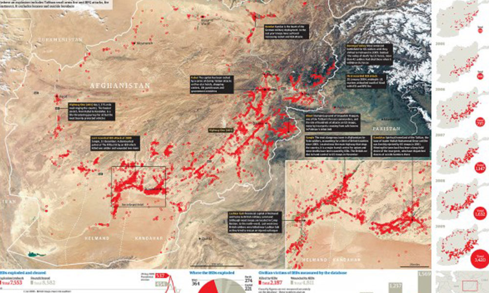
Guardian – IED attacks on civilians, coalition and Afghan troops
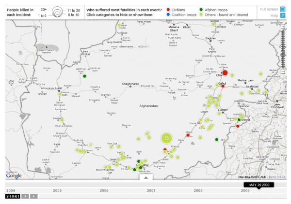
Guardian – IED attacks by location by year
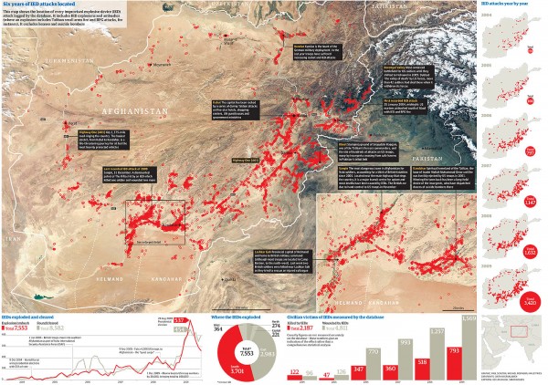
Guardian – selection of significant incidents
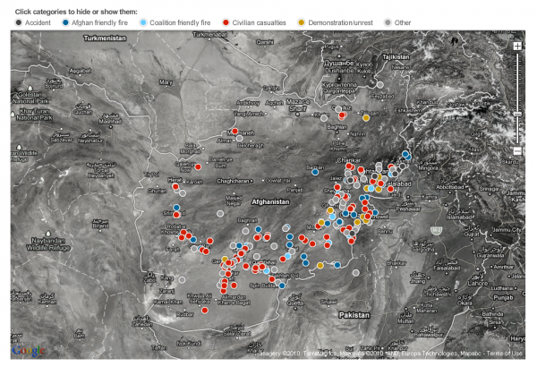
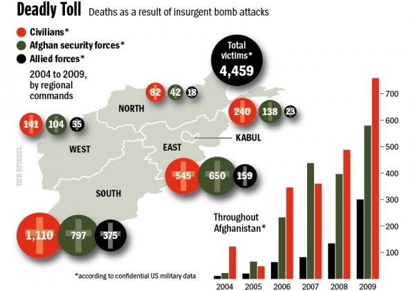
Der Spiegel – Deaths as a result of insurgent bomb attacks
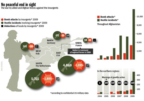
Der Spiegel – No peaceful end in sight
* note that I’ve returned the ‘?’ to the end of the post’s title – it was unintentionally missing from the original post.

