
The BBC has published a set of graphics to support their analysis of the (re-) increasing financial crisis across the Eurozone.
The first graphic (debt) presents both the national debt and deficit as a % of GDP. Wisely the values are presented on a colour-coded scale using only a single colour. This makes it easier for the eye to be drawn to and pick out the countries with the highest debt/deficit levels. I would have preferred to see the graphic without the labels and think the map visualisation could have been supplemented on the right by a bar chart presenting the values in an alternative way showing the countries in descending order of crisis. This would have been much more useful than the unnecessary (and large) image of the currency.

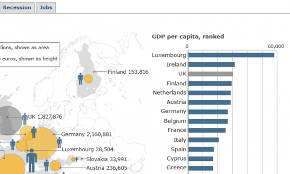
The second graphic (economy) does usefully provide an accompanying bar chart, similar to what I described above, however, there are significant problems with the visualisation approach used to display each country’s GDP and its GDP per capita. A circle area is used to represent the former and the height of ‘person’ icons are used to encode the latter. Circles are always difficult to accurately interpret but the prominent issue here is that some of the circle sizes occasionally cause the shapes to outgrow the space of the country. This creates a need for optional labels which in turn makes the display overly crowded. The icons are useless – it is virtually impossible to accurately determine the values they represent or how comparatively larger/smaller they are in relation to each country. Not only do they fail to sit conveniently alongside the country they represent – the Luxembourg ‘giant’ has his head in Germany, his body in Switzerland and his toes in Northern Italy – they also badly misrepresent the data. The GDP per capita is supposed to be represented by height yet the icons are sized in both increasing height AND width. This conduses our visual system which automatically processes the encoded values according to the shape’s area rather than its height.

The third graphic (recession) would benefit from the same optional label display as in the second graph, allowing us to clear the clutter these cause. Also, why can’t the labels be more closely positioned to their associated countries? The use of blue to represent those countries in growth feels instinctively unnatural – convention suggests using the colour green for good/positive representations and that would seem to be more appropriate and ‘instant’ to help convey growth.

Not much to comment on the final graphic (jobs) aside from the need to once again allow the viewer to optionally show the labelling. However, I’m not sure about the merit of the information relating to average full time earnings which doesn’t seem to add anything to the narrative around jobs (indeed it has no narrative underneath in the text). Had this shown a pre- and post-recession change in the average earnings by country that might have been interesting to see the impact but otherwise it feels like it was just a dataset that happened to be available and so was included. I suppose its at least better than having a huge ugly picture of some guy’s hand leafing through the €50 stash in the till…
