
With yesterday’s announcement that the general election will take place on Thursday 6th May, the media has wasted no time in launching a glut of graphics, explanatory analytics and interactive guides to supplement their coverage. Whilst there is much focus about the internet’s role in this election, particularly with reference to the social web, in this country at least, we will have never seen innovative visualisation approaches so prominently deployed to help (or at least intended to help) us digest the latest predictions and trends as the election date approaches. Here are a few of the main players.
BBC
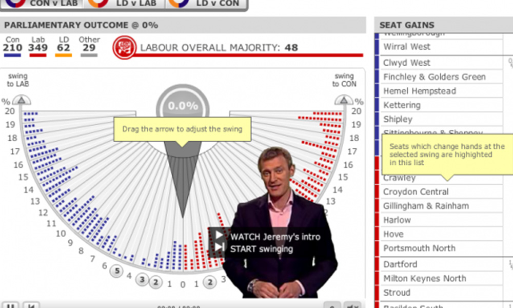
The most famous election-related visualisation in this country is the treasured swingometer. First used in 1955, this is the BBC’s flagship device and is most prominently deployed on the night of the election to show the progress of votes and seats as the results emerge around the country.
With the election outcome more unpredictable and uniquely poised than it has been for decades, once again in 2010 the swingometer will be at the front line of the BBC’s information presentation tactics. An image is shown below and the interactive version can be found here.
The swingometer is a rough way of measuring the switch of voters from one party to another on a national, regional or constituency basis. To find out about a particular swing percentage, drag the pointer or use the top arrow buttons at either side of the swingometer.

They have also got a poll tracking guide to keep tabs on the progress of opinion polls in the context of historical party ratings going back to 1983 (depending on which poll you select).

The Guardian
As I have spoken before on this site The Guardian is at the forefront of digital media and innovative use of information graphics. Their election coverage reinforces this brand with a three-way swingometer which allows you to simulate different swing percentages and directions across the three main parties using either a schematic map, a standard map or a dynamic bar chart.


The paper is also renowned as a prominent campaigner for the public accessibility of key data and they have set up an accompanying site presenting the 10 key data sets that will help users better understand the key election debates.
The Telegraph
The Telegraph follows a similar approach to The Guardian with a schematic style map offering details of which parties hold seats across the country. This is a neat device which provides users with a quick at-a-glance view of some of the most high-profile seats, an interactive swingometer where you select two-party combinations for comparison and also a guide to the most recent poll data.

Sky
Sky’s website presents a map interface which at the moment acts more as a navigation device to view key details behind all seats and locations across the country. I would anticipate this will be enhanced to display live predictions or simulations for alternative results.

The Times
Finally, The Times which, similar to Sky (possibly due to the Murdoch associations), presents an interactive map-based guide to the parties and the seats they hold around the country. They are also providing a secondary view which will be based on forecast predictions from one of the leading bookmakers as the days go by.
