A few days ago I published a post assessing the design flaws with the O2 ‘My Account’ app for the iPhone. In this second part of two posts I will propose a potential revised design.
Design considerations and requirements
So where do we start with the redesign? Well, firstly, we need to consider the purpose of this application and what the user’s needs are – all design must focus first on the user.
Putting myself into the role of the user, which in this case I am, I would consider these to be the most important items of information I would wish to have displayed:
- how many minutes I have used and have left
- how many messages I have used and have left
- how many days left I have until the end of my bill period
- the charges I have incurred on top of my allowances
Additionally, there are several items of information that could be provided that would be of particular interest:
- the minutes I have used that were not included in my allowance
- the messages I sent that were not included in my allowance
- how this month’s usage compares to previous months
The current design provides only some of this information. I won’t repeat the analysis I provided in the earlier post but this presentation is inefficient (split over two screens, wasted use of space) and ineffective (unnecessary gauge displays).
Proposed redesign
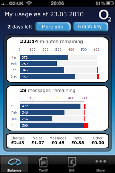
The focus of the redesign was to present all the information i was interested in on a single screen, enabling the eye to clearly pick up the most prominent elements of interest.

Here are some general comments about the redesign:
- I have renamed the title ‘My usage as at date‘ to more accurately describe the nature of the information presented (as opposed to just ‘My allowances’). Ideally I would also rename the ‘Balance’ label for the menu icon used to select this screen at the bottom of the page.
- I have removed the ‘Welcome: name‘ and ‘Mobile number: number‘ from the header because this is unnecessary.
- I then have a clear indication of the number of days left until the end of the bill period as well as two buttons to show ‘More Info’ and ‘Graph key’.
- The ‘More info’ button would bring up a pop-up describing some of the legal/small print type wording that was shown on the original design explaining the calls included/not included etc.
- The ‘Graph key’ button would bring up a pop-up showing the legend to explain the series and coloured bars on the graphs. This has been hidden on a separate screen because you might only need to learn this key once and so it shouldn’t take up valuable screen space.
- The first information box presents the number of minutes (and seconds) remaining with a supporting bar graph showing the used minutes (dark blue), remaining minutes (light blue) and charged-for minutes (red). This is presented in the context of the contract allowance of 600 free minutes. Data is provided for the month-to-date as well as the previous three months for comparison. Labels have been included for used minutes to enhance the clarity of the data but arguably these could have been left off the design.
- The second information box presents similar information to the minutes box, this time for message usage based on the allowance of 500 free messages.
- The final box presents (with photoshop shortcomings!) the total and consistuent breakdown of charges that have been incurred. The main difference to the original data (which was on a second screen) is the decision to merge the ‘International’ category with ‘Other’. I did this because I have used the phone on a number of occasions in international settings and never incurred a charge under this category, so believe it to be fairly redundant as a separate category.
- Finally, the colour scheme, shape designs and typography are all deliberatley consistent with the O2 visual identity.
I feel this redesign offers a much more effective solution for delivering the information and interface approach I require from such an application. Feel free to comment.

