Hi, I’m ANDY KIRK, an independent data visualisation expert delivering a range of professional services to clients around the world. I specialise in data visualisation design training and consultancy, but alongside this I am a sought-after speaker, a four-times published author, and host of the ‘Explore Explain’ video and podcast series. I’ve had more than a decade of experience as an adjunct lecturer positions teaching data visualisation modules on Masters programmes at a range of esteemed institutes.
Since launching visualisingdata.com as a blog in 2010 this site has grown to become a popular reference in the data visualisation field for new enthusiasts and experienced practitioners alike, offering discourse about the field’s development, design references, and contemporary examples. Across these pages you’ll also find examples of my work and experiences, as well as lots of useful resources I’ve collected from tracking and participating in what has been a golden era of growth in the data visualisation field.
My vision is to deliver data viz excellence, everywhere. A desire to help individuals and organisations elevate their data visualisation capabilities is at the heart of the range of visualisation education, design, and consultancy services I offer through my company, Visualising Data Ltd.
To find out more about these professional services get in touch on email via andy@visualisingdata.com. You can follow my updates through my monthly newsletter, or connect with me via the social media platforms on which I’m most active: LinkedIn, Bluesky, and Instagram.
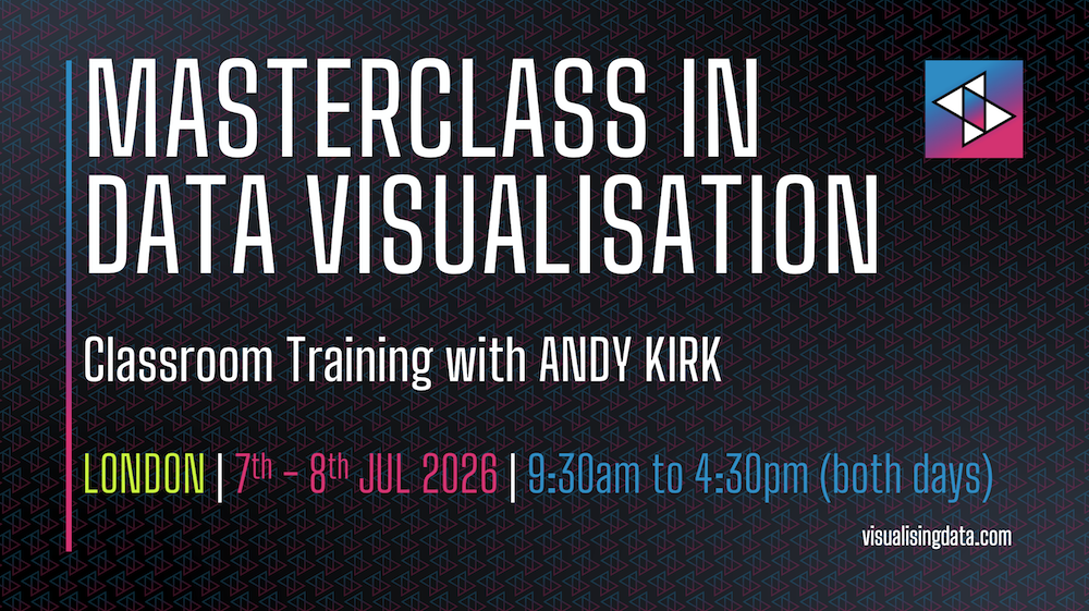
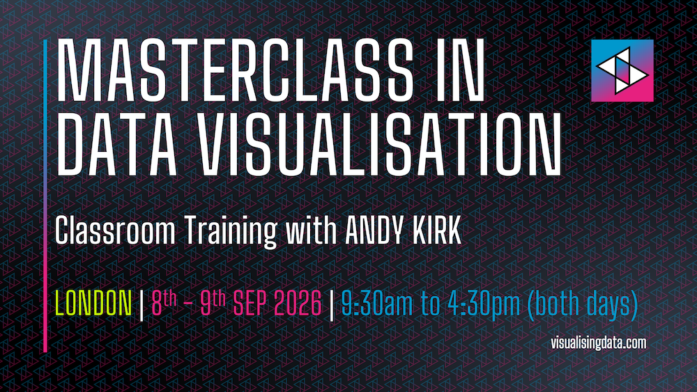
I’m fortunate to be one of the most in-demand, prolific, and experienced data visualisation trainer. Since starting them in 2011, nearly 9000 people have attended nearly 450 public and private training courses, virtually and in-person in 27 different countries.
The training page has lots of information about my range of training offerings, which include public and private training courses, different short, medium, and long duration formats to suit different learning appetites and budgets, and courses delivered through in-person classroom events or as online virtual sessions.
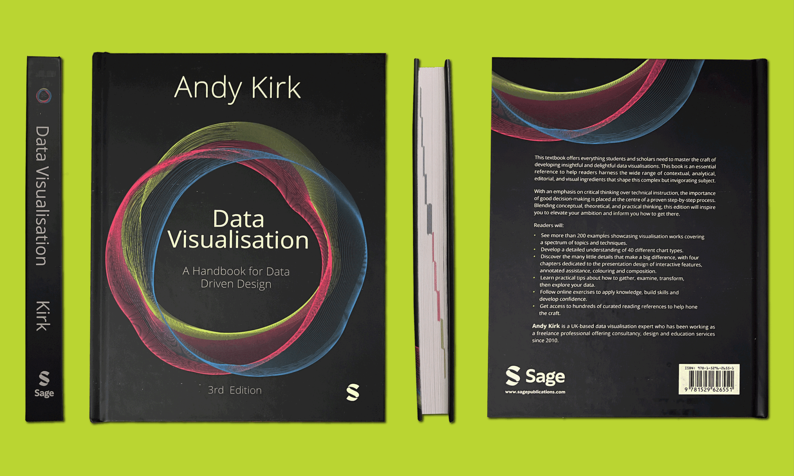
The aim of this book is to help everyone and anyone to become more sophisticated in how they go about communicating data in visual form. It focuses on the craft of this discipline, taking a human-centred perspective on the complex challenges in optimising creative, analytical, and contextual decision-making.
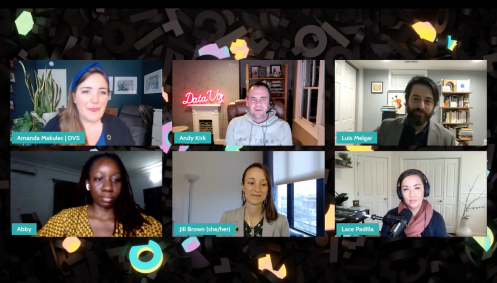
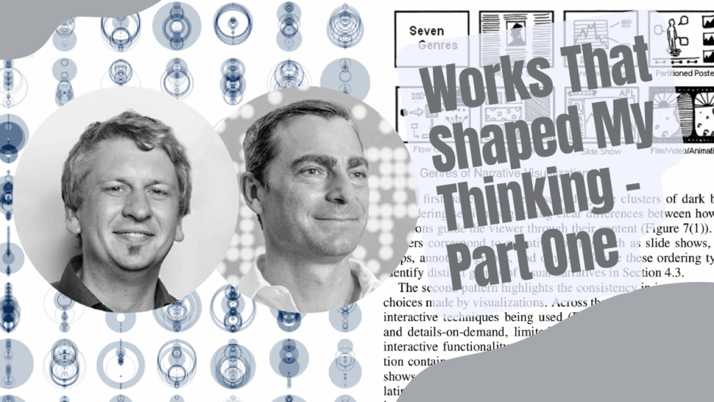
Explore Explain is a long-form data visualisation podcast and video series. Each episode is based on a detailed conversation with visualisation designers, developers, and data journalists to explore the story behind a single or series of visualisations, or a related major project.
There is a diverse cast of talented practitioners from across the field and around the world, showcasing a variety of different types of visualisation work. Visit the podcast page to see the full line-up of previous guests and links to all episode videos and audio from across the first four seasons of this series.
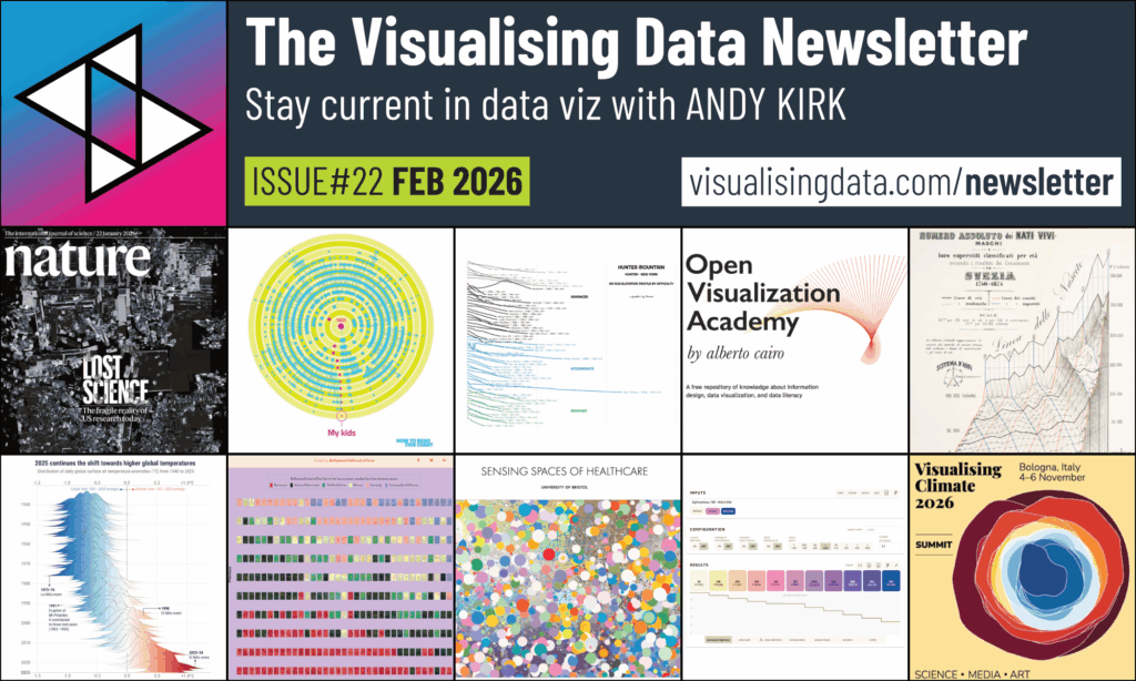
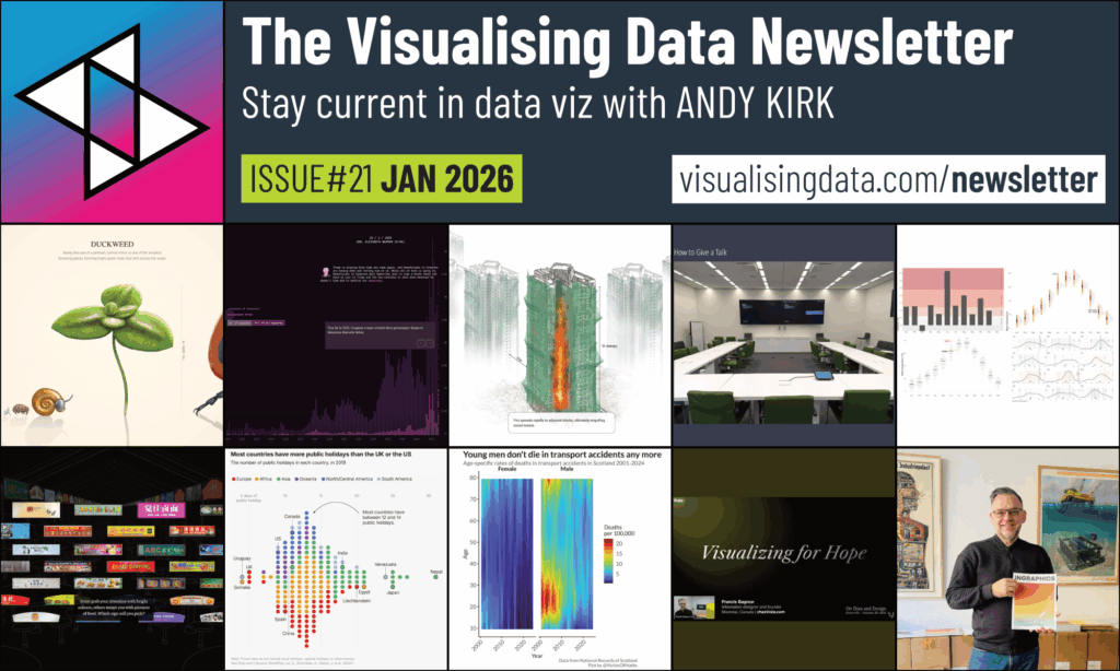
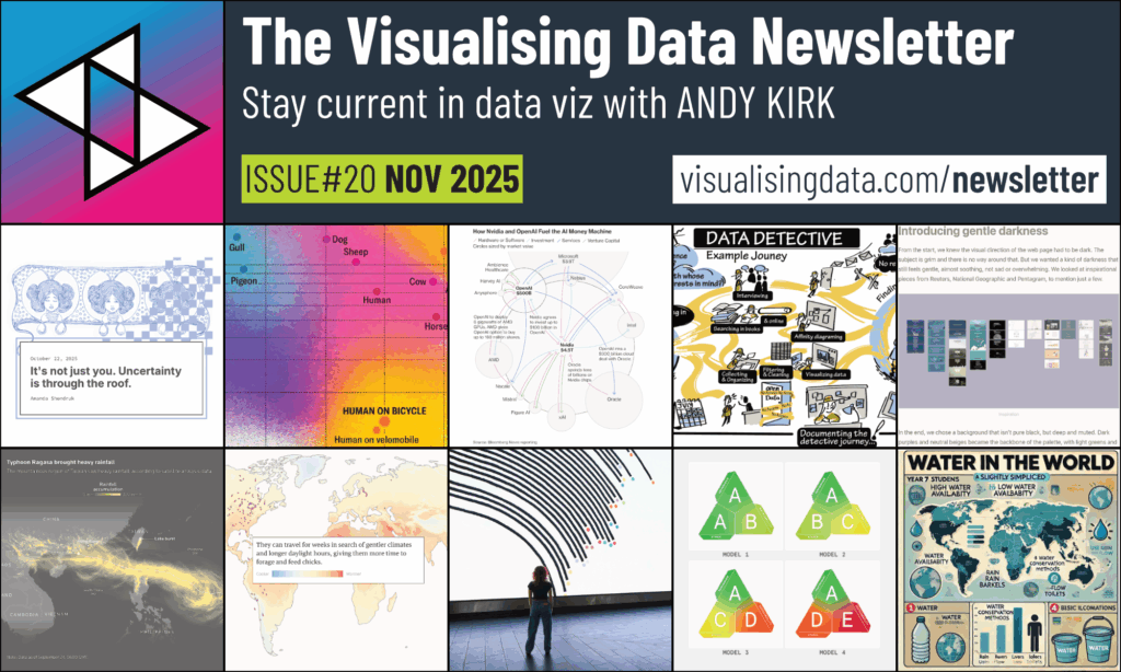
Stay current in dataviz by subscribing to the Visualising Data Newsletter, chronicling the most insightful and delightful data visualisation content every month, straight to your inbox. Whether you are in the business, adjacent to it, or completely new to data viz, I’ll elevate your understanding of what’s going on with a monthly roundup of the most insightful and delightful data visualisation content. I’ll showcase the freshest designs and compelling articles from the field. I’ll share relevant developments in technologies and useful learning resources. If its good, if its interesting, or just thought-provoking, I’ll pass it on.
Visit the work page to see a portfolio of examples that characterise the wide range of professional and public services I offer, one-off personal projects, and some of my public collections of learning, resources, and articles collections.
Not all commercial projects can be shared publicly but the work that is shown is created and shared with the motivation of spreading knowledge about good data visualisation practice.
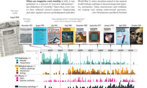
Visualisingdata.com was originally launched in 2010 as a blog and I continue to publish articles and share announcements that track developments in my professional experiences as well as developments in the data visualisation field at large.
Visit the posts page to see the full collection of all my published posts, starting with the newest and dating back to 2010, tracking. These posts include articles, design commentaries, podcast updates, professional updates, and general news from across the data visualisation field.
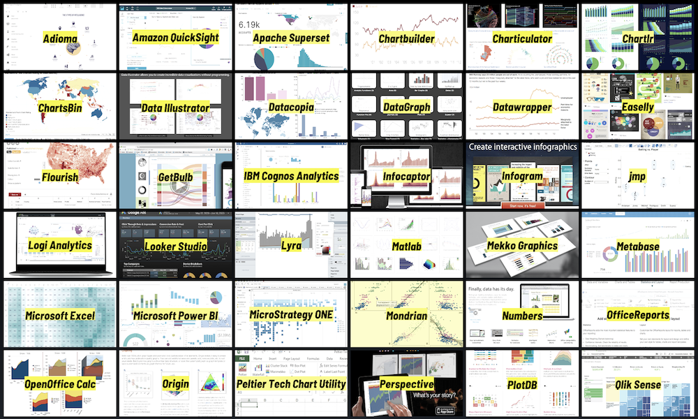
The resources catalogue organises links to hundreds of tools, applications, and libraries across many different categories of the data visualisation technology landscape.
Most of the tools compiled are directly applicable to the creating of data visualisations (like making charts or developing interactives), with others assisting with different aspects of the creative process (such as statistical analysis, colour generation, sketching).
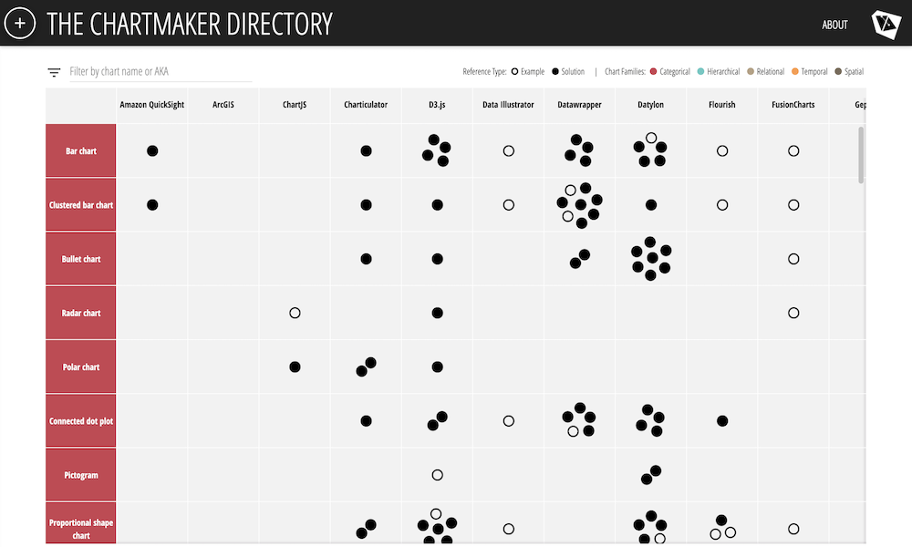
The Chartmaker Directory is a collection of hundreds of references to examples and technical solutions that help answer that most common of questions: what tools can make which charts, and which charts can be made with what tools?
This directory displays the chart-making capabilities of around 40 of the most common tools selected from the resources catalogue against a list of around 50 distinct chart types.
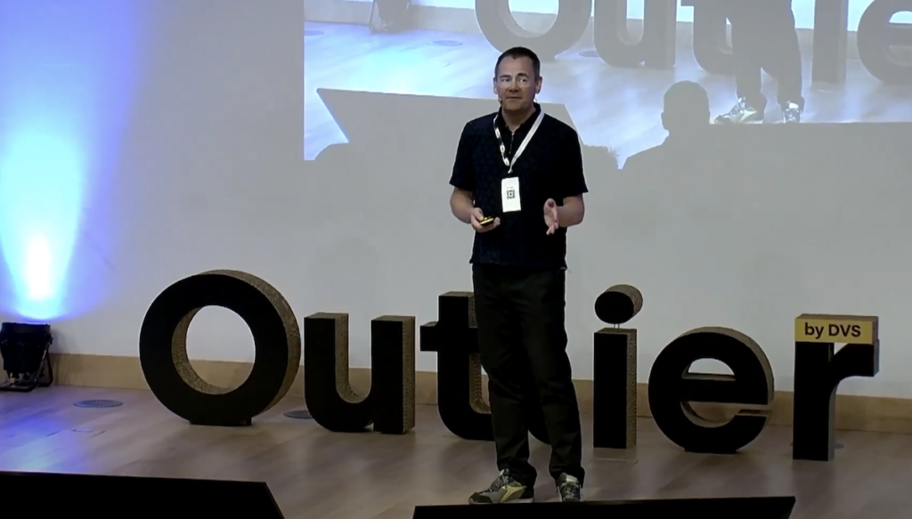
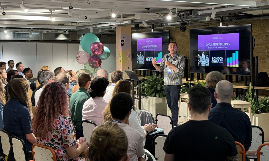
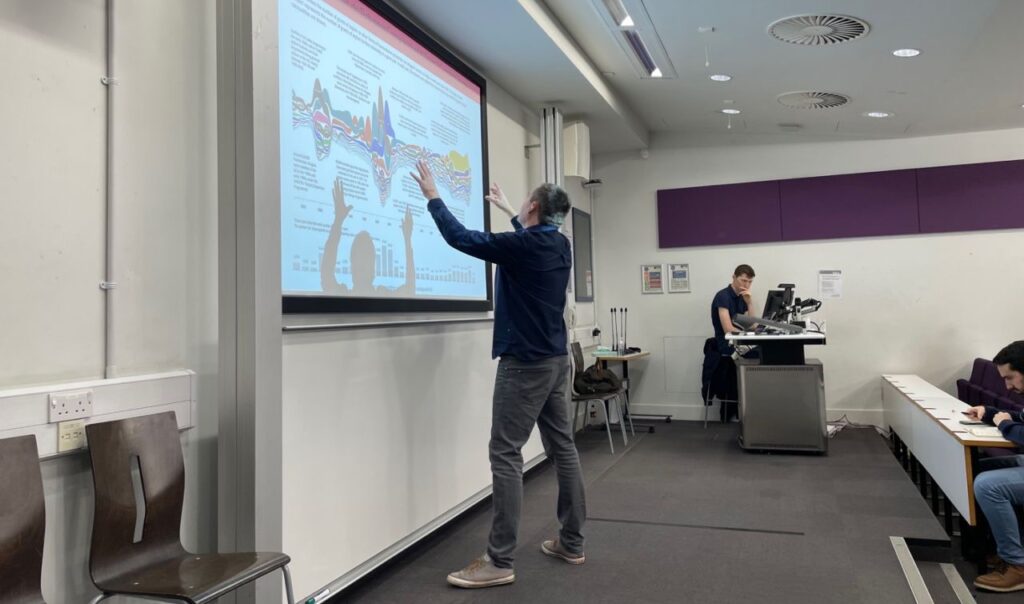
The appearances page lists all the in-person talks I have given (whether at conference events, meet-ups, or when visiting organisations), all the virtual appearances I have made (delivering presentations as part of stand-alone webinars or broader virtual conferences), or occasions when I’ve appeared as a guest on episodes of other podcasts.
Since founding Visualising Data Ltd in 2010 I’ve had the pleasure of working with people and teams from hundreds of different clients, representing a wide range of different organisations types from across all industries, sectors, and regions, operating in all shapes, forms, and sizes.


![Part of a panel at the Digital Sport North meetup event in Leeds, February 2023 [photo credit: Sarah O'Neill]](https://visualisingdata.com/wp-content/uploads/2023/03/Hero_Talks-1024x583.jpeg)